A good product roadmap is a very simple list of high-level goals you want to achieve in the next 3-6 months. This UX roadmap will guide your team (and everyone else) in the right direction. You also need to plan the next steps you take, which means planning the design sprints. Last, but not least, you have to define how designers and developers will work together. In this article, I will share how to do all these things.
A young product manager pulled me aside with huge excitement in his voice. He proudly showed me what he did the day before: a detailed product roadmap. It was a sophisticated Excel sheet, with every big issue highlighted with different colors, and the design and development of different features planned with precise dates.
I saw the joy on his face while he opened different sections and drilled down into specific details. And it just saddened me. How will I tell this enthusiastic guy, who just tried to do his best, that his roadmap is worthless?
This poor guy basically did everything you should NOT do with a product roadmap.
The inconvenient truth about creating a UX roadmap
There is an inconvenient truth about roadmaps that many people fail to understand. These detailed plans never survive the test of reality. When the first obstacle arises, they fall apart.
You can easily recognize it when participants start blaming each other regarding deadlines, and what was a dream project before, suddenly becomes hell.
So it’s better not to set exact deadlines. Remember, in agile the only things that have exact delivery dates are the things in your current sprint. Everything else is just an estimation.
Listing-specific features in a roadmap also don’t make sense. You can decide what business or user needs will be solved in what order, but in many cases, you don’t know what features will be affected in this early stage.
If your goal is to raise the conversion rate, for example, it can affect many parts of the product. Remember, our goal is not to deliver certain features in time. Our goal is to create a product that satisfies real user needs. And it is not always as simple as coding a few features in time.
So be careful if you meet a product roadmap with the following warning signs.
5 signs of a bad roadmap
- It has specific features in it
- Everything has an exact deadline
- It is a complex plan, with many details
- It looks like a Gantt chart
- Certain features are designed and developed at the same time.
How does a good product roadmap look like?
A good product roadmap is made up of themes. A theme is a high-level goal we want to achieve. It can be a business goal, like increasing certain numbers. It can be an engineering goal, like terminating tech debt.
And, of course, it can be a user-centered goal, like solving a pain we have recently discovered or designed a new user onboarding flow to the app.

In the roadmap, we prioritize these themes. Instead of adding strict deadlines we put down the order of the themes. It tells the story of how we go from the current state to the product we are dreaming of.
The roadmap is a high-level, strategic document. It should be very simple, with just a few themes in it in the right order. And that’s all. If done right, the roadmap can be used to communicate our product and UX strategy easily.
A roadmap is not a static thing. It has to be reviewed every 2-6 months, depending on the industry and product you work with. Roman Pichler has a nice graph about that. I recommend updating your roadmap together with your team on a ux strategy workshop.

As you can see, the roadmap is a product-related thing. There is no such thing as a UX roadmap. The roadmap lays down the direction the whole team goes. And we plan certain design or development tasks only for the next sprint. But this planning is not easy either.
Difficulties of planning the design phase
Design takes place in the early phase when everything changes fast. So design is difficult to predict. As we go through the process and get closer to the pixel-perfect UI design, it becomes easier to estimate the time needed for certain design tasks.
Let’s say we design an email marketing software. We have done some interviews lately, and it turned out that one of the most important pain point of marketers is presenting marketing results to stakeholders. In this super-early phase, we don’t know how we will solve this problem.
The solution can be either just a small new feature in the statistics module, or we might have to redesign the whole stats thing from scratch, or even create a new standalone product to solve this pain. It is nearly impossible to estimate the time we need for the design and development at this point.
After making and testing some prototypes and deciding how to solve this need, we can decide on the features the solution will need. When we have a feature list, we can estimate the time needed for design and coding, but it will be inaccurate, for sure. During the design phase, we will iterate on wireframes and user tests to find and solve usability issues, and we never know how many rounds we will need.
After we got the wireframes ready, and we agreed on the look and feel, we are able to estimate the time needed for the detailed UI design quite easily.
So the big question here: how to handle all these uncertainties and how to plan the design activities?
The solution: organize risky tasks into a simultaneous track
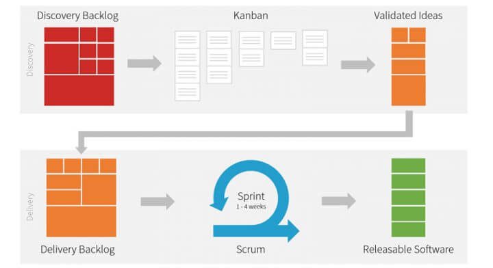
To solve the uncertainties of the early-phase design tasks we can organize them into a separate “track”, where product discovery progresses simultaneously with the design and development of the more mature features.
Some companies have dedicated discovery teams, others have dedicated time for these tasks. This highly depends on UX team structure.
After the discovery is ready (so we have a validated feature list that solves a user pain), we can pass the issue to designers and developers who will then create and publish the new features. We call these two discovery and delivery tracks.

The discovery phase is basically done by UX researchers and designers. They collect user pain points by doing discovery methods like interviewing and validating solution ideas with landing pages, fake door tests or testing prototypes.
The delivery part is done by designers, researchers and developers. In the delivery phase designers design low-fidelity wireframes first, test and iterate on it to eliminate usability issues, then do the detailed design and pass it to the devs who build them.
This dual-track system makes sure we can act on user needs fast, as we do product discovery continuously. The discovery team just passes validated, reasonably well-defined features to the delivery team, so the delivery team’s work is relatively predictable. They can have a good plan for the next few sprints.

Questions to uncover hidden design tasks
When the vague part of product discovery is done, and you think you just have to design the interface of the features, well, it can still be full of surprises. To avoid these, try to answer the list of questions below before you plan your next sprint.
- Will the new features affect the settings or the admin part?
- Do you need a user profile, or will the new features have any effect on the profiles?
- Will you need empty states?
- Will there be a dashboard?
- Do you need unique icons or a logo?
- Do you have to experiment with the general look&feel of the product, or will you just follow the existing brand’s look?
- What platforms will you design to? Mobile? Desktop? Native or web?
- Do you know all the steps of all the flows? Can there be a hidden step or a branching somewhere?
- Look for listing-details-editor triplets. If a piece of content has its own page, there will probably be a list and an editor too.
- Do you need any animations?
- Are there any screens with heavy use of interactions (panels opening and closing, drag and drop, etc.)?
Another important learning I always highlight is that you can not code and design the same feature at the same time. Believe me, we have tried it and it always ends up in chaos. Give developers features to build, when the design is ready.
Designers and developers should also agree beforehand in what format they will hand over the design documents. The handover shouldn’t be just an email, they should sit down and go through the flows to make sure everyone understands everything. And when something is developed, designers should check it whether it works as it should.
The 4 things you need for a UX roadmap
To sum it up, here are the things you will need for your UX roadmap:
- Do product discovery continuously and simultaneously with other activities to uncover people’s pains and needs.
- Hold a strategy workshop every 2-6 months where you collect and prioritize the pains you want to solve.
- The result of the strategy workshop should be a simple, high-level roadmap with themes.
- Give designers the time they need to iterate on prototypes. When you plan sprints for developers only count with the functions that are over the wireframing and testing phase, therefore you can easily estimate the UI design and dev time needed.
I’m sure many of you thought it would be easier to put together a UX roadmap. With this article, we hope that you will be able to put together a UX design project roadmap template for yourself, which you will be able to come back to each time you get stuck.
It probably is really easier to create a good old waterfall project plan. But this method with the strategy workshops and the discovery part will create a process that can generate business value continuously in the long run.
And what is your experience with roadmaps and UX? Please leave a quick comment and share it with us.
Take the next step to improve your website’s UX
Planning a design OR a research project soon? Get in touch with UX studio and find out how we can help you conduct usability research and create a powerful UI that will appeal to your target audience.
Users drop from your website and the conversion rate is low? UX audit might help pinpoint usability flows in your product and define key steps to improve its performance. Learn more about UX audit and why you should consider it.


