Tamarind Logo Case Study
- Client
- Tamarind Insurance
- Industry
- Insurance for Electric Vehicle (EV) Companies
- Services
- Logo, Brand Colour, Presentation, Creatives, Stationery
CASE STUDY
Case Study: B2B Branding Solutions for Tamarind Insurance – Empowering EV Futures
Branding Objective:
Deliver modern, credible, and eco-conscious branding solutions for Tamarind Insurance, targeting B2B clients in the Electric Vehicle (EV) industry. Establish a visual identity that communicates reliability, innovation, and sustainability.
Logo Design
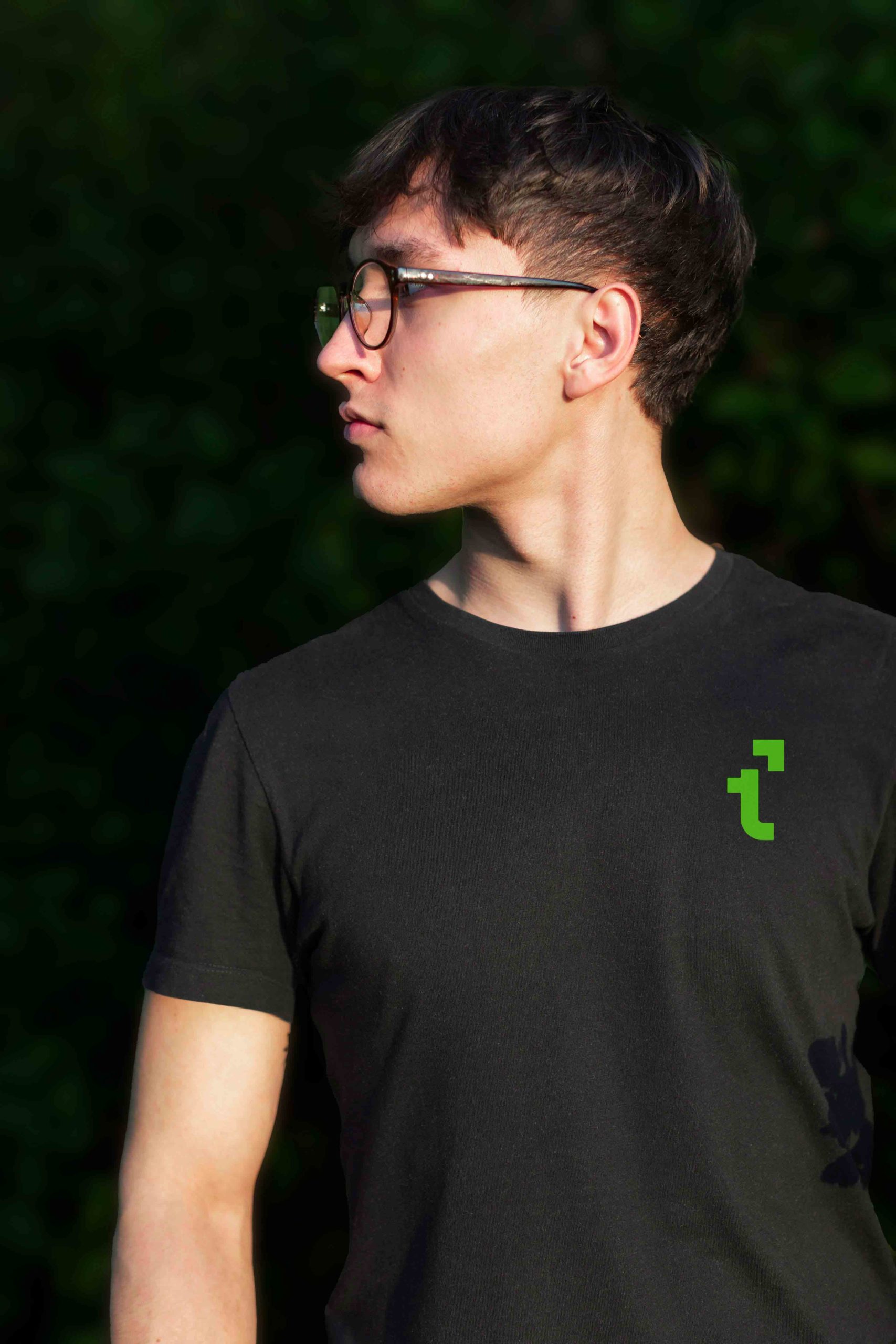
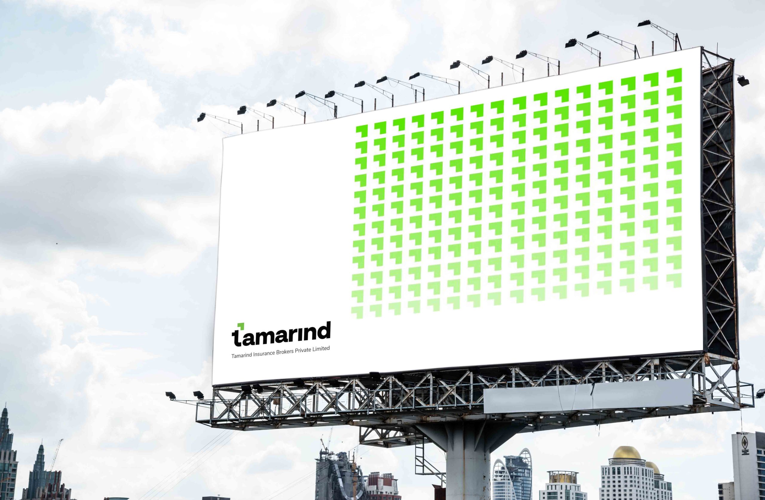
The logo design for Tamarind Insurance encompasses the essence of safeguarding and growth. The rounded arrow, cleverly forming the letter “T,” symbolizes progress, protection, and the interconnected nature of insurance. This choice embodies the core values of trust and reliability, essential for B2B relationships. The curvature of the arrow emanates approachability and a welcoming vibe, while the upward direction signifies growth and advancement. The vibrant green color not only aligns with eco-consciousness but also captures the forward-thinking approach of Tamarind Insurance.
Typography
A bold serif font is meticulously chosen for the typography, merging classic sophistication with modern strength. The boldness confidently communicates Tamarind’s contemporary mindset, making it an ideal fit for B2B branding. The serifs in the font evoke trustworthiness and stability, critical elements for establishing credibility in B2B interactions.
Color Palette
Green takes the forefront in Tamarind’s color palette, signifying sustainability, renewal, and the environmentally-focused EV industry. The strategic use of various shades of gray complements the green, adding a touch of professionalism and balance to the overall visual identity.
Deliverables
Logo Variations
A diverse set of logo variations is provided to cater to different applications, including horizontal, vertical, and simplified versions, ensuring adaptability across various mediums.
Printed Collaterals
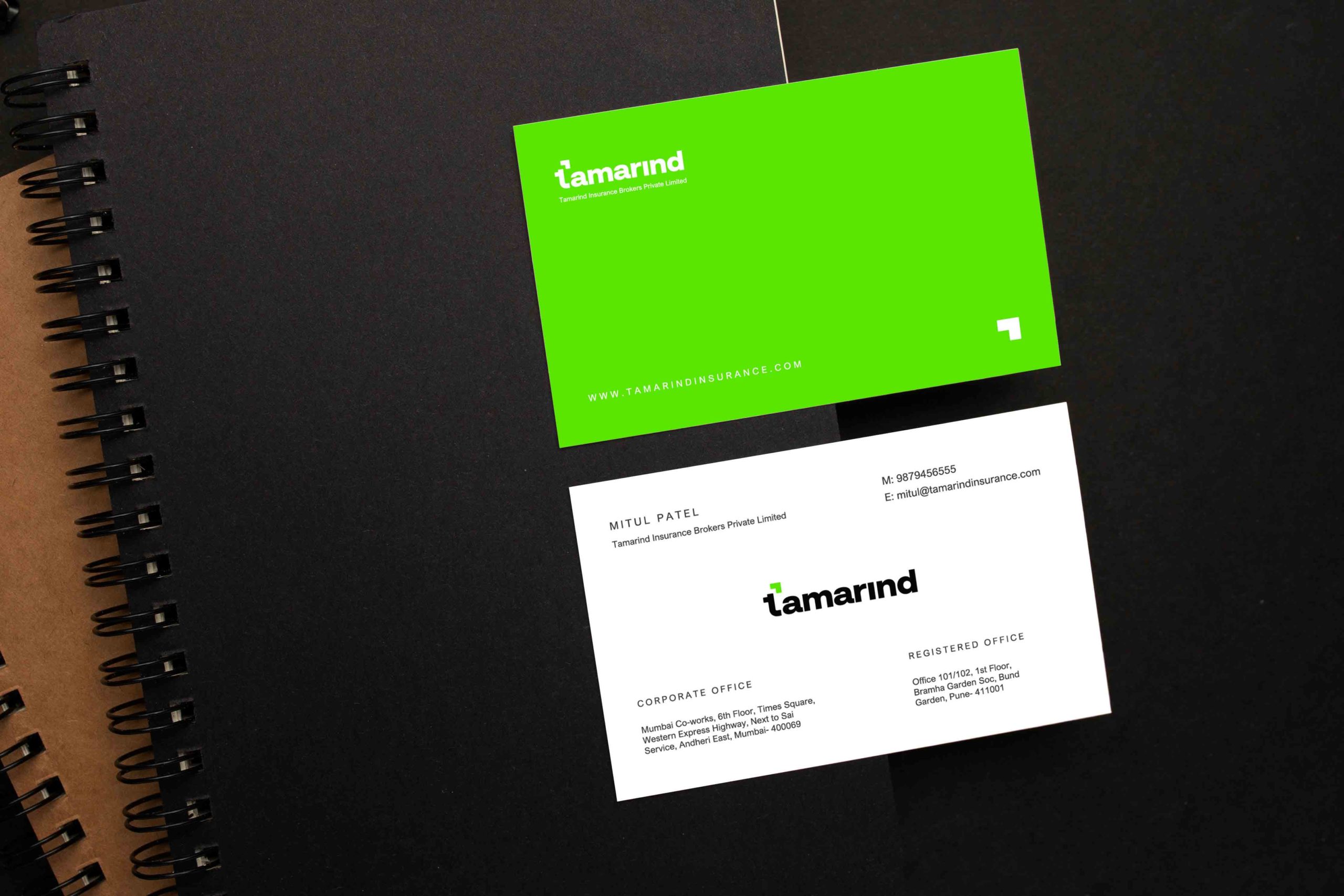
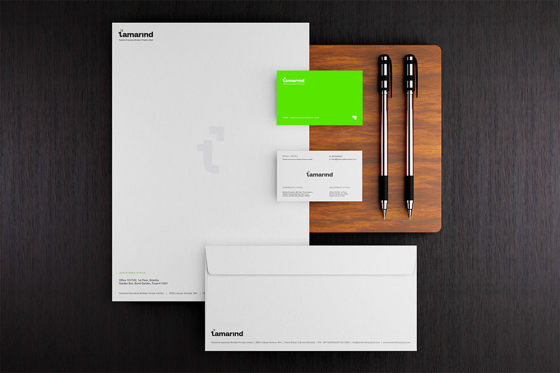
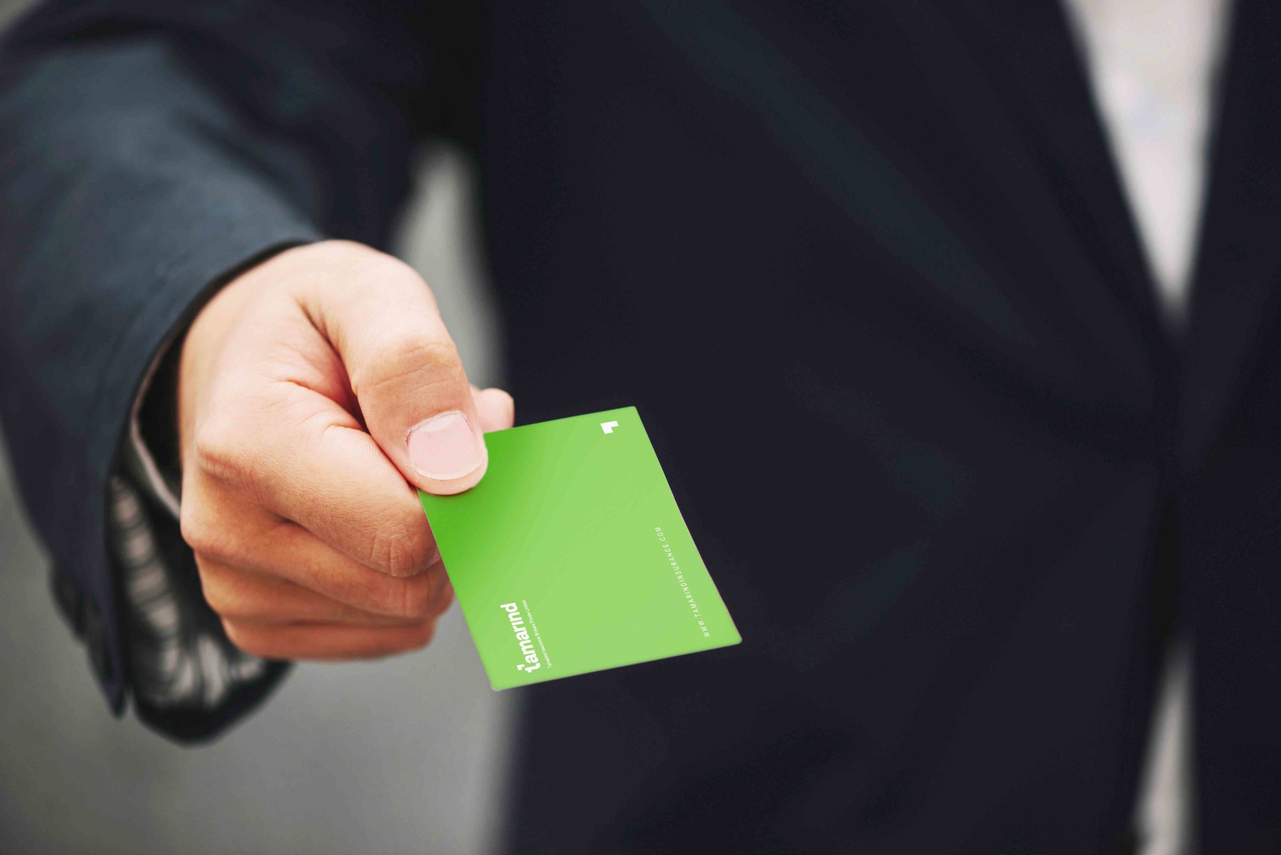
Branded Stationery Set: Business cards, letterheads, envelopes, and notepads maintain a consistent branding that resonates with B2B partners.
Digital Presence
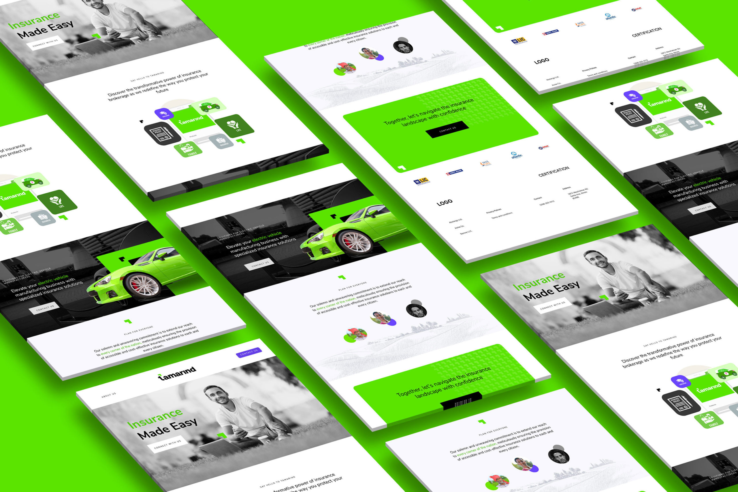
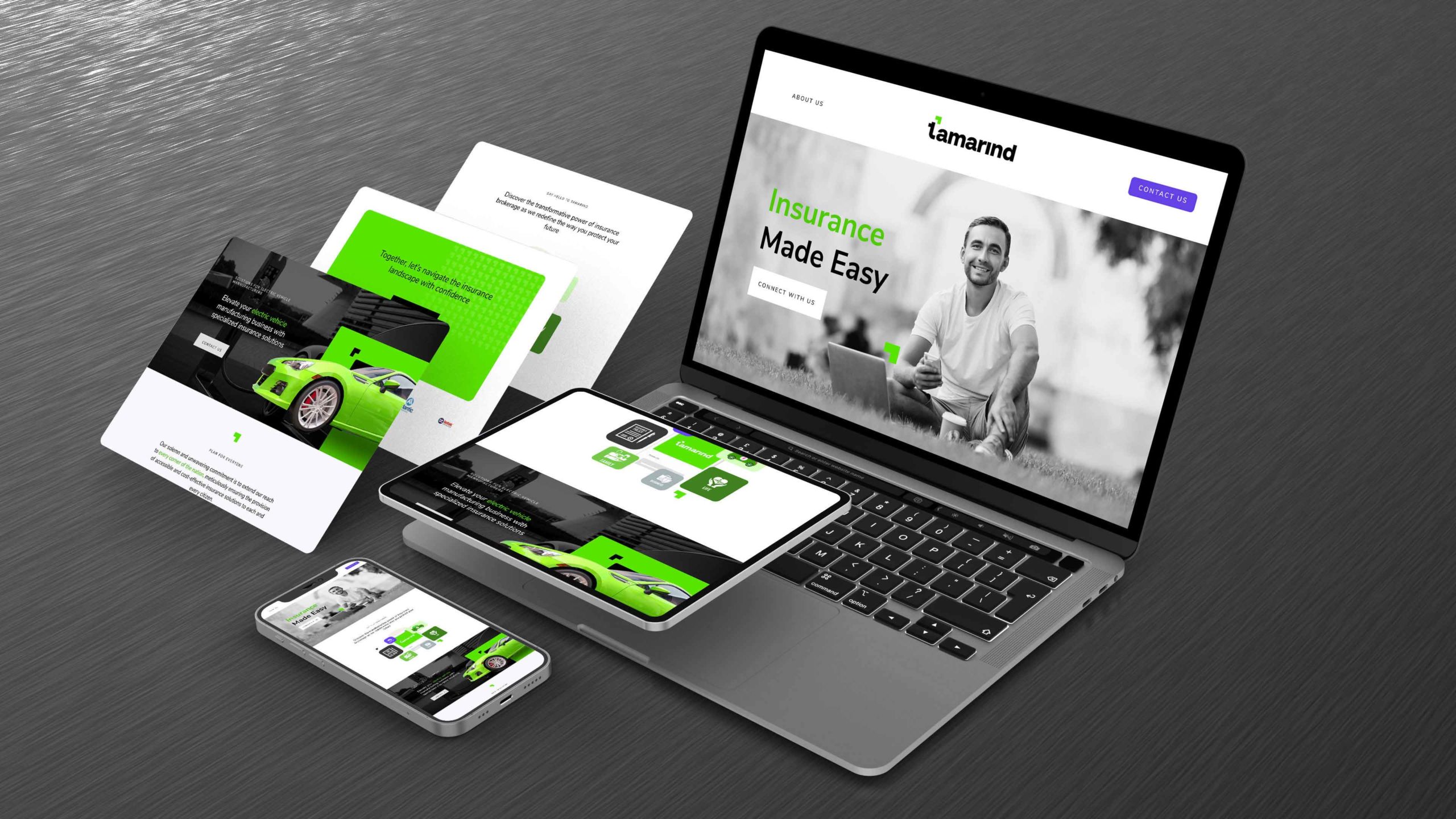
Professional Website Design: The website design showcases Tamarind’s dedication to B2B clients in the EV industry. The website incorporates the logo, typography, color scheme, detailed insurance offerings, and a user-friendly contact form to facilitate seamless communication.
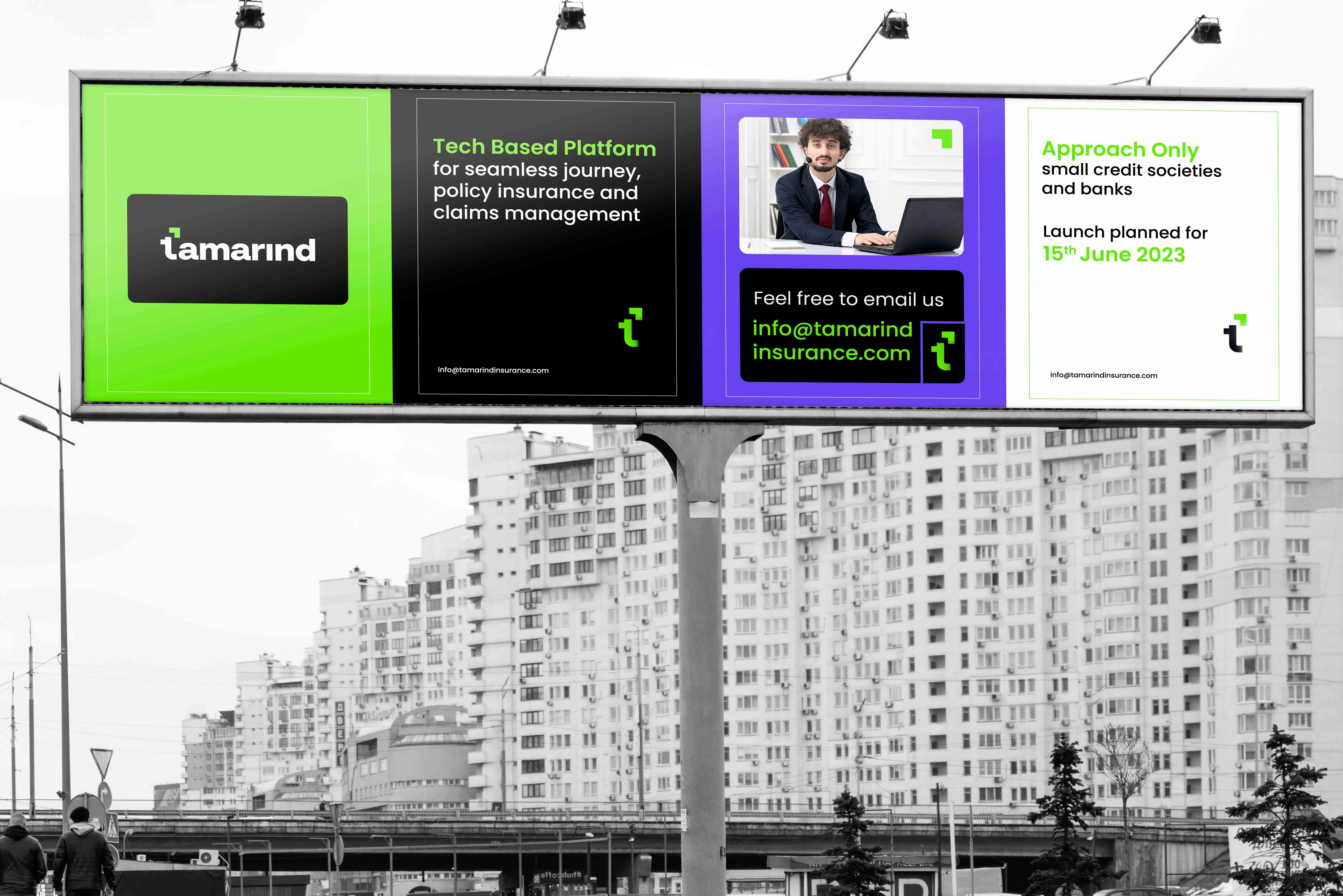
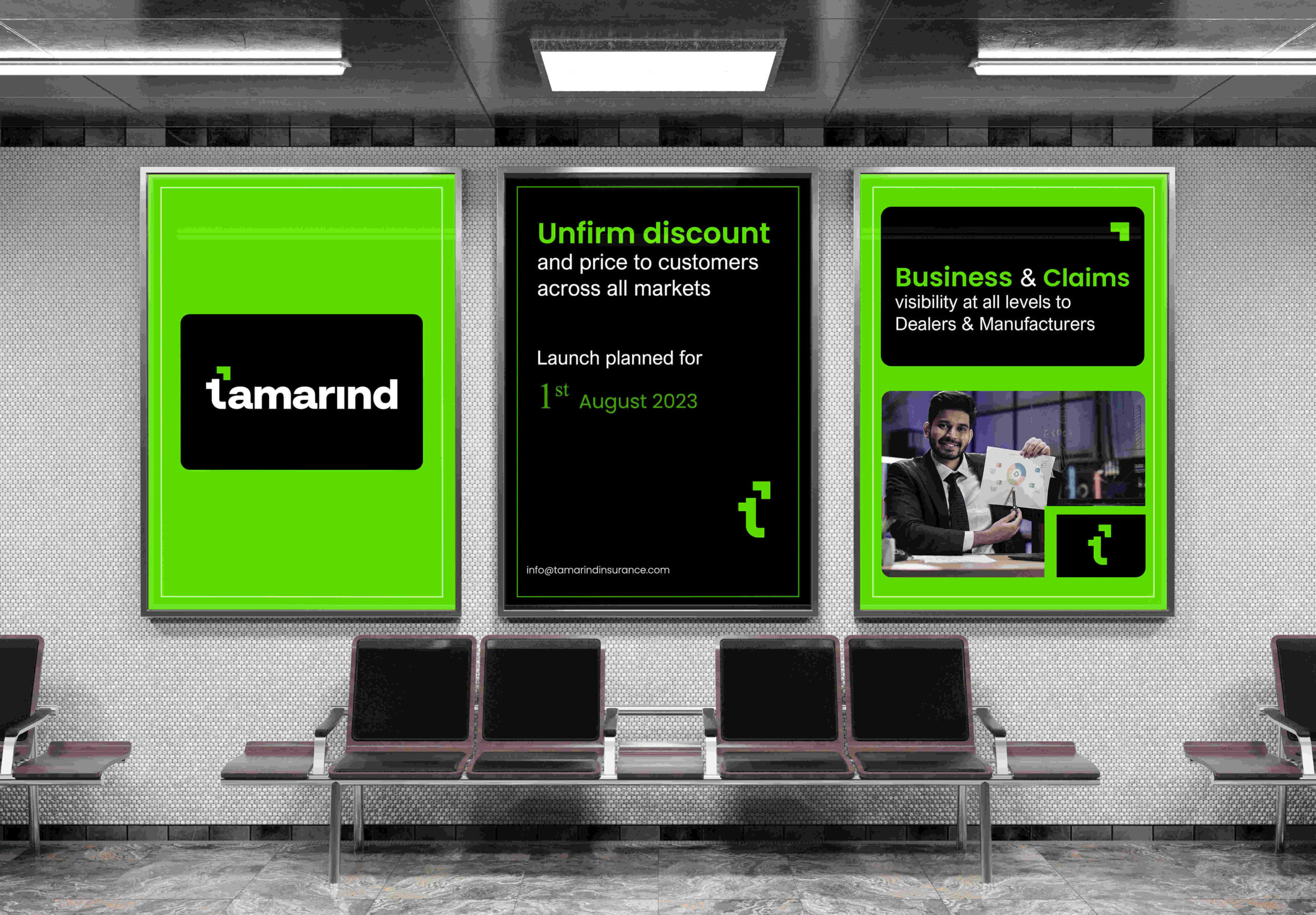
Strategic Social Media Graphics: Customized graphics for various social media platforms ensure a unified brand identity, enhancing Tamarind’s presence in the B2B space.
Presentation Templates
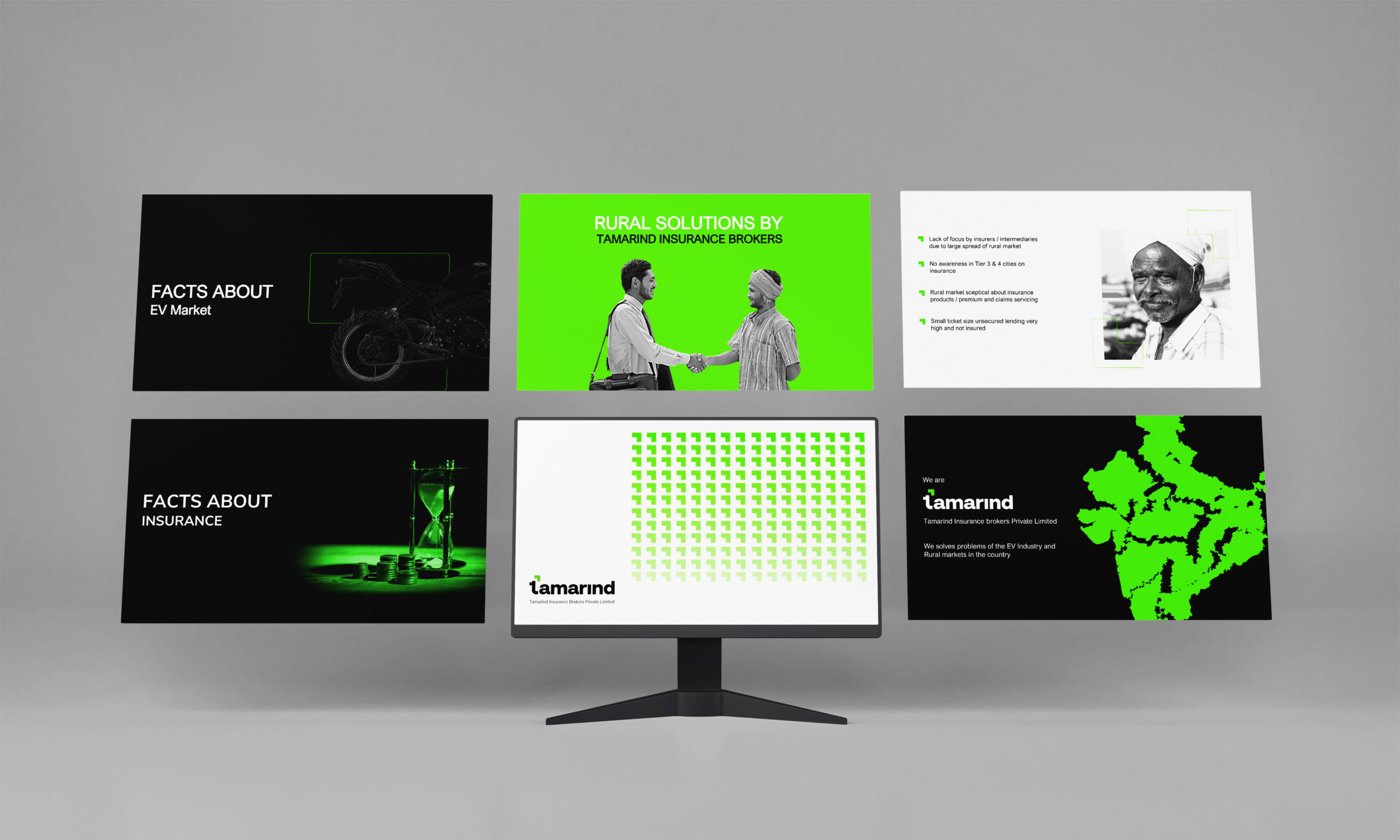
Customized PPT Templates: PowerPoint templates are tailored for presentations, workshops, and webinars, enabling Tamarind to consistently present their brand in B2B interactions.
Creative
Outcome:
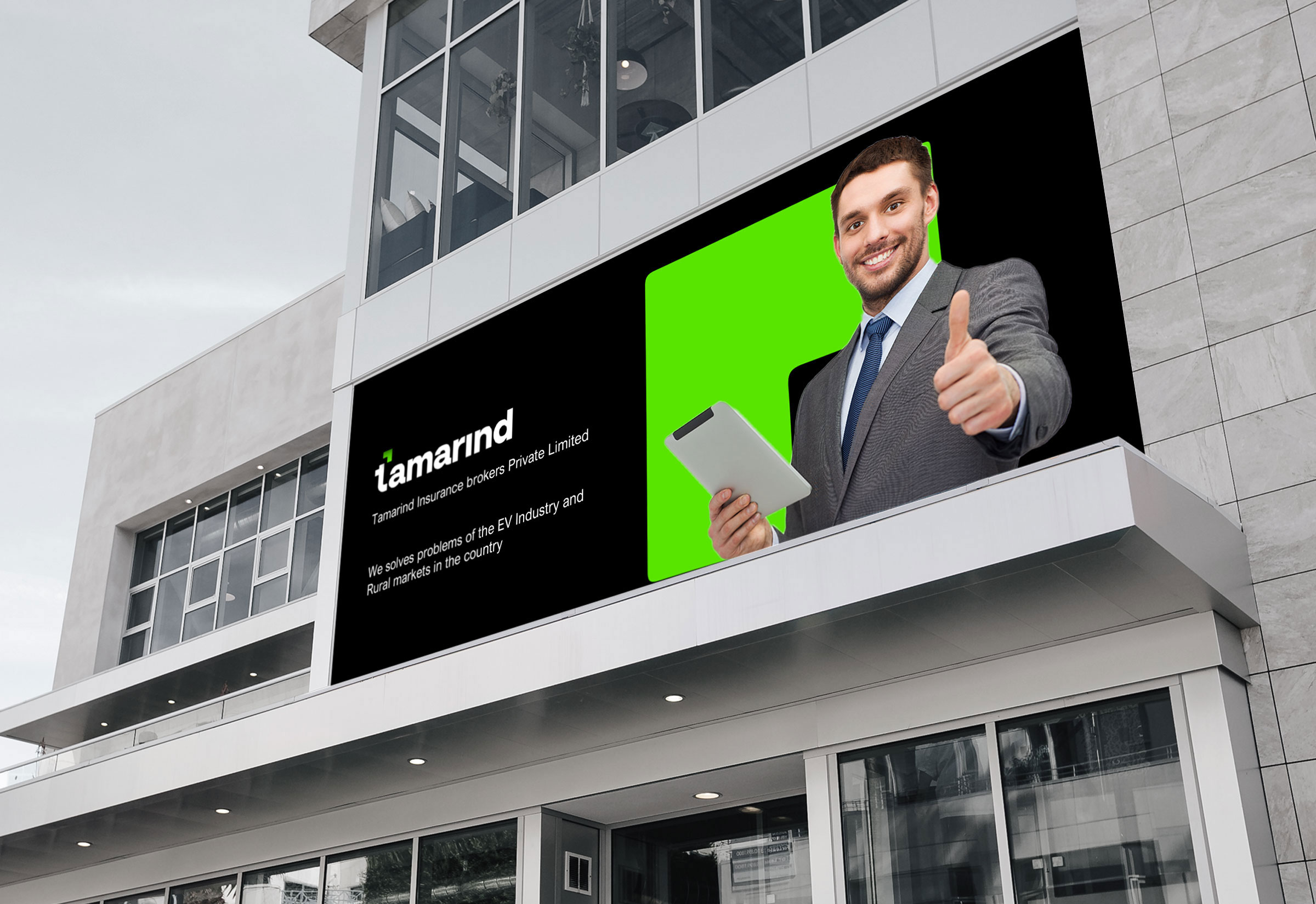
Tamarind Insurance’s revamped brand identity leverages strategic B2B branding solutions, positioning it as a modern, eco-conscious, and trustworthy partner within the competitive EV insurance sector. The rounded arrow logo, coupled with the bold serif typography and vibrant green color palette, establishes a robust and memorable visual identity. The consistent application of these elements across deliverables, from printed materials to digital platforms, ensures a cohesive and impactful B2B brand presence. Tamarind Insurance is poised to serve as a dedicated B2B partner for EV companies, underscoring its commitment to a secure and sustainable future.