Munchster Website Design & Development Case Study
- Client
- Munchster
- Industry
- Snacks
- Services
- Website Design & Website Development
CASE STUDY
Client Overview
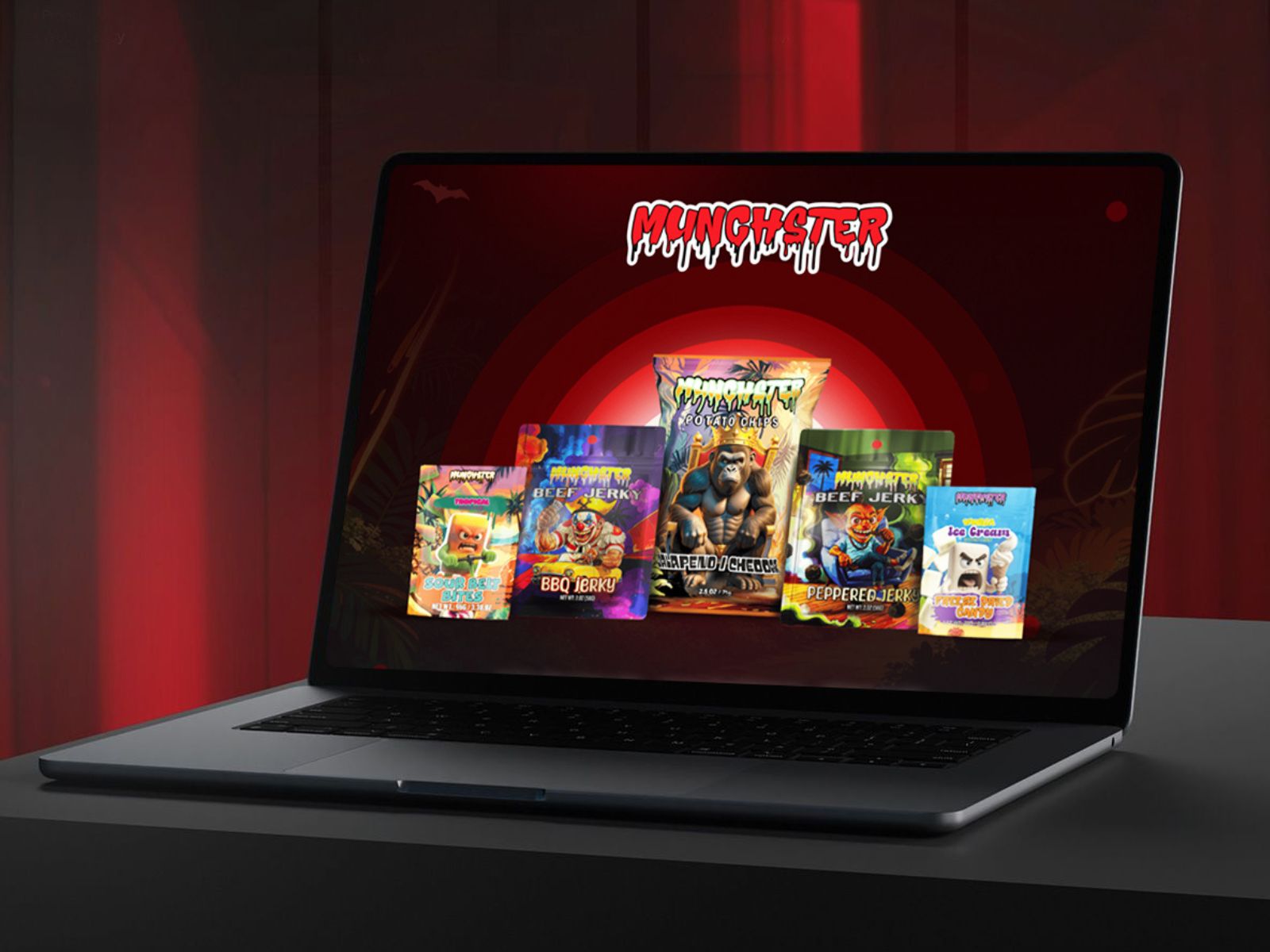
Munchster is a high-energy D2C snack brand built on bold flavors, loud crunch, and an unapologetic attitude. The objective was to design a high-conversion ecommerce experience that visually matched the brand’s chaotic personality while remaining fast, usable, and scalable.
The website needed to support multiple snack categories, chips, beef jerky, and freeze-dried candy, without overwhelming users, all while delivering a scroll-stopping, entertainment-led experience.
This project focused on conversion-driven UI/UX design for snack ecommerce brands, blending bold visual storytelling with strong usability fundamentals.
The Challenge:
- Translating Munchster’s loud, chaotic brand voice into a usable and scalable ecommerce UI
- Organizing multiple product categories without creating cognitive overload
- Maintaining high visual impact while ensuring fast load times and mobile performance
- Designing a scroll-stopping experience that drives exploration and repeat engagement
UI/UX Strategy & Approach:
- Overall Visual Direction
- Look & Feel: Bold, edgy, high-contrast UI with monster-inspired visuals
- Design Goal: Create an immersive ecommerce experience for Gen Z and late-night snackers
- Brand Personality: Loud, rebellious, playful, unapologetic, and addictive
The strategy balanced visual chaos with structured UX, aligning with best practices for conversion-focused D2C snack brands
UI Design System
Design Style & Mood
- Oversized, high-impact typography for instant attention
- Strong visual hierarchy to support fast product scanning
- Dark backgrounds paired with vibrant accents for maximum contrast
- Repeating brand phrases to reinforce recall and personality-driven UX
Optimized for:
- Snack ecommerce UI/UX
- High-engagement product browsing
- Entertainment-led brand storytelling
Key Screens Designed
- Home: Brand immersion + category discovery
- Brand Sections: “Busted in the Wild”, Monster Lore, community-driven content
Each screen was designed to support high-intent ecommerce user journeys.
-
Mobile-First & Responsive UX
- Fully mobile-first ecommerce UI
- Thumb-friendly interactions for late-night scrolling
- Optimized layouts for quick decision-making on small screens
- Consistent brand experience across desktop, tablet, and mobile
Built in line with mobile UX best practices for ecommerce snack brands.
Typography System
Primary Display Fonts:
- Anton
- Bebas Neue
- Staatliches
Used for:
- Oversized headlines and section titles
- Flavor names and punchy brand statements
- Scroll-stopping callouts and monster-led microcopy
Why it works:
These bold, condensed display fonts amplify Munchster’s loud, rebellious personality. Their strong vertical presence creates instant impact, reinforces hierarchy, and makes key messaging impossible to ignore, perfect for high-energy snack ecommerce.
Secondary / Body Font:
- Humane
Used for:
- Product descriptions and ingredient details
- Supporting content and informational sections
- Checkout and utility text where clarity matters
Why it works:
Humane balances the heavy display fonts with excellent readability. It keeps the experience clean, scannable, and usable, especially on mobile, without diluting the brand’s bold attitude.
Color Palette & Visual Language
- Dark, high-contrast base to amplify brand attitude
- Vibrant accent colors to highlight CTAs and product categories
- Neutral tones for spacing and visual balance
UX Impact:
- Guides attention without clutter
- Reinforces energy, flavor intensity, and boldness
- Supports emotion-driven ecommerce design
Product Discovery & Navigation UX
- Clear segmentation by snack type:
- Chips
- Beef Jerky
- Freeze-Dried Candy
- Repeating flavor cues and crunch indicators
- Scroll-friendly layouts that encourage exploration
Built for intuitive navigation and frictionless product discovery.
Content-Led UX & Brand Engagement
- Strong microcopy and brand slogans to maintain tone
- Sections like “The Crunch Situation” and “Carnivorous Crew” add personality
- “Busted in the Wild” builds social proof and lifestyle connection
This approach strengthened brand storytelling through UI/UX.
Performance & Usability Considerations
The UI was designed with lightweight, performance-optimized layouts to balance Munchster’s heavy visual style with fast load times. All imagery was optimized for speed-first ecommerce performance, ensuring smooth browsing across desktop and mobile devices.
Clean sectioning and structured layouts were used to reduce cognitive overload, making it easier for users to scan products, understand flavor differences, and move confidently through the purchase journey. The overall UX strategy focused on keeping users engaged, scrolling, and exploring, rather than bouncing, aligning with performance-first ecommerce UI/UX best practices and Core Web Vitals standards.
Final Outcome
The result is a bold and unforgettable D2C snack ecommerce experience that captures attention while remaining highly usable. The design achieves a strong balance between high-impact visuals and functional clarity, enabling effortless navigation across multiple snack categories.
Improved product discoverability and category clarity support faster decision-making, while the scalable UI system allows the brand to easily launch new flavors, limited drops, and future collections, making it ideal for fast-growing D2C food and snack brands.
Key UX Takeaways
Entertainment-driven ecommerce brands still require strong UX foundations, clear hierarchy, and structured navigation to convert effectively. Bold visuals deliver the best results when paired with intentional layout systems and conversion-focused UI design.
Personality-led ecommerce succeeds when immersive UI storytelling is supported by intuitive user flows, performance optimization, and mobile-first UX principles, especially in competitive D2C snack and FMCG markets.