CASE STUDY Website Revamp, UI/UX Redesign & Development
- Client
- HOKIPO
- Industry
- Home Furnishing and Lifestyle
- Services
- UI/UX Redesign, Ecommerce Website Revamp
CASE STUDY
Project Summary
HOKIPO has a wide home furnishing and lifestyle catalogue, with a strong focus on sofa covers alongside cushions, bedsheets, curtains, storage, dining and other home essentials.
The existing website had strong product depth, but the homepage relied heavily on repetitive product grids. Category hierarchy was unclear, important trust signals appeared late in the journey, and the lack of visual breaks made the page feel long and difficult to browse.
Emerge Digital approached the project as a Shopify ecommerce website revamp, focusing on restructuring the existing experience rather than simply giving it a new visual look. The objective was to make the catalogue easier to understand, improve product discovery and create a more guided path towards purchase.
Challenges & Our Approach
Challenge 1: A Product-Heavy Homepage
The homepage felt long and repetitive, with product grids dominating the experience. There was limited visual rhythm between sections, making it difficult for users to stay engaged while scrolling.
Solution
We restructured the homepage into a guided shopping journey with clear visual breaks and varied content sections:
Hero → Offers → Trust → Categories → Sofa Discovery → Bestsellers → Social Proof → Lifestyle Categories → Additional Products → Buying Guides
This created a more engaging ecommerce website design while reducing scroll fatigue.
Challenge 2: HOKIPO’s Product Depth Was Not Clear
Although HOKIPO has a broad catalogue and significant sofa-cover depth, users could not immediately understand the range or how the products were organised.
Solution
We introduced a clearer category hierarchy with broader sections such as Living, Dining and Storage, while giving sofa covers deeper discovery paths based on:
- Sofa type
- Size
- Material
This created a more intuitive home furnishing ecommerce experience based on how customers actually search for products.
Challenge 3: Weak Positioning and Early Trust Signals
The existing homepage did not communicate HOKIPO’s key proposition or trust factors strongly enough above the fold.
Solution
We brought trust and value communication higher into the journey through dedicated callouts for relevant benefits such as returns, shipping and product features. The hero area was also planned to communicate HOKIPO’s sofa-cover focus more clearly.
Challenge 4: Product and Collection Browsing Lacked Distinction
Product and collection cards had a similar visual treatment, while collection sections lacked consistent spacing and visual structure.
Solution
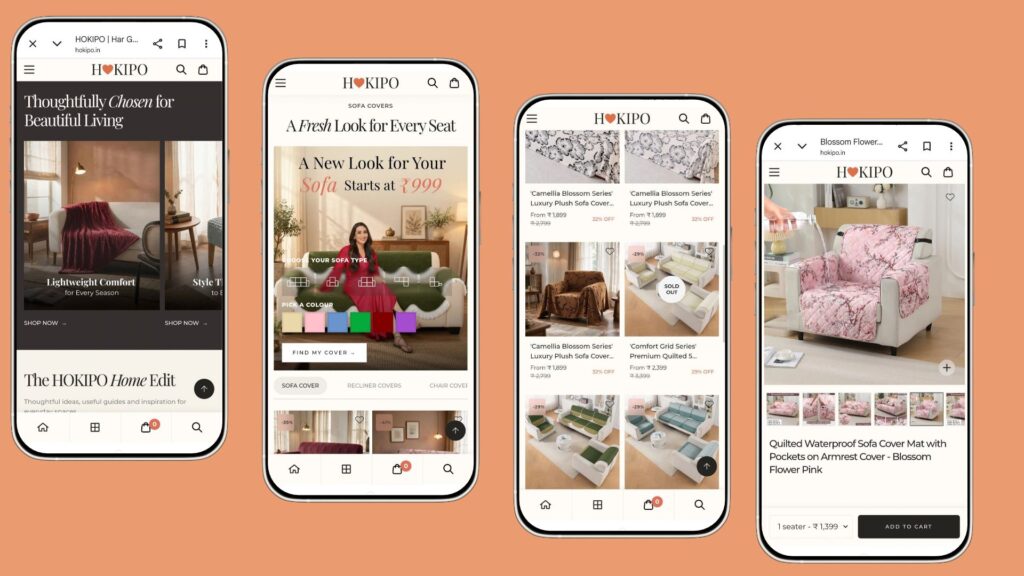
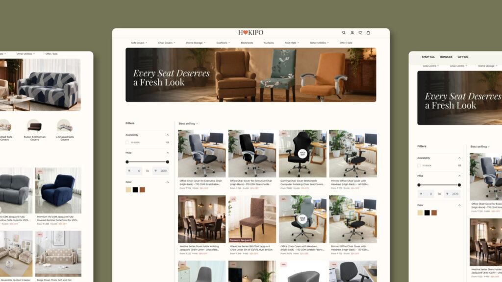
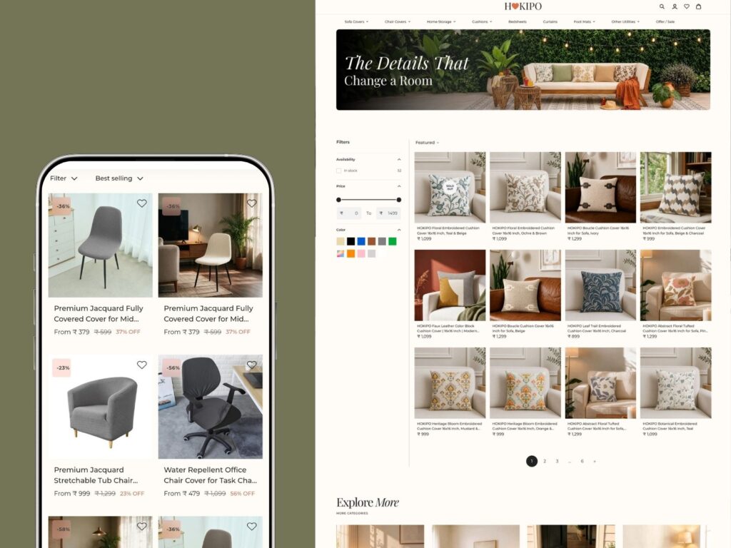
We created clearer visual differentiation between category discovery and product browsing, with improved card hierarchy, spacing and section design. Product cards were also structured to surface discounts, product benefits, badges and variants more clearly.
Challenge 5: Social Proof Appeared Too Late
Reviews and UGC were already part of the website, but their placement and presentation did not give them enough impact.
Solution
We repositioned social proof as part of the core homepage journey and planned a cleaner, more structured presentation for reviews and UGC, helping customer validation appear at a more relevant stage of product discovery.
Challenge 6: Limited Conversion-Focused Discovery
Customers shopping for sofa covers are often looking for a specific sofa type, size or material rather than browsing a generic sofa-cover category.
Solution
We introduced dedicated discovery journeys such as Shop by Sofa Type, Shop by Size and Shop by Material, along with buying guides covering topics such as measuring a sofa and choosing the right cover.
This reduced the effort required to move from a broad category to a relevant product.
UI/UX
Visual Direction
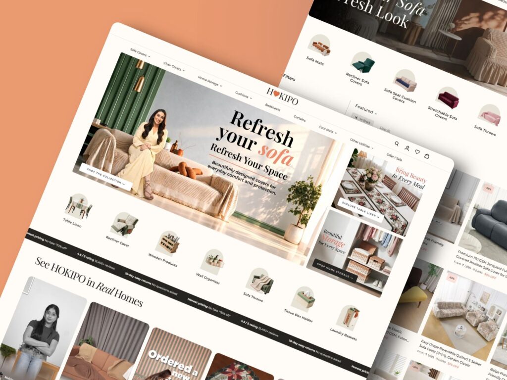
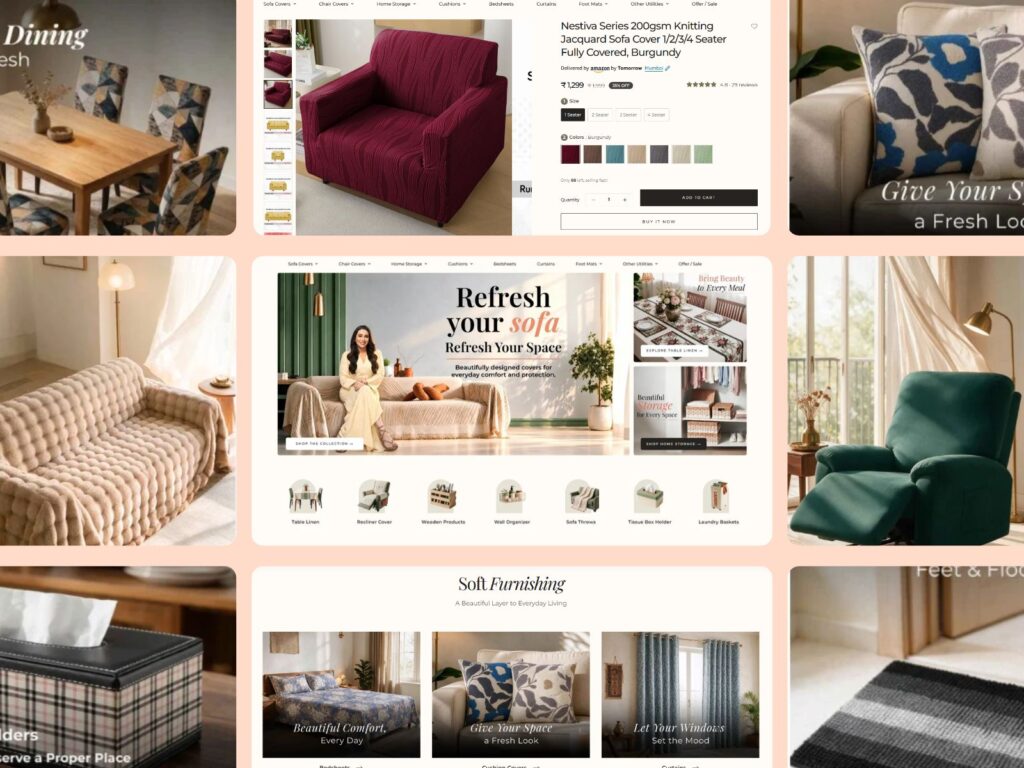
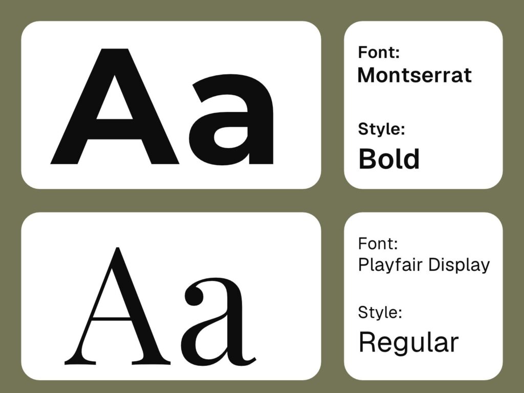
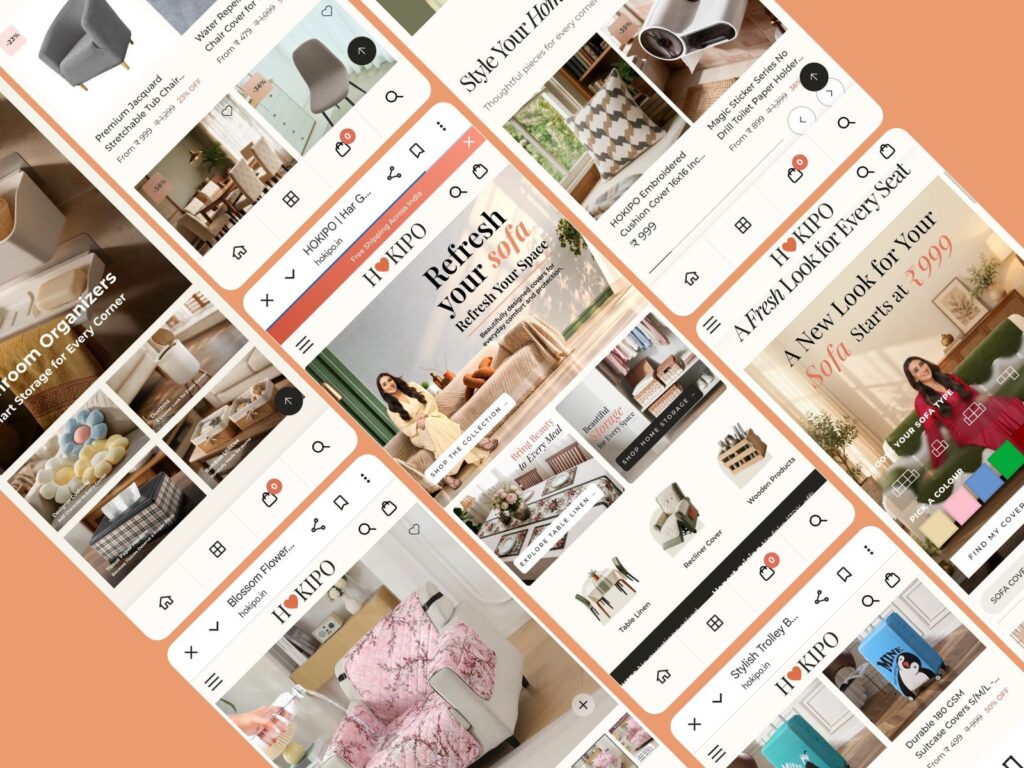
The ecommerce UI/UX design focused on creating a cleaner, more structured and visually engaging experience.
Instead of treating the homepage as one continuous product listing, we introduced stronger hierarchy through hero sections, category blocks, lifestyle banners, trust callouts, product sections, UGC and buying guides.
The visual system uses HOKIPO’s existing brand palette while applying accent colours more purposefully across key actions and interface elements.
Navigation & Discovery
The navigation was redesigned around broader categories and deeper product discovery.
The planned mega menu introduces:
- Living
- Bedroom
- Dining
- Storage & Organisers
Sofa covers receive deeper navigation by size, sofa type and material, helping users reach relevant products faster.
Key UI Improvements
- Grid-based hero section
- Offer and category banners
- Trust callouts
- Category tabs
- Shop by sofa type
- Shop by size and material
- Improved product cards
- Bestseller sections
- Lifestyle sections
- Reviews and UGC
- Buying guides
Development
Shopify Website Revamp
The existing Shopify website was restructured to support the redesigned UX and new discovery journeys.
The development focused on implementing the revised homepage structure, category hierarchy, navigation and ecommerce components while retaining a scalable Shopify foundation.
Ecommerce Enhancements
The revamped experience supports:
- Category-based browsing
- Sofa type and size discovery
- Product and variant selection
- Product recommendations
- Promotional collections
- Add-to-cart functionality
- Wishlist and account functionality
- Newsletter signup
The development also supports a clearer distinction between collection discovery and individual product browsing.
Final Outcome / Results
The revamp shifted HOKIPO’s homepage from a long, product-grid-heavy experience to a more structured and guided ecommerce journey.
The redesigned experience gives greater visibility to HOKIPO’s product depth, particularly its sofa-cover range, while making it easier for customers to browse by category, sofa type, size and material.
By addressing the key UX challenges — scroll fatigue, unclear hierarchy, weak visual rhythm, delayed trust signals and limited product discovery — the revamp creates a clearer path from initial discovery to product consideration.
Client Impact
The revamped Shopify experience provides:
- Clearer category hierarchy
- Faster product discovery
- Stronger sofa-cover navigation
- Better visibility of trust signals
- More engaging homepage flow
- Improved product and collection differentiation
- Greater opportunities for cross-selling and combo discovery
Future Scope
- Advanced search suggestions
- Personalised recommendations
- CRO and A/B testing
- Product bundling and combo offers
- Enhanced filtering
- Expanded UGC and reviews
- Advanced buying guides
- Cross-selling and upselling
Closing
Emerge Digital’s Shopify website design and development approach focused on solving the UX challenges within HOKIPO’s existing ecommerce experience rather than simply redesigning its appearance.
By restructuring navigation, improving product discovery, introducing stronger visual hierarchy and bringing trust and social proof into the shopping journey, the revamp creates a more organised, engaging and conversion-focused experience for a broad home furnishing catalogue.