Design Systems for SaaS in 2025: 11 Examples & How to Build Yours
In 2025, SaaS design isn’t just about looking good — it’s about delivering consistent, scalable, and user-friendly experiences that keep customers coming back. A strong design system helps you do exactly that by aligning designers, developers, and product teams around a single source of truth.
In this guide, we’ll explore the 11 best design systems from industry leaders, uncover key lessons you can apply today, and show you how to build a design system that future-proofs your SaaS product.
Table of Contents
- Why Design Systems Matter for SaaS
- Benefits of a Design System
- Key Elements of an Effective Design System
- 11 Best Design System Examples in 2025
- Lessons from Leading Design Systems
- Why 2025 Is the Year to Invest in a Design System

1. Why Design Systems Matter for SaaS
If you’re running a SaaS product, you already know one truth: your platform is never truly “finished.” New features roll out, UI/UX design updates happen, integrations keep coming — and without a unified approach, your product can quickly turn into a patchwork of inconsistent user interfaces, confusing navigation, and clunky interactions.
That’s exactly where a SaaS design system changes the game.
A design system for SaaS applications isn’t just a random set of colors, typography, and buttons. It’s a centralized library of reusable UI components, interaction patterns, design guidelines, and front-end code standards that ensure every part of your platform looks, feels, and works seamlessly together.
Think of it as your UI/UX design playbook — a single source of truth that aligns your product team, speeds up development, and maintains a consistent user experience across every screen.
Pro tip: In the fast-moving world of SaaS, a scalable design system is like having a compass, map, and toolkit in one — it guides your product’s visual direction, improves design-to-development handoff, and helps you ship updates faster without sacrificing quality.
2. Benefits of a Design System
If you’re building or scaling a SaaS product in 2025, a well-structured UI/UX design system is no longer optional — it’s the foundation for speed, consistency, and user trust. Here’s why:
- Consistency Across Every Screen
Whether it’s your SaaS onboarding flow, pricing page, or a complex admin dashboard UI, users should always feel they’re in the same product. Visual and interaction consistency builds brand trust — and trust is what keeps customers loyal. - Faster Time-to-Market for Features
Instead of redesigning UI components from scratch, your team can pull pre-built, reusable patterns from the design system, customize them if needed, and ship new features in days instead of weeks. - Better Collaboration Between Designers & Developers
With documented design guidelines and coded component libraries, everyone speaks the same design language — reducing the “This isn’t what I designed” conflicts and making handoffs seamless. - Scalability Without Design Chaos
As your SaaS product grows, so will your team. A design system ensures that even with multiple designers and developers working in parallel, the final product remains visually unified and functionally consistent. - Accessibility Built-In from Day One
Modern design systems integrate WCAG-compliant patterns by default — making your product more inclusive and ensuring it works for all users, including those with disabilities. - Reduced Design & Technical Debt
Without a design system, quick UI fixes and inconsistent patterns pile up — creating UX debt that’s expensive to fix later. A design system keeps things clean, reducing repetitive work and preventing inconsistencies.
Bottom Line: If you want to compete with leading SaaS brands in 2025, you need a scalable design system that helps you ship faster, collaborate better, and deliver a consistently exceptional user experience.
3. Key Elements of an Effective Design System
Not all design systems are created equal. A truly effective SaaS design system combines both design and development principles.
Here are the core components you should include:
- Design Tokens – Centralized values for colors, typography, spacing, shadows, and animation speeds.
- Reusable UI Components – Buttons, form fields, dropdowns, modals, tables, navigation bars, etc., built for reusability.
- Accessibility Guidelines – Contrast ratios, focus states, ARIA attributes, and keyboard navigation.
- Documentation & Usage Rules – Do’s and don’ts, visual examples, and coding best practices.
- Developer-Ready Code – Components built in your chosen framework (React, Vue, Angular, etc.) so developers can plug and play.
- Brand Guidelines – Logo usage, tone of voice, and visual identity rules for a cohesive brand feel.
- Version Control & Updates – A process to evolve your design system as your product grows.
Pro Tip: A design system is a living document, not a static PDF. It should be updated regularly as your SaaS product evolves.
4. 13 Best Design System Examples in 2025
Looking for inspiration before building your own? Here are 13 of the most influential design systems in 2025, with lessons you can apply to your SaaS product.

1. Porsche Design System – Precision, performance, and luxury in digital UI/UX design.
The Porsche Design System delivers pixel-perfect, responsive, and scalable design components that reflect the brand’s engineering excellence. It blends premium UI aesthetics with functional reliability, ensuring a consistent user experience across web and mobile platforms.
Key Features:
- Pixel-based Figma libraries for high-fidelity UI/UX prototyping.
- Coded Web Components ready for seamless front-end integration.
- Detailed design system documentation and usage guidelines.
- Accessibility-compliant UI design for an inclusive digital experience.
- Corporate-aligned color palette, typography, and grid systems.
Tested for functional reliability and aesthetic excellence.
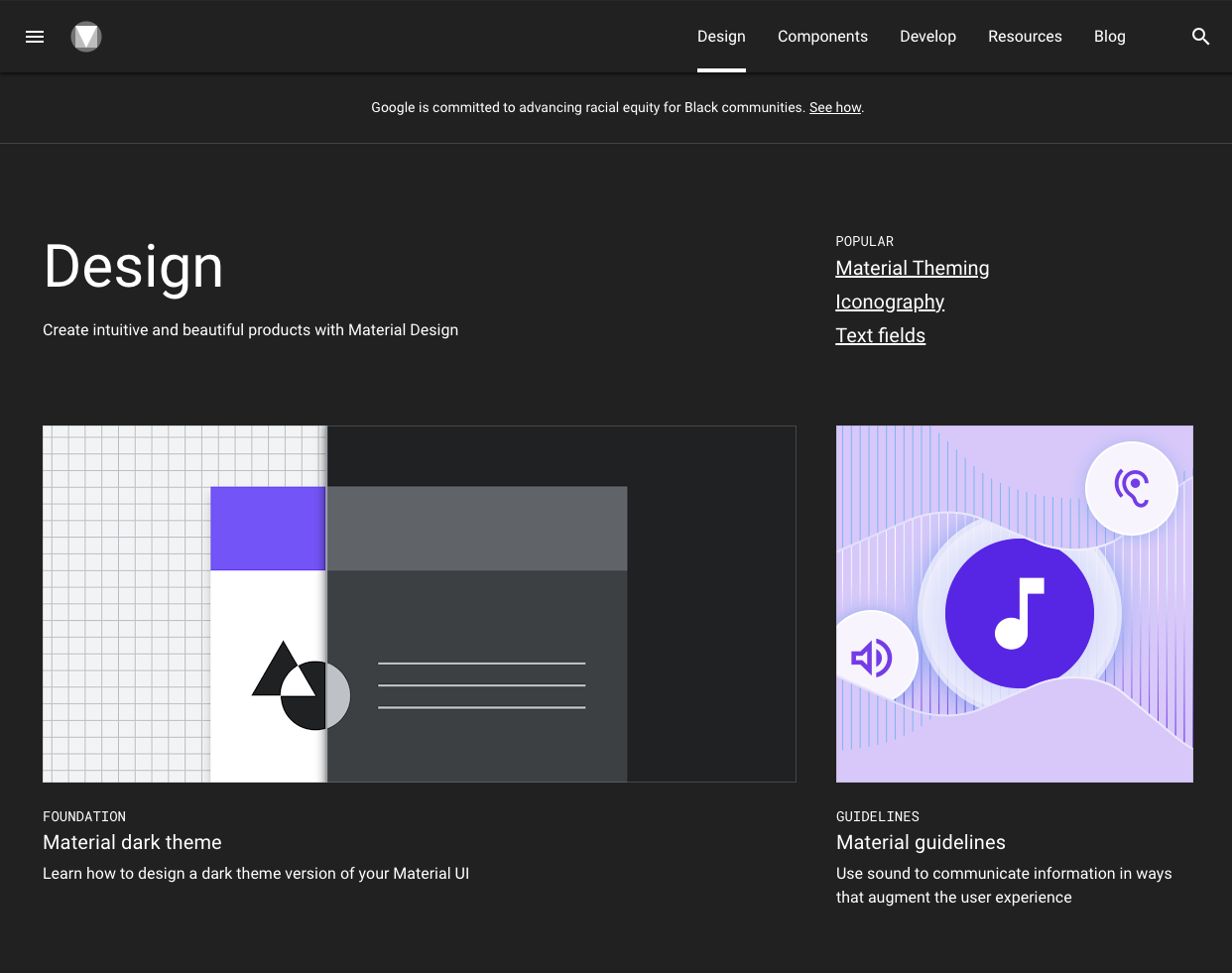
2. Google Material Design System – A universal framework for seamless cross-platform UI/UX
Google’s Material Design has become one of the most influential design systems for digital products, setting a benchmark for responsive, scalable, and accessible UI/UX design. Developed and maintained by Google, it’s more than just a set of guidelines—it’s a comprehensive visual language that blends classic design principles with innovative technology.
Material Design provides designers and developers with everything they need to create a consistent and engaging user experience—whether for mobile apps, desktop interfaces, or web platforms. Its atomic design approach ensures that every UI element, from buttons to navigation bars, works harmoniously together while still allowing creative flexibility for unique branding.
Key Features and Benefits:
- Starter Kits & UI Resources – Pre-built templates and design files for faster prototyping.
- Material Theming – Customization tools to align typography, shapes, and colors with brand identity.
- Responsive Layout Systems – Adaptive grid and spacing rules for a smooth experience across all screen sizes.
- Extensive UI Component Library – Ready-to-use components with clean, production-ready code.
- Mobile-First Design Approach – Optimized guidelines for native Android apps and cross-platform usability.
- Color & Typography Guidelines – Clear standards for creating readable, visually appealing interfaces.
- Integration with Design Tools – Works seamlessly with Figma, UXPin, and other collaboration platforms.
By using Material Design, product teams can speed up development, reduce inconsistencies, and maintain a unified brand presence—making it a go-to framework for SaaS products, mobile apps, and enterprise platforms worldwide.
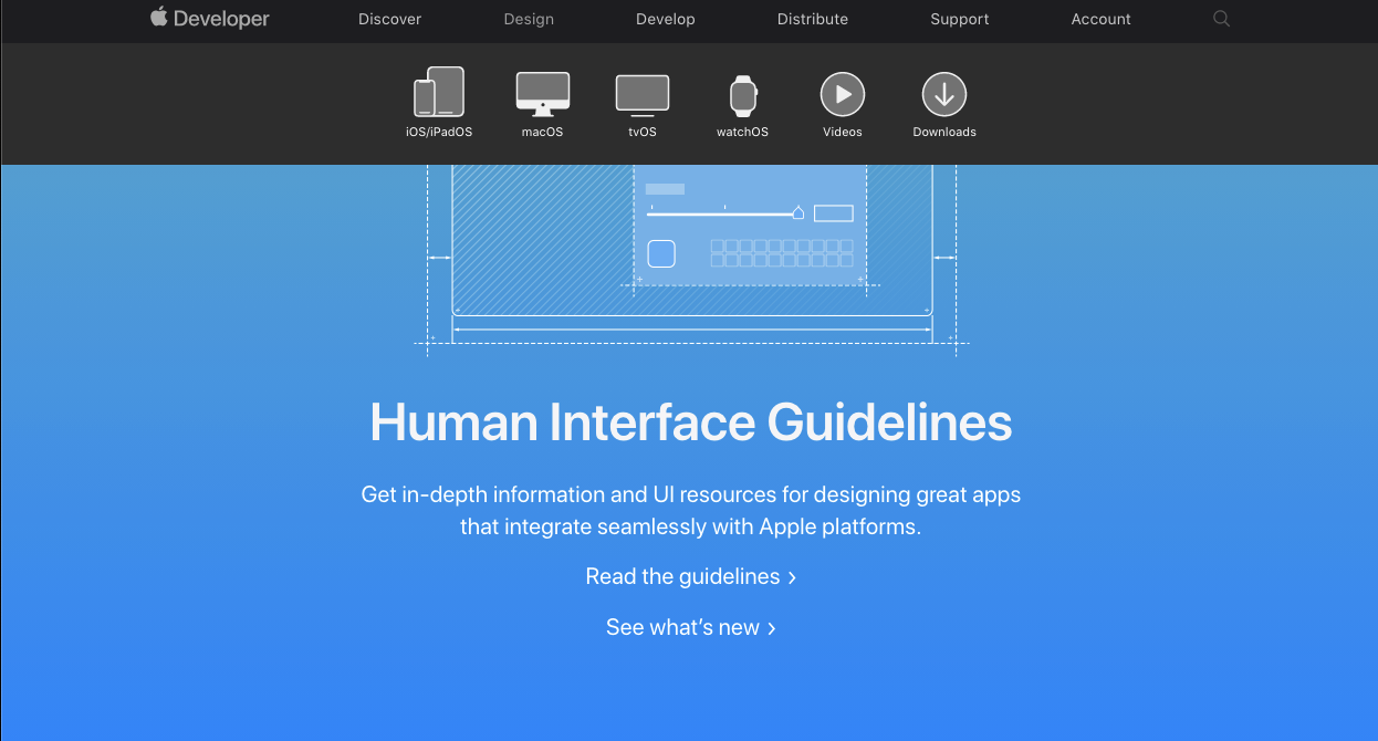
3. Apple Human Interface Guidelines – Minimal, user-first patterns that define usability
Apple’s Human Interface Guidelines (HIG) set the benchmark for UI/UX design best practices across iOS, macOS, watchOS, and tvOS. Focused on clarity, consistency, and user delight, this design system blends minimalism with intuitive interaction.
Key strengths:
- Precision-crafted UI components like menus, buttons, icons, and labels.
- Platform-specific guidance for mobile, desktop, and wearable interfaces.
- Visual design rules for typography, color, and spacing.
- Interaction patterns that make technology approachable for all users.
By following Apple HIG, designers can create beautiful, functional, and familiar digital experiences that instantly connect with users.
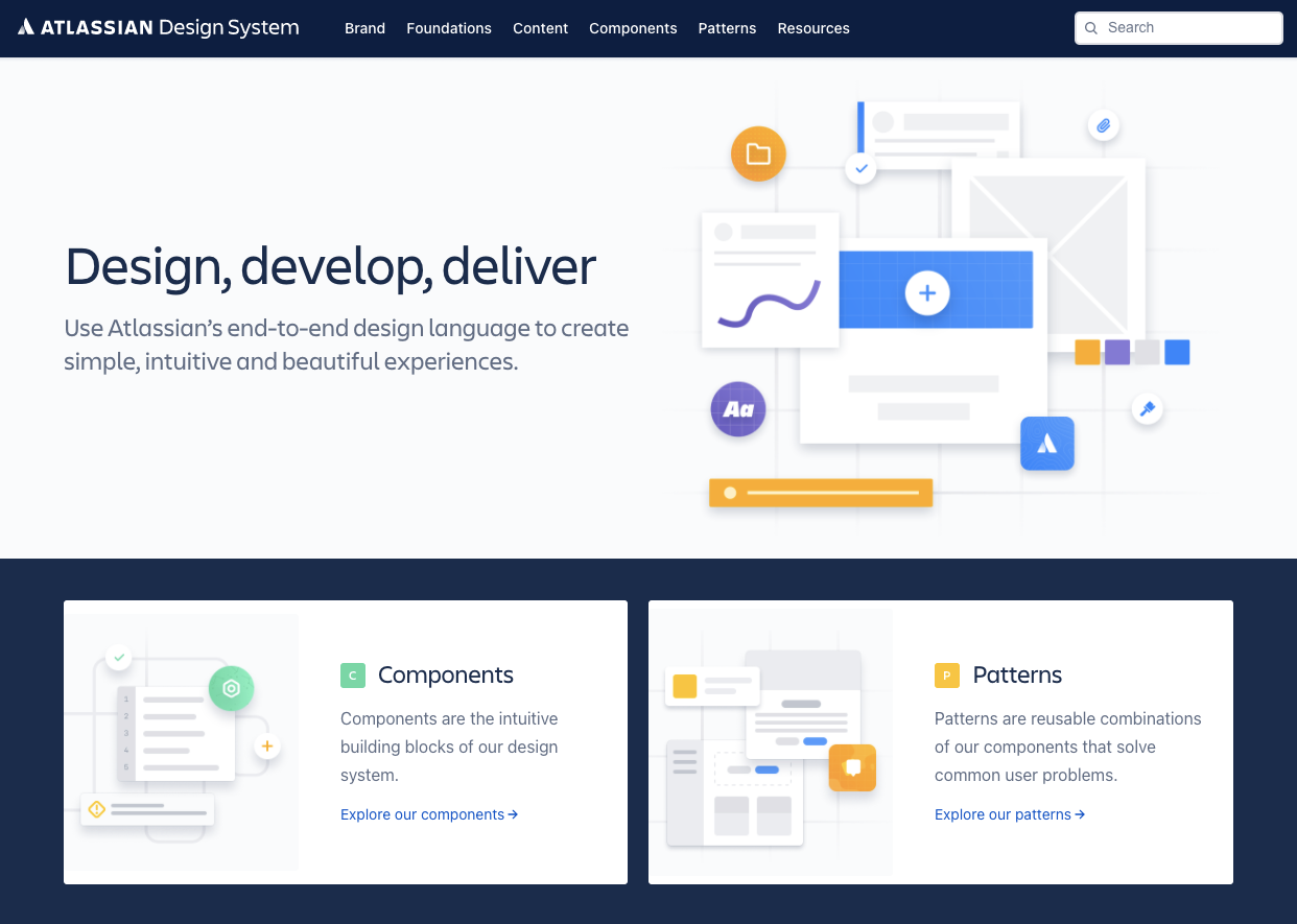
4. Atlassian Design System – Collaboration-driven UI for complex team workflows
The Atlassian Design System powers tools like Jira and Trello with a focus on UI/UX patterns that enhance team collaboration. Built for agile workflows and global teams, it delivers consistency across products while improving productivity.
Key strengths:
- Comprehensive UI component library and design tokens for scalability.
- Brand guidelines that unify product look and feel.
- Ready-to-use UI kits, patterns, and illustration libraries.
- Content guidelines that keep messaging clear and collaborative.
By using the Atlassian Design System, teams can ship faster, stay aligned, and create cohesive digital experiences across all touchpoints.
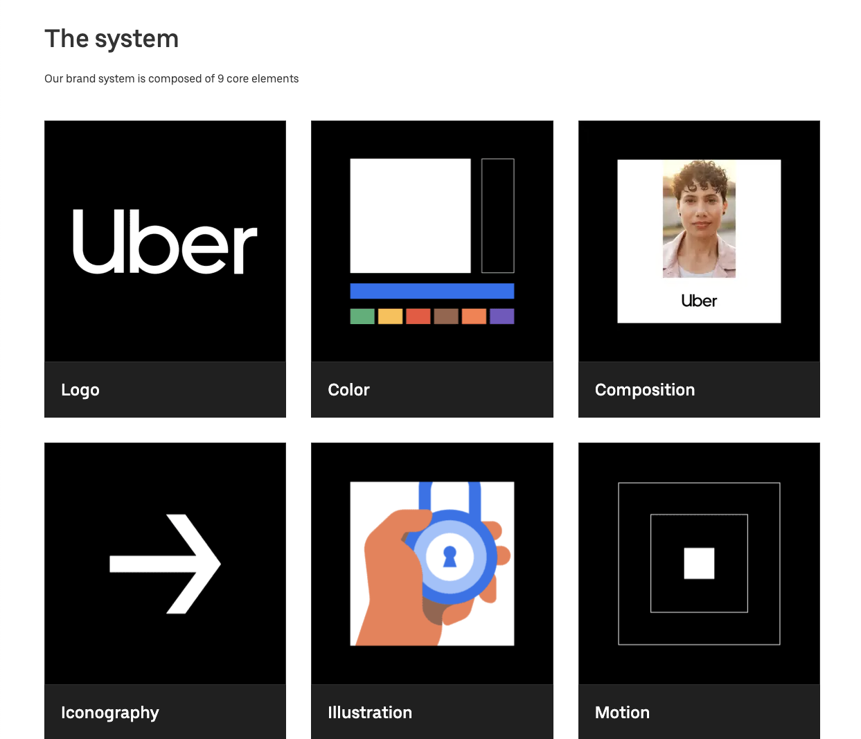
5. Uber Base Web – Scalable components built for high-volume, real-time apps
The Uber Base Web Design System delivers a scalable UI framework built for high-volume, real-time services like ride-hailing, food delivery, and micro-mobility. Designed for speed, consistency, and global reach, it powers Uber’s apps and sub-brands with pixel-perfect, performance-ready components.
Key strengths:
- Brand architecture that unifies sub-brands and product lines.
- Flexible composition and motion guidelines for dynamic interfaces.
- Clear tone of voice and visual language across digital touchpoints.
- Robust asset libraries covering illustration, iconography, and photography.
- Cohesive color, typography, and logo standards for instant brand recognition.
With Base Web, Uber ensures its UX/UI design remains intuitive, scalable, and reliable—no matter how fast the business moves.
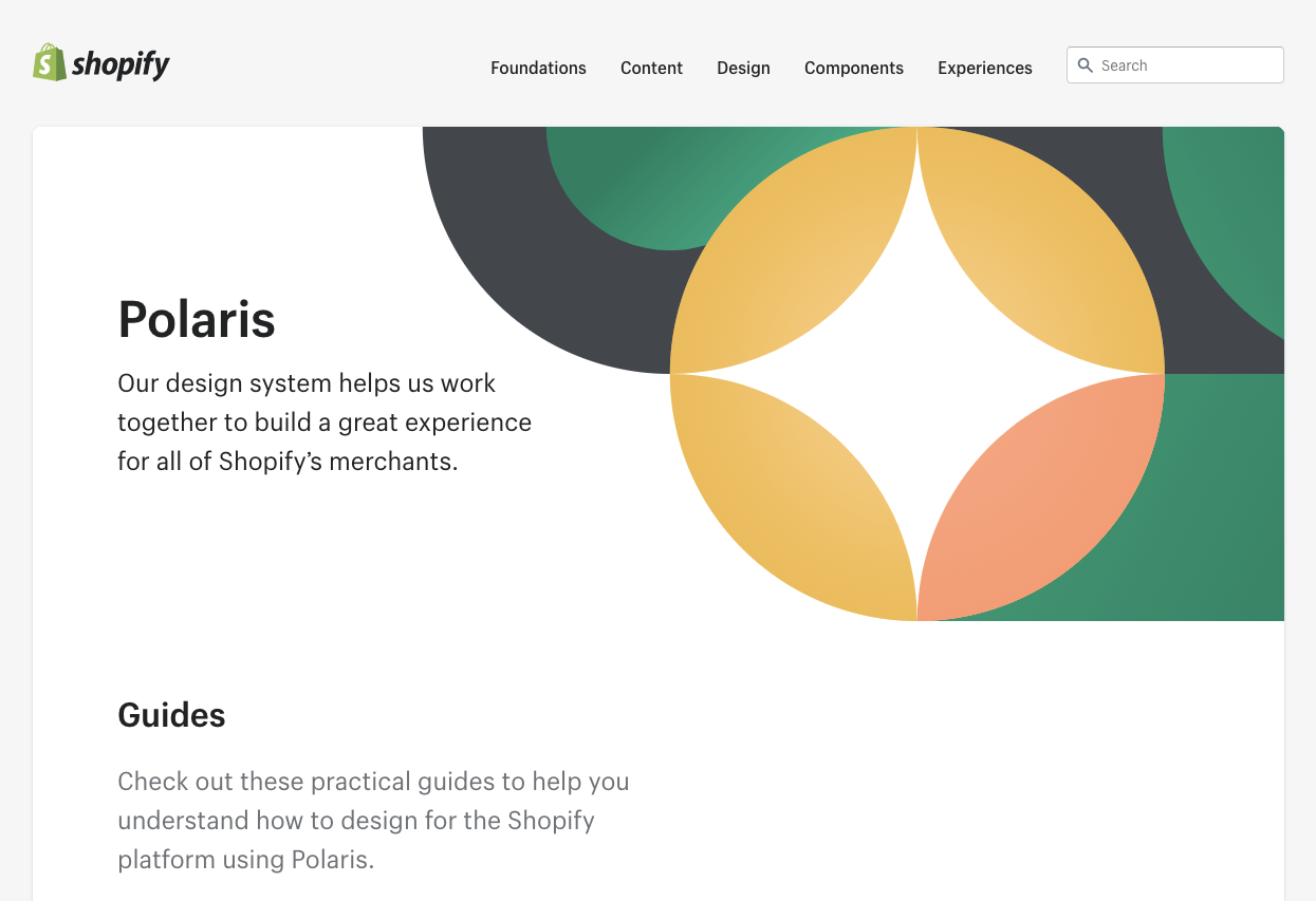
6. Shopify Polaris – Designed for commerce experiences with a strong focus on trust and clarity
Shopify Polaris is a commerce-focused design system that delivers clear, trustworthy, and accessible shopping experiences. Built for one of the world’s largest eCommerce platforms, it gives merchants and developers the tools to craft consistent, high-quality interfaces across all touchpoints.
Key strengths:
- Accessibility-first design to ensure inclusivity for all users.
- Data visualization standards for clear and actionable insights.
- Consistent interaction states, colors, and typography for brand cohesion.
- Rich iconography, illustrations, and spacing guidelines to enhance usability.
- Sound and micro-interaction principles to create engaging user moments.
Polaris empowers brands to design commerce experiences that are fast, intuitive, and built on trust.
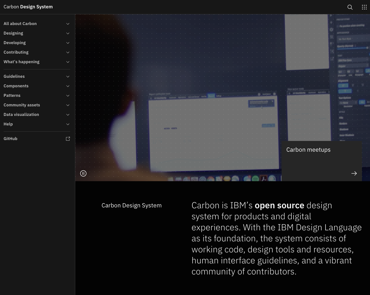
7. IBM Carbon – Enterprise-ready, highly modular, and accessible
IBM’s Carbon Design System is built to power complex enterprise applications with scalability, modularity, and accessibility at its core. Designed for global IT solutions, it provides both designers and developers with resources to build cohesive, high-performance digital experiences.
Key strengths:
- Extensive component library for enterprise-scale interfaces.
- Data visualization standards to present complex information clearly.
- Design patterns and guidelines for consistency across large projects.
- Multi-tool support with resources for Adobe, Axure, and Sketch.
- Detailed tutorials and documentation for smooth implementation.
Carbon reflects IBM’s belief that great design is a responsibility, ensuring products are not only functional but also inclusive and future-ready.
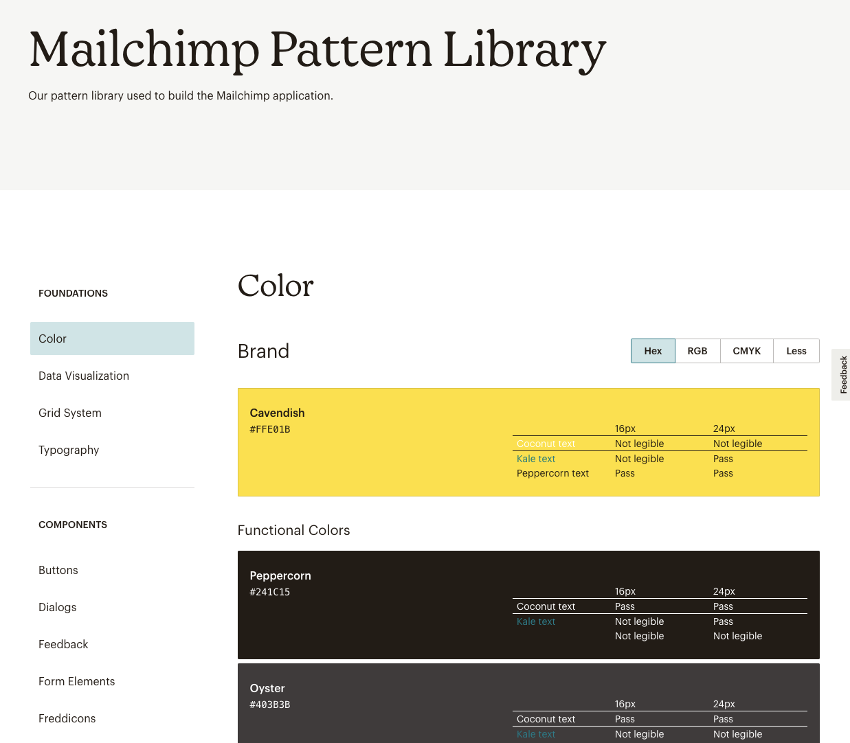
8. Mailchimp Design System – Expressive, brand-rich UI patterns for SaaS marketing
Mailchimp’s Design System blends creative expression with functional clarity, helping small businesses deliver marketing campaigns that feel both professional and personal. Its design language is playful yet structured, keeping the brand’s personality intact while ensuring usability.
Key strengths:
- Data visualization tools for clear marketing insights.
- Flexible grid system for responsive layouts.
- Vibrant color palette reflecting brand personality.
- Consistent typography for tone and readability.
- Reusable components to streamline design and development.
Mailchimp proves that a design system can be both brand-rich and conversion-focused, making it ideal for SaaS marketing platforms.

9. Pinterest Gestalt – Designed for visual discovery and creative inspiration
Pinterest’s Gestalt Design System powers the platform’s visually rich, highly personalized experience. It enables seamless content discovery, from home décor to recipes, while keeping the interface intuitive and inspiring.
Key strengths:
- Clear design guidelines to maintain brand consistency.
- Responsive layouts that adapt across devices.
- Accessibility-first approach for inclusive design.
- Reusable UI components to speed up development.
Gestalt reflects Pinterest’s “Pinners First” philosophy, combining simplicity, empathy, and scalability to deliver creative inspiration at every interaction.

10. Intuit Design System – Easy-to-use patterns for finance and accounting SaaS
The Intuit Design System powers products like TurboTax and QuickBooks, ensuring a consistent, scalable, and user-friendly experience across all financial tools. It simplifies complex accounting and tax tasks, helping individuals and businesses manage finances with confidence.
Key strengths:
- Empathy-driven design that addresses real financial challenges.
- High-quality craftsmanship for both UI and functionality.
- Speed-focused patterns to help users complete tasks quickly.
- Trust and transparency in financial data presentation.
With a “Design for Delight” philosophy, Intuit combines usability, scalability, and brand consistency to make financial management seamless.

11. Adobe Spectrum – Scalable design principles for creative tools
Adobe Spectrum is the design system that unifies the look, feel, and usability across Adobe’s creative suite, from Photoshop to Illustrator. It’s built for scalability, accessibility, and consistency, ensuring that creatives can switch between tools without friction.
Key strengths:
- Creativity-first design to empower users at every skill level.
- Consistent UI patterns for seamless navigation across products.
- Inclusive accessibility standards for all user abilities.
- Scalable framework that adapts as Adobe’s product lineup grows.
Spectrum acts as the backbone for Adobe’s creative ecosystem, providing designers and developers with reusable components, visual guidelines, and interaction principles to deliver cohesive and inspiring user experiences.
Study these systems not to copy them, but to understand how they balance scalability, usability, and brand personality.

5. Lessons from Leading Design Systems
After studying some of the best UI/UX design systems for SaaS products in 2025, here are actionable takeaways you can implement immediately:
- Start Small, Grow Big – Begin with your most-used UI components and design patterns before scaling to a full enterprise design system.
- Keep Designers & Developers Aligned – Use Figma design libraries and coded components in sync to maintain design-development consistency.
- Write Clear Documentation – Your design system guidelines should be detailed, easy to follow, and cover both UI and UX best practices.
- Make Accessibility Non-Negotiable – Integrate WCAG compliance and inclusive design principles from day one.
- Iterate Continuously – Treat your design system like a living product with regular updates, usability testing, and version control.
6. Why 2025 Is the Year to Invest in a Design System
The SaaS industry in 2025 is more competitive than ever, and delaying the creation of a scalable UI/UX design system could be a costly mistake. Here’s why:
- User Expectations Are Sky-High – Modern users demand consistent, lightning-fast, and accessible digital experiences across web and mobile apps. A robust design system ensures you meet these expectations every time.
- Faster Release Cycles Require Efficiency – Without reusable UI components and standardized design patterns, your team wastes valuable hours on repetitive work instead of focusing on innovation.
- Hybrid & Distributed Teams Need Shared Standards – In a remote-first world, a single source of truth for all UI, UX, and brand assets keeps designers, developers, and product teams perfectly aligned.
- AI-Powered Design Tools Have Lowered the Barrier – With AI-driven component libraries and automated design-to-code workflows, building your design system in 2025 is faster and more cost-effective than ever.
Pro Tip: If you’re preparing for a major SaaS product update, entering a new market, or scaling rapidly this year, a design system isn’t just a nice-to-have — it’s your competitive advantage.

Explore more
The 15 Best Sustainable Shopify Stores to Shop in 2025: Eco-Friendly Brands Leading the Way
15 Shopify Health Brands Redefining Wellness in 2025
15 Essential Features for Your Health and Wellness Store

About the Author
Priya, Co-Founder of Emerge Digital, is a UI/UX enthusiast with 15 years of experience. She’s passionate about crafting user-centered designs that exceed expectations, delivering meaningful and engaging digital experiences. At Emerge Digital, Priya blends her deep expertise with a commitment to client and user needs, driving innovative design solutions.