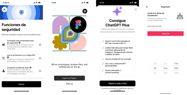
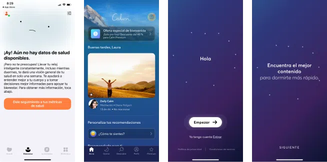
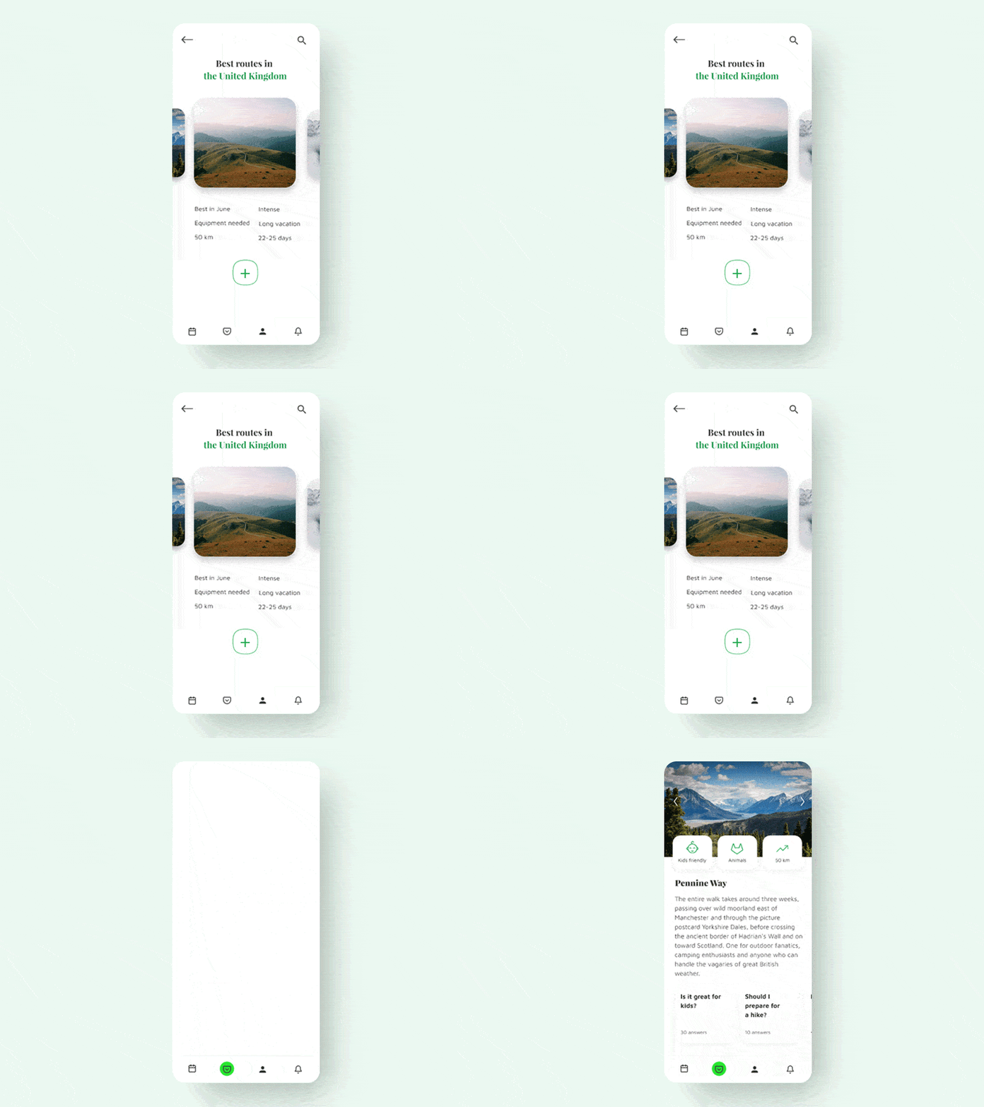
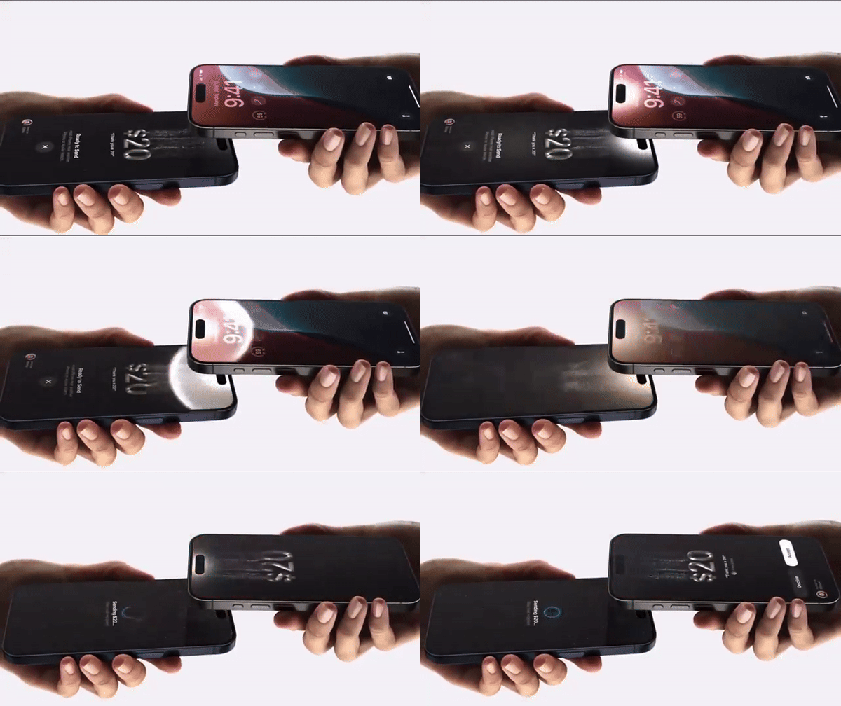
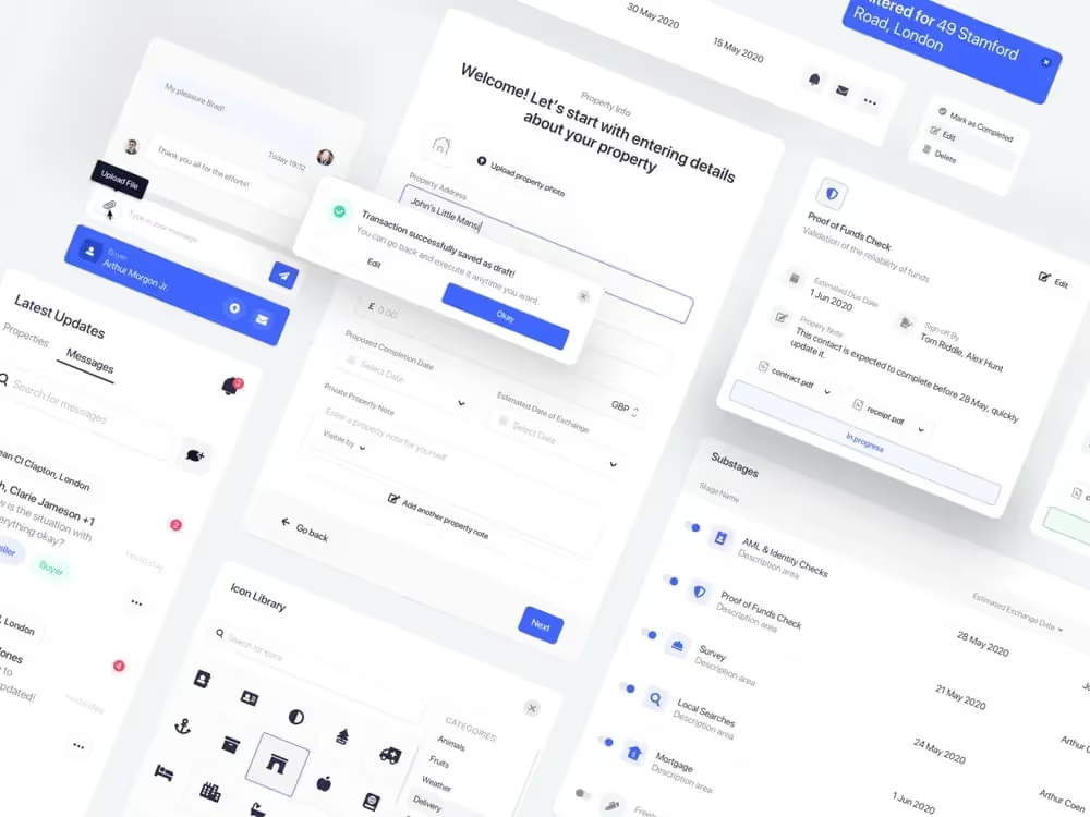
Our Top 10 UI Trends of 2025
Want to make your ecommerce website design stand out in 2025?
You’re in the right place.
From 3D product previews to bold typography and emotionally smart layouts, this year’s top UI trends are all about creating smoother, more human shopping experiences.
These aren’t just visual upgrades—they’re strategic moves to help you boost conversions, engage longer, and keep customers coming back.
Let’s dive into the 10 ecommerce UI/UX trends that will shape how shoppers interact with your brand in 2025.
Table of Contents
- Interactive 3D Objects
- Dark Mode Evolution
- Text & Emoji Mix
- Progressive Blurs
- Minimalist Buttons
- Interactive Backgrounds & Dynamic Imagery
- Animations in UI
- Metal Performance Shaders
- Design Systems
- Bold Typography
- How to Apply These UI Trends to Your Store
1. Interactive 3D Objects
3D visuals aren’t just cool—they’re conversion tools.
In 2025, ecommerce UI UX design is leaning heavily into interactive 3D elements, and for good reason—3D helps users experience your product in a more tactile, immersive way before they hit “buy.”
Why you should consider 3D for your ecommerce store:
- Realistic product views – Let customers rotate, zoom, and explore your products from every angle. It’s a game-changer for fashion ecommerce, home décor, electronics, and more.
- Increased engagement – Users interact significantly longer with 3D visuals than static images, which means better dwell time and lower bounce rates—essential UX metrics that affect SEO.
- Immersive storytelling – Create interactive product journeys or AR previews to simulate real-life usage. This makes the online shopping experience closer to in-store interactions, reducing hesitation and improving conversion rates.
By integrating 3D product viewers into your ecommerce website design—especially on Shopify or WooCommerce platforms—you can dramatically improve product presentation. We’ve seen brands that use 3D product showcases report up to 34% higher add-to-cart rates and more confident purchasing behavior.
If you’re selling products where look, feel, or fit matter—like furniture, fashion, footwear, electronics, or auto accessories—3D design is no longer optional. It’s becoming a standard for high-converting ecommerce websites in 2025.
2. Dark Mode Evolution
Dark mode isn’t just trendy—it’s smart ecommerce UI/UX design.
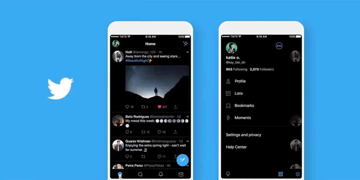
As online shoppers become more design-conscious and mobile-first, the demand for visually soothing interfaces is growing rapidly. Enter: dark mode ecommerce design. In 2025, more Shopify stores, WooCommerce websites, and custom ecommerce platforms are embracing this sleek and user-friendly feature—and customers are responding positively.
Here’s why dark mode is a UX win:
- Saves battery on OLED screens – A practical benefit that appeals to mobile-first shoppers, especially Gen Z and millennials who browse and buy on the go.
- Reduces eye strain – A major plus for late-night shoppers and users spending longer browsing sessions. Dark backgrounds with light text are gentler on the eyes, improving the overall user experience.
- Makes vibrant CTAs and visuals pop – Dark mode enhances contrast, making high-converting CTAs, product images, and banner graphics stand out dramatically.
- Modern, minimal, and focused – With fewer distractions, dark interfaces naturally guide user attention to key areas like product galleries, offers, and buttons—boosting click-through rates and conversions.
If you’re working on an ecommerce website redesign in 2025, consider offering a dark/light mode toggle for accessibility and personalization. Especially for brands in tech, fashion, luxury goods, and gaming, dark mode helps build a premium, futuristic vibe that matches shopper expectations.
It’s not just a design trend—it’s a smart move for UI/UX optimization that can help improve time on site, customer satisfaction, and ultimately, sales.
3. Text & Emoji Mix
Yes, even ecommerce brands are using emojis now—and it works.
In 2025, UI UX design for ecommerce websites is embracing a friendlier, more conversational tone—and emojis are playing a big part. What started as a trend in D2C brand communication and mobile-first ecommerce stores has now become a subtle but powerful UI UX design tactic.
You’ve probably seen this approach in product descriptions, email CTAs, live chat interfaces, and checkout nudges. The strategic use of emojis can humanize your brand voice, making interactions feel warmer and more approachable.
Why it helps your ecommerce UI UX design:
- Adds emotional tone – Emojis act like visual cues in your text, helping to guide shoppers through their decision-making journey and reduce friction in conversion-critical moments (like cart abandonment reminders or upsell prompts).
- Universal language – Whether your customers speak English, Hindi, Spanish, or French, emojis are globally understood. This makes them perfect for international ecommerce brands trying to maintain consistent UI UX experiences across cultures.
- Mobile-friendly readability – With most ecommerce traffic coming from mobile, emojis help break up large blocks of text, draw attention to key elements, and improve scannability—crucial for fast browsing.
- Boosts engagement – Emojis naturally attract the eye and have been shown to increase click-through rates and conversions when used in moderation.
But remember—less is more. The goal is to enhance clarity and tone without diluting professionalism. Use emojis in your Shopify UX design, WooCommerce store content, or microcopy (like tooltips and popups) to add a playful edge—without going overboard.
In 2025, the most memorable ecommerce brands will be the ones that feel relatable. A well-placed emoji might just make all the difference.
4. Progressive Blurs
Want to make your ecommerce website feel modern without overwhelming animations? Try blur.
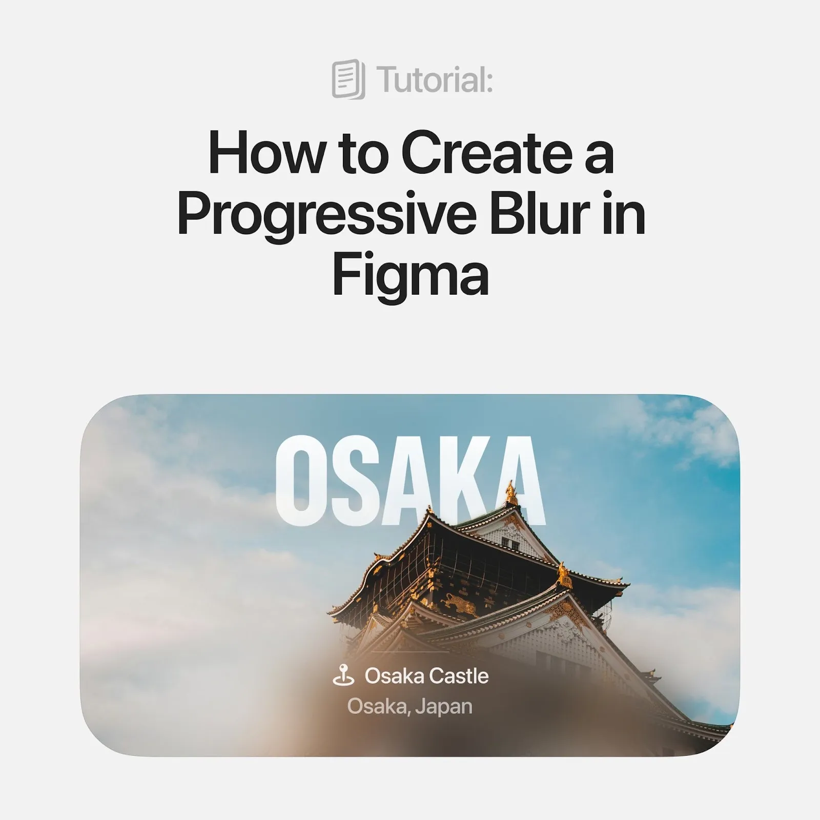
In 2025, progressive blur effects are becoming a go-to feature in ecommerce UI UX design. They’re subtle, sleek, and highly effective at creating visual hierarchy—especially on product-heavy pages or mobile screens.
Think of it like depth-of-field in photography, but for digital interfaces. You blur the less important content while keeping the user’s focus locked on what matters most—like the Add to Cart button, price, or product specifications.
Why designers love this trend in ecommerce design:
- Directs attention to product info or CTAs – Blurs create a sense of depth, helping you highlight the most conversion-critical elements of your Shopify or WooCommerce store.
- Improves mobile UX where space is limited – On smaller screens, progressive blur can soften background distractions, making navigation more intuitive and keeping users focused on their journey.
- Adds polish and smooth transitions – Paired with minimal animations, it makes your ecommerce website UI feel clean, modern, and refined—without sacrificing speed or usability.
- Supports faster decision-making – Users subconsciously follow your visual cues. Blur helps subtly guide user behavior without needing extra text or arrows.
If you’re redesigning your Shopify UX or planning a fresh look for your WooCommerce website, progressive blurs can be the secret sauce that balances aesthetics and function. It’s the kind of modern detail that shows your brand is evolving—without trying too hard.
5. Minimalist Buttons
Small changes in buttons = Big improvements in conversions.
In the world of ecommerce UI UX design, buttons are not just functional elements—they’re conversion drivers. And in 2025, minimalist button design is getting smarter, more interactive, and more emotionally responsive.
While minimalism still leads, the shift is toward intentional simplicity—every pixel must have purpose. Good button design can increase click-through rates, reduce decision fatigue, and make your Shopify or WooCommerce store feel seamless across devices.
What makes a high-converting button in modern ecommerce website design:
- Rounded corners – Friendly, approachable, and mobile-tap optimized. They feel natural on touchscreen interfaces and encourage user interaction.
- Subtle gradients or shadows – Not flashy, but enough to give a tactile, real-world feel. Users should feel the button is “pressable” even on flat screens.
- Clear contrast between CTAs – A bold “Buy Now” and a muted “Learn More” reduce hesitation. Color and contrast tell users what to do next, without overwhelming the page.
- Ghost buttons with high visibility – These minimal outlined buttons are perfect for secondary actions. They don’t steal focus from primary CTAs but still remain accessible and elegant.
- Responsive sizing and spacing – Buttons now adapt fluidly across screen sizes, making your ecommerce website more accessible and user-friendly.
Whether you’re refreshing your WooCommerce UX or building a custom Shopify theme, refining button styles can significantly improve both visual hierarchy and conversion rates. It’s a micro-interaction with a macro impact.
6. Interactive Backgrounds & Dynamic Imagery
Static backgrounds are boring. In 2025, your background should do more.
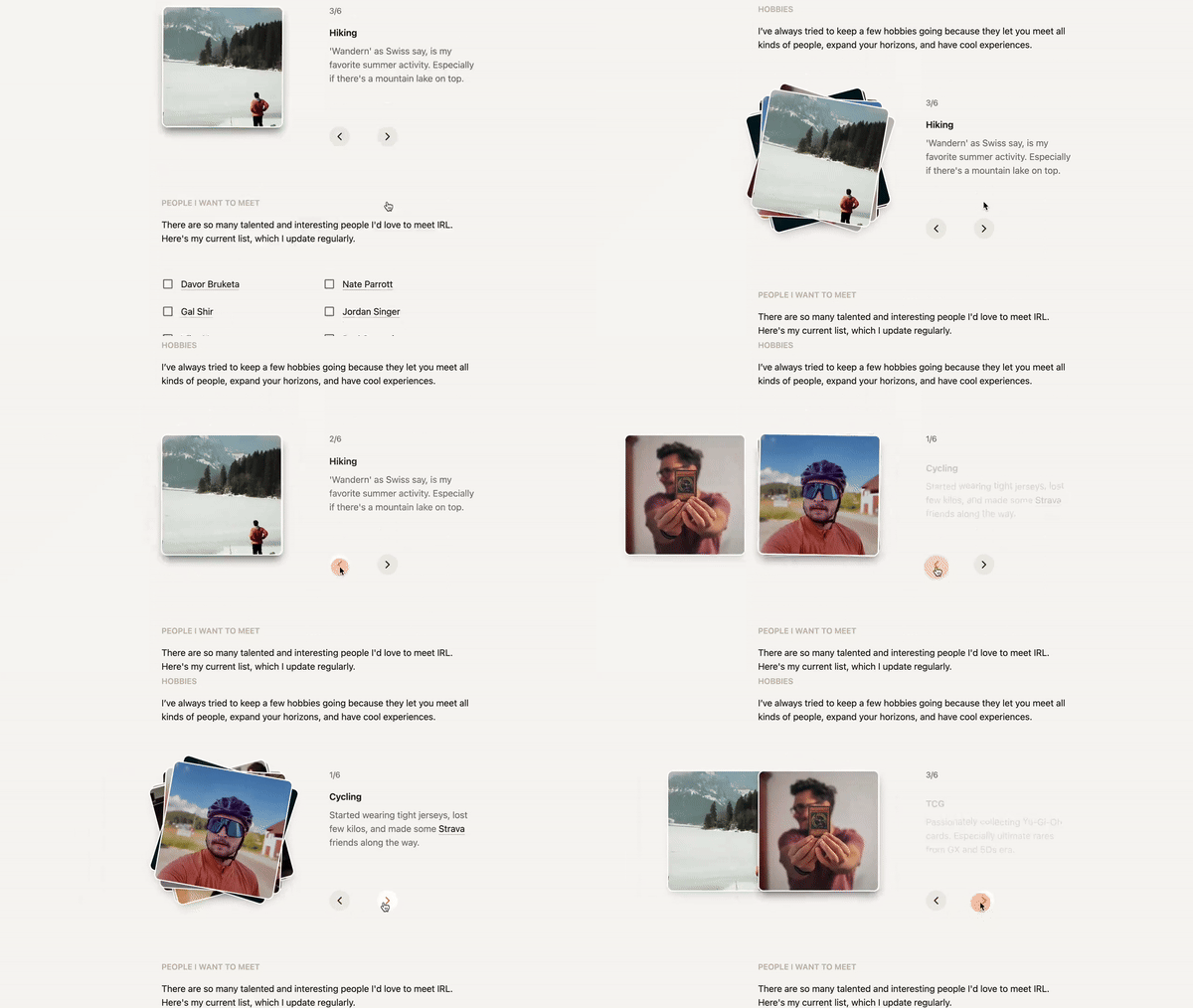
The best ecommerce UI UX designs today aren’t just functional—they’re emotionally engaging. One of the fastest-growing design trends this year is the use of interactive backgrounds and dynamic visuals to elevate brand storytelling and create immersive shopping experiences.
Gone are the days of flat, motionless backdrops. Now, top-performing Shopify and WooCommerce stores are using motion, depth, and personalization to stand out and connect.
Why this ecommerce design trend matters:
- Builds emotional resonance – Soft transitions, color shifts, or subtle animation help evoke feelings that match your brand’s tone—whether it’s luxury, playful, or bold.
- Reflects real-world cues – Weather-based changes, time-of-day themes, or location-specific imagery make your ecommerce site feel timely and personal.
- Keeps your store visually alive – Dynamic visuals catch the eye and increase time-on-site, boosting engagement without compromising speed.
- Enhances storytelling – When your background reacts or evolves as users scroll, it brings the user journey to life—great for brands selling fashion, lifestyle, tech, or artisanal products.
Imagine visiting a skincare site that shifts to soft morning tones for East Coast visitors or a fashion brand that syncs its visuals with seasonal drops. That’s not just design—it’s smart ecommerce UX.
Whether you’re revamping a Shopify store or custom-developing on WooCommerce, this trend helps turn casual visitors into loyal customers.
7. Animations in UI
If you’re not using animations in your ecommerce UI yet—you’re already behind.
In 2025, animations aren’t just for flair. They’re functional, intuitive, and essential to creating a modern, seamless ecommerce user experience.
Whether you’re designing a Shopify store or a custom WooCommerce website, smart animations help bridge the gap between static interfaces and real-life user interaction.
Why animations enhance ecommerce UI/UX design:
- Add-to-cart hovers or slide-ins – Instant feedback reassures users that their action worked and encourages continued shopping.
- Navigation transitions – Smooth menu animations make the browsing journey feel seamless and reduce cognitive friction.
- Interactive product features – Motion brings product benefits to life, especially for tech, fashion, or home goods where detail matters.
- Loading spinners or skeleton screens – Minimize perceived wait times and keep users engaged even during brief delays.
- Bonus: Use micro-interactions to delight users subtly—like heart icons that pulse on click, or buttons that shift slightly on hover. These little touches add polish and professionalism.
- Pro Tip: Tools like LottieFiles allow you to integrate scalable, lightweight animations without bloating your website speed.
The best ecommerce UI designs aren’t overloaded with effects—they use targeted animation to guide, inform, and delight. It’s where aesthetics meets usability.
8. Metal Performance Shaders
Want to wow your Apple users? Lean into Metal.
Apple’s Metal API brings console-grade graphics to iOS and Safari browsers—perfect for high-performance, premium ecommerce websites.
If you’re designing for tech-savvy shoppers or running a luxury D2C brand, Metal shaders unlock a new level of polish and realism.
What Metal Performance Shaders offer:
- Realistic lighting and shadows – Make your product visuals pop with lifelike depth and sheen.
- Glassy UI effects & metallic glow – Add subtle elegance to hover states, modals, or product cards.
- AR-ready visuals that run smoothly on iOS – Perfect for try-on features, 3D product previews, and immersive navigation.
Pro Tip: Combine Metal shaders with progressive blurs or ambient transitions to craft a truly futuristic ecommerce experience—without sacrificing performance on Safari.
9. Design Systems
Scaling your ecommerce store? You need a design system.
A design system is more than a style guide—it’s your brand’s visual and functional DNA. It ensures UI consistency across your:
- Homepage
- Product pages
- Mobile app
- Email campaigns
- Paid ads
Why design systems are a must-have in 2025:
- Reusable UI components → Speed up launches, A/B tests, and seasonal updates.
- Consistent visuals → Build customer trust by maintaining pixel-perfect design across every channel.
- Cross-team alignment → Help developers and designers collaborate faster and with fewer handoff errors.
Whether you adopt Material UI, Fluent, or create a custom system—investing in a design system future-proofs your ecommerce UX and accelerates growth.
10. Bold Typography
Typography is your secret weapon.
In 2025, bold, oversized fonts are dominating ecommerce homepages, banners, and product launches—and for good reason.
Why bold typography works:
- Grabs attention instantly – Hook users in the first 3 seconds.
- Establishes hierarchy – Direct the eye where it matters without overwhelming the layout.
- Expresses brand voice – From playful to premium, your font weight speaks volumes.
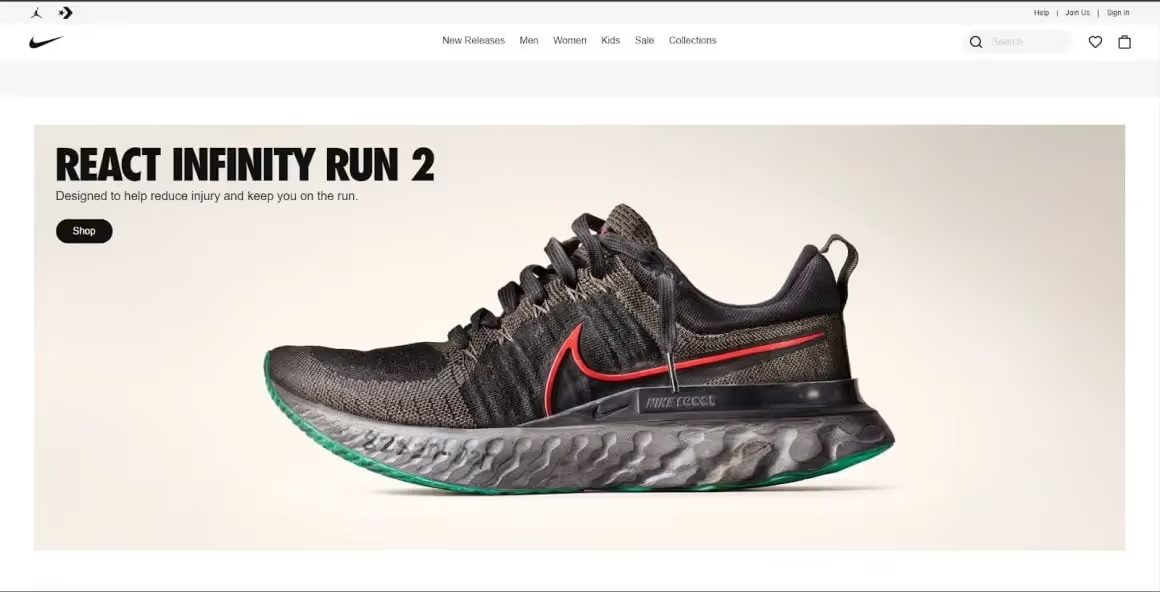
Brands like Dropbox, Drift, and Nike are masters of bold type—they let typography do the talking while keeping visuals clean and confident.
Pro Tip: Pair a bold H1 with generous whitespace and muted product imagery for a premium, editorial feel.
How to Apply These UI Trends to Your Store
Reading about design trends is one thing—implementing them effectively is what separates smart brands from the rest. Here’s how to get started:
- Audit your current UI/UX
Start by identifying outdated patterns, slow-loading areas, or confusing CTAs. Use tools like Hotjar or Google Analytics to pinpoint where users drop off. - Prioritize by impact
Don’t try to apply every trend at once. Start with what will move the needle fastest—like optimizing buttons, adding dark mode, or simplifying typography. - Use the right tech stack
If you’re on Shopify, consider apps or themes that support interactive elements (like 3D models or animations). On WooCommerce, work with a developer to implement custom UI improvements. - Test before you scale
Run A/B tests for changes like button styles or page layouts. What looks beautiful must also convert better.
Work with ecommerce UI/UX experts
Whether you’re scaling fast or just getting started, working with a partner who understands both design and ecommerce logic can save you time—and boost results.
Final Thoughts: Are You Ready for Smarter UI?
You don’t need to follow every trend to succeed—but adopting a few can seriously boost your ecommerce performance.
- Higher conversions
- More time-on-site
- Better mobile experiences
- Stronger brand recognition
At Emerge Digital, I help brands like yours build ecommerce experiences that are seamless, strategic, and built to scale.
Whether you’re launching your first Shopify store or revamping a WooCommerce site, we make sure your store looks great and performs even better.
Ready to build a store your customers will love?
Let’s talk.
Let’s build something that performs as beautifully as it looks.
Explore more
The 15 Best Sustainable Shopify Stores to Shop in 2025: Eco-Friendly Brands Leading the Way
15 Shopify Health Brands Redefining Wellness in 2025
15 Essential Features for Your Health and Wellness Store

About the Author
Priya, Co-Founder of Emerge Digital, is a UI/UX enthusiast with 15 years of experience. She’s passionate about crafting user-centered designs that exceed expectations, delivering meaningful and engaging digital experiences. At Emerge Digital, Priya blends her deep expertise with a commitment to client and user needs, driving innovative design solutions.
