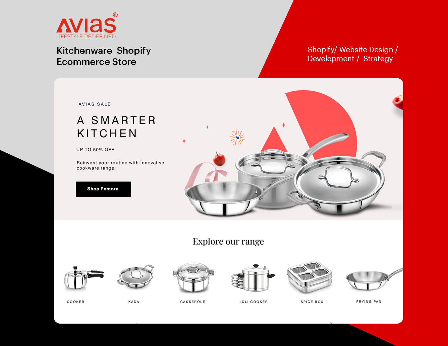
Avias Website Case Study
- Client
- Avias World
- Industry
- Cookware & Kitchenware
- Services
- Offers a wide range of premium cookware products from saucepans and casseroles to pressure cookers and spice boxes
CASE STUDY
About the client:
Our client Avias is a legacy brand that offers precise, high-quality and reliable cookware. From triply saucepans to pressure cookers, Avias’s range of products has built a connection in the kitchens all over the country. It offers premium cookware products that make cooking an easy, enjoyable and smooth experience.
The Problem:
Avias reached out to us to redesign and revamp their website. They wanted their website to truly represent the quality and ease of use that their products offer. The website needed a makeover.
The previous website was not well structured, and the categories and products were not well bifurcated. The navigation was restrictive and lacked seamlessness. This affected the user experience. The visual and written content both needed to come together and play in sync. The website needed better functionality and a sleek visual language.
The Solution:
Our team at Emerge Digital was excited to bring the values, offerings, premium appeal and quality of the brand alive to the website. We carried out a detailed study, thorough understanding and multiple brainstorming sessions to design a website that was stellar, high performing, easy to navigate, well-integrated and visually pleasing. It was a truly collaborative process, both within the internal team at Emerge and with the client.
Deliverables:
Research & Strategy
Research and thorough study make a good strategy. And a good strategy translates into a stunning website. Our team at Emerge Digital carried out a detailed study and research to understand the customer journey, the problem areas and the approaches to fix them. We laid out a strong strategy to make the website more engaging, efficient, intuitive and seamless.
Website Building:
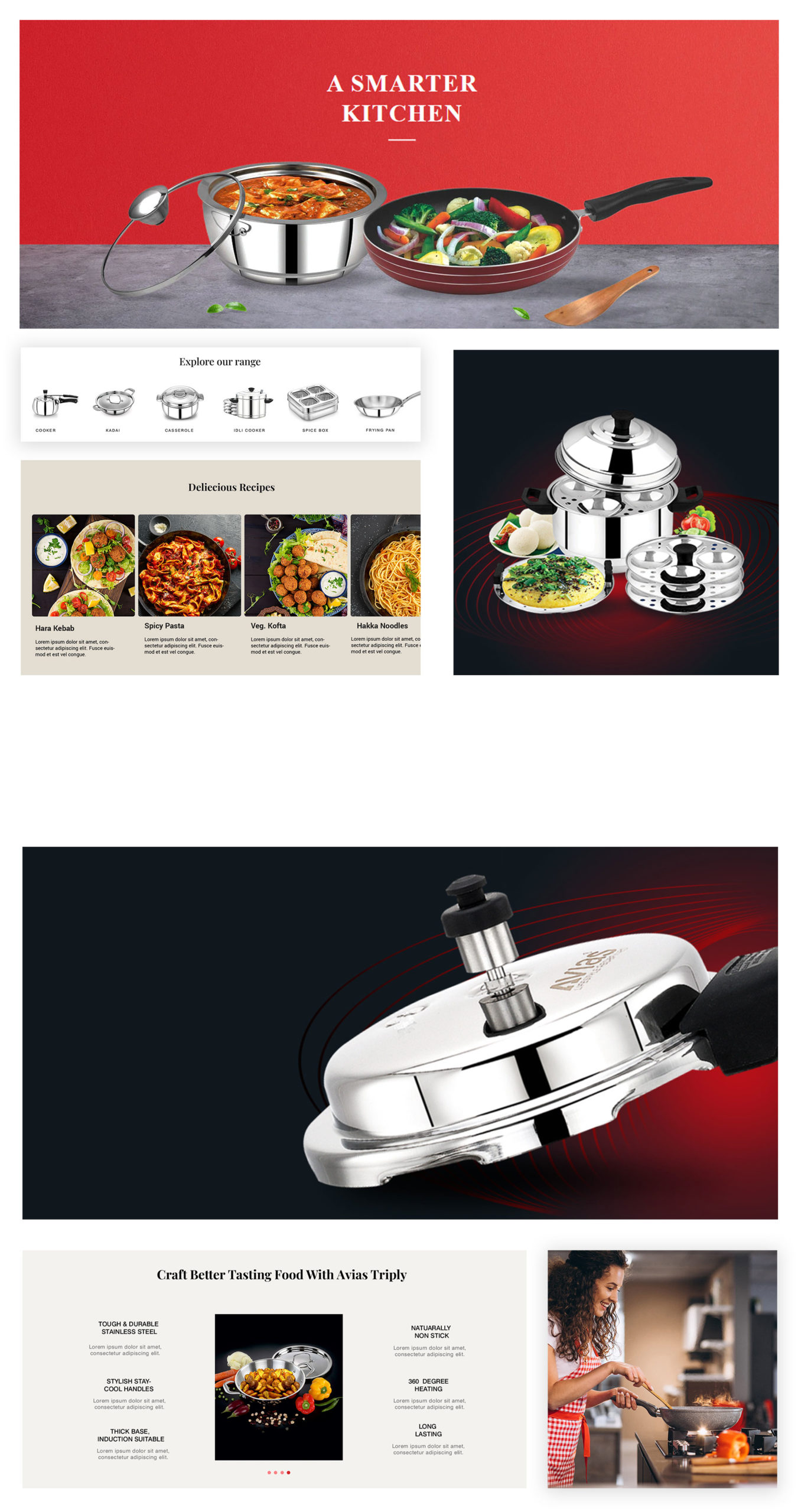
We incorporated our research, strategy, experience, expertise and client feedback to create an extraordinary website. The new website was now well structured, had proper architecture and beautiful navigation. The wide catalogue was well put in . It had become easier to find and locate the desired product. There were CTAs added at all the right places. User flows were optimized. Well-defined sections for descriptions, sales offers, features, and filters were added. The layout, content and visual strategy made the website more engaging, efficient and effective.
With Emerge Digital by their side, Avias had a marvelous website ready to achieve their desired ambitions.
Visual Identity:
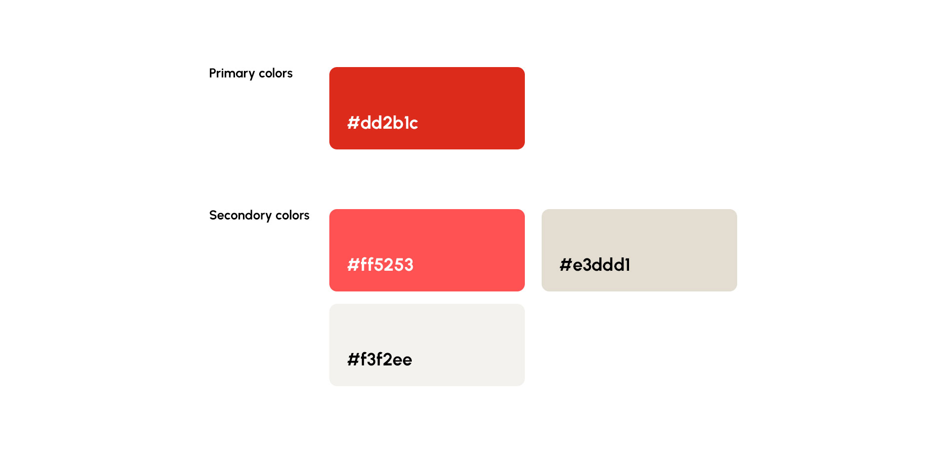
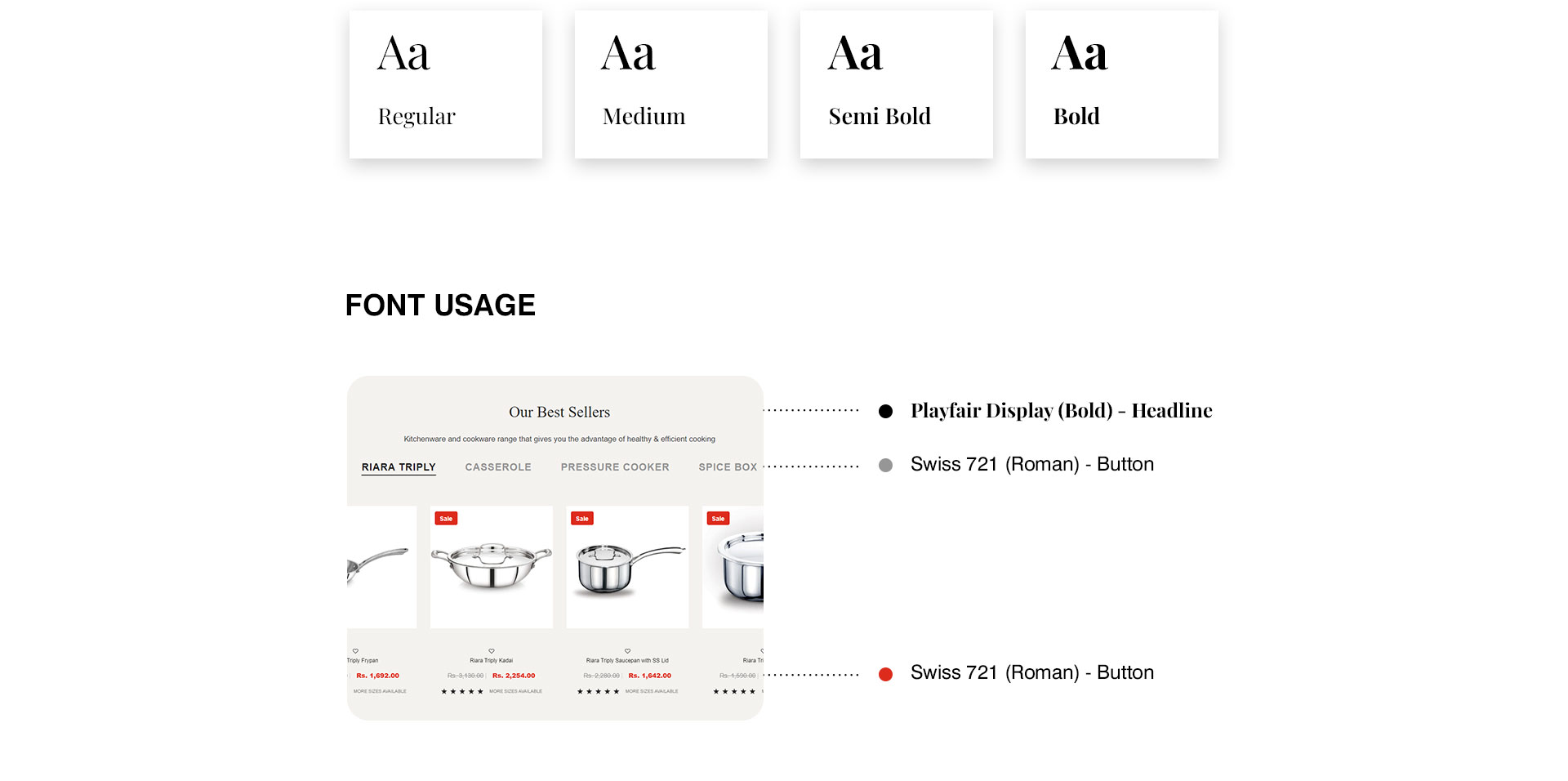
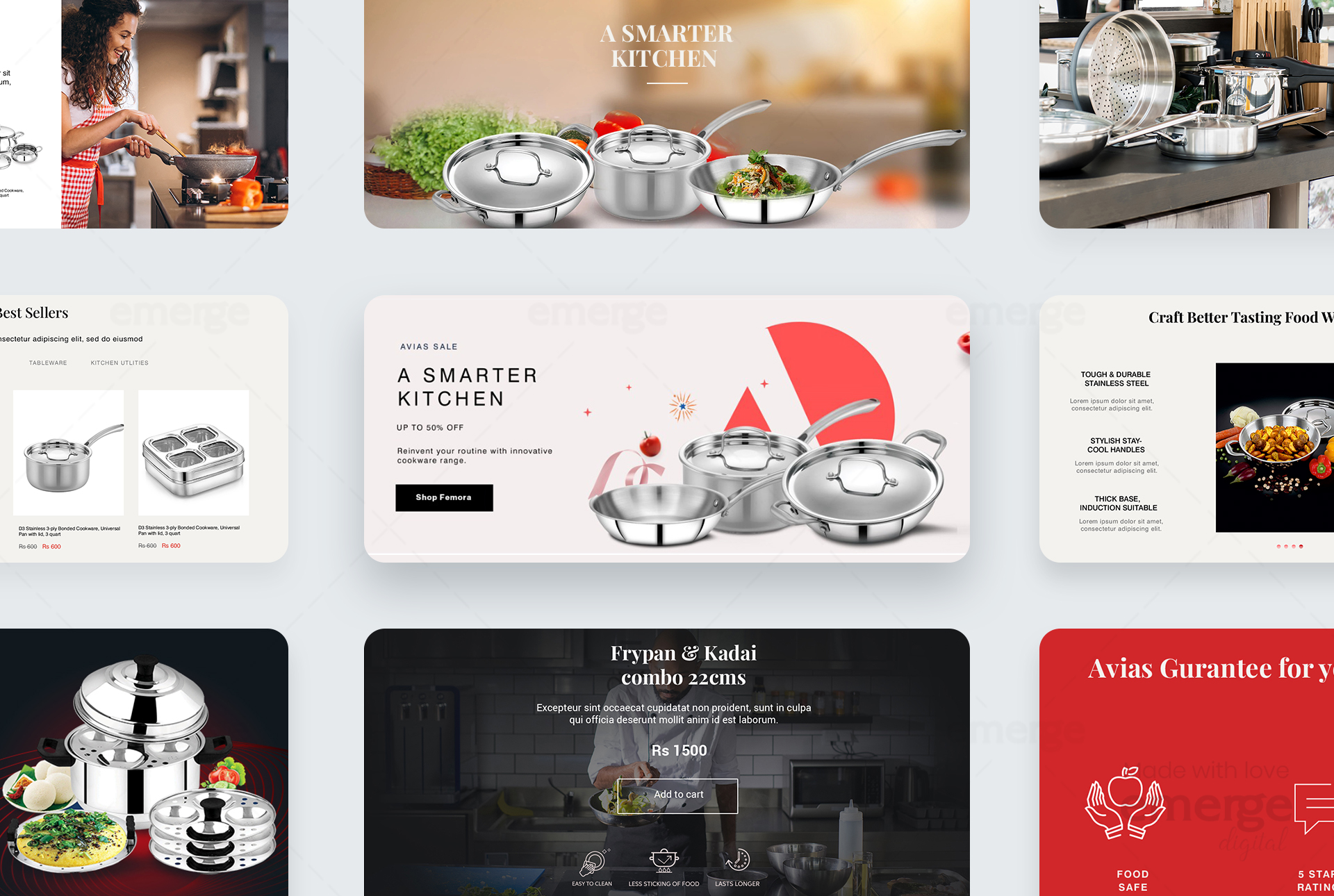
We gave Avias’s website a clean, minimal and premium design. The website emitted a sleek and stylish look and feel. The images, videos, icons, fonts and all the other graphic elements came together as united and holistic. The content and visuals perfectly fit each other like pieces of puzzles. The website now appealed more to the viewers and guided them to interact and take action.
The visual identity combined with the boosted functionality makes Avias’s unused website one of the best.
Result:
Our skill, expertise, experience, attention to the needs of the client and the work ethos of providing and suggesting only the best translated into a beautiful end result. An industry-perfect website was ready to boost the business of our client and realise its vision.
Brand Colors and Typography
