Contap - Connecting with Circularity
- Client
- Contap
- Industry
- Digital NFC
- Services
- Logo
CASE STUDY
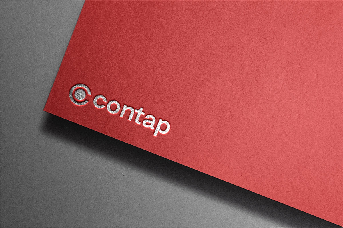
The Contap logo is a striking representation of modern connectivity and innovation. The logo features a unique combination of a half “C” and a complete circle, symbolizing the company’s expertise in digital and NFC card solutions. The half “C” signifies the initial letter of the brand while seamlessly merging into the circular form, portraying a sense of continuity and fluidity.
This design choice reflects Contap’s commitment to bridging the gap between traditional and digital communication, creating a harmonious blend of the two worlds. The circular shape embodies unity, collaboration, and the endless possibilities that arise from well-connected interactions.
With its clean lines and balanced composition, the Contap logo exudes a sense of professionalism and modernity, capturing the essence of the company’s offerings in the realm of digital and NFC cards. The choice of colors further enhances the logo’s vibrancy, making it a distinctive symbol that encapsulates Contap’s vision of connecting people and information seamlessly through innovative solutions.