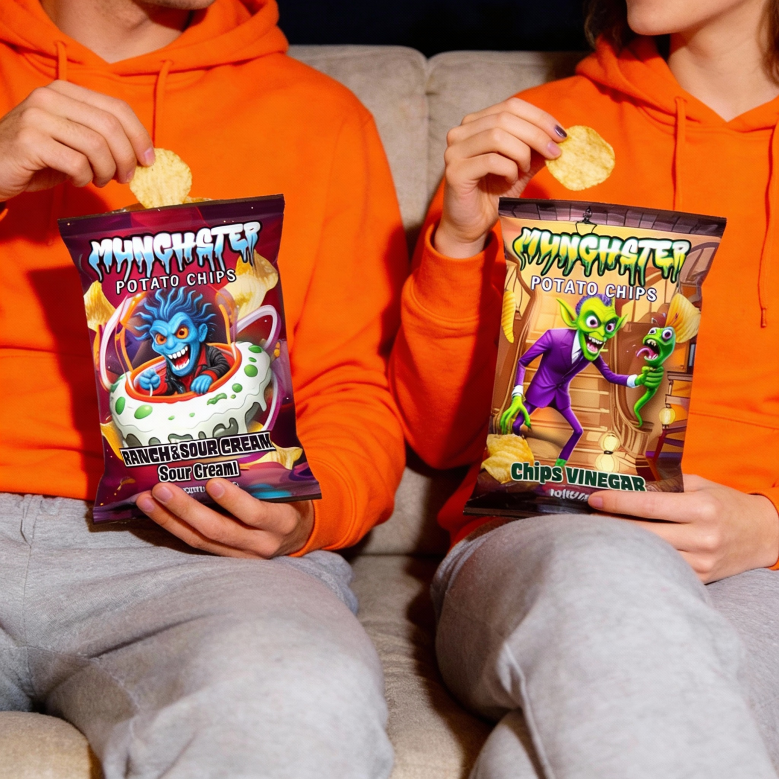
Munchster Website Design & Development Case Study
- Client
- Munchster
- Industry
- Snacks
- Services
- Website Design & Website Development
CASE STUDY
Project Overview
Munchster is a bold D2C snack brand bringing together potato chips, sour belt bites, and freeze-dried candy under one playful monster-themed identity.
We designed a complete ecommerce experience that combines bold visuals with easy product discovery, from the homepage and collections to product browsing, product pages, and shopping interactions.
The goal was to make the website feel fun, energetic, and unmistakably Munchster, while keeping the shopping journey simple.
The Challenge:
- Bring Munchster’s playful monster personality into the ecommerce experience
- Organize different snack categories for easy discovery
- Make a wide range of products easy to browse
- Balance expressive visuals with clear ecommerce navigation
- Create a consistent experience across desktop and mobile
UI/UX Strategy & Approach:
The website was designed around a simple journey:
Discover → Explore → Choose → Snack
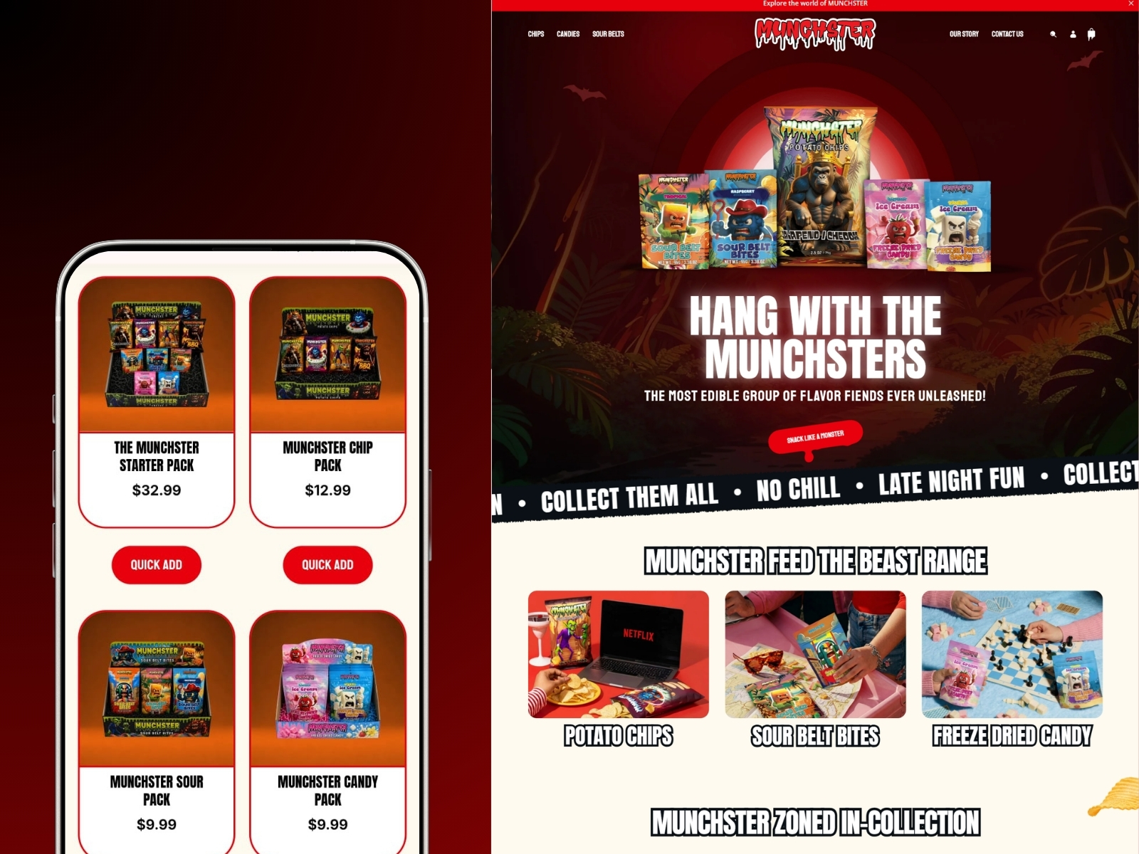
The homepage introduces the Munchster world through bold imagery, playful messaging, product categories, featured products, and the “Meet the Monsters” section.
Collection pages then help users explore specific snack types, while product pages focus on product imagery, flavor information, pricing, and purchase actions.
Key Ecommerce Screens
Homepage
Immersive hero section, category discovery, featured products, reviews, social content, and brand storytelling.
Collection Pages
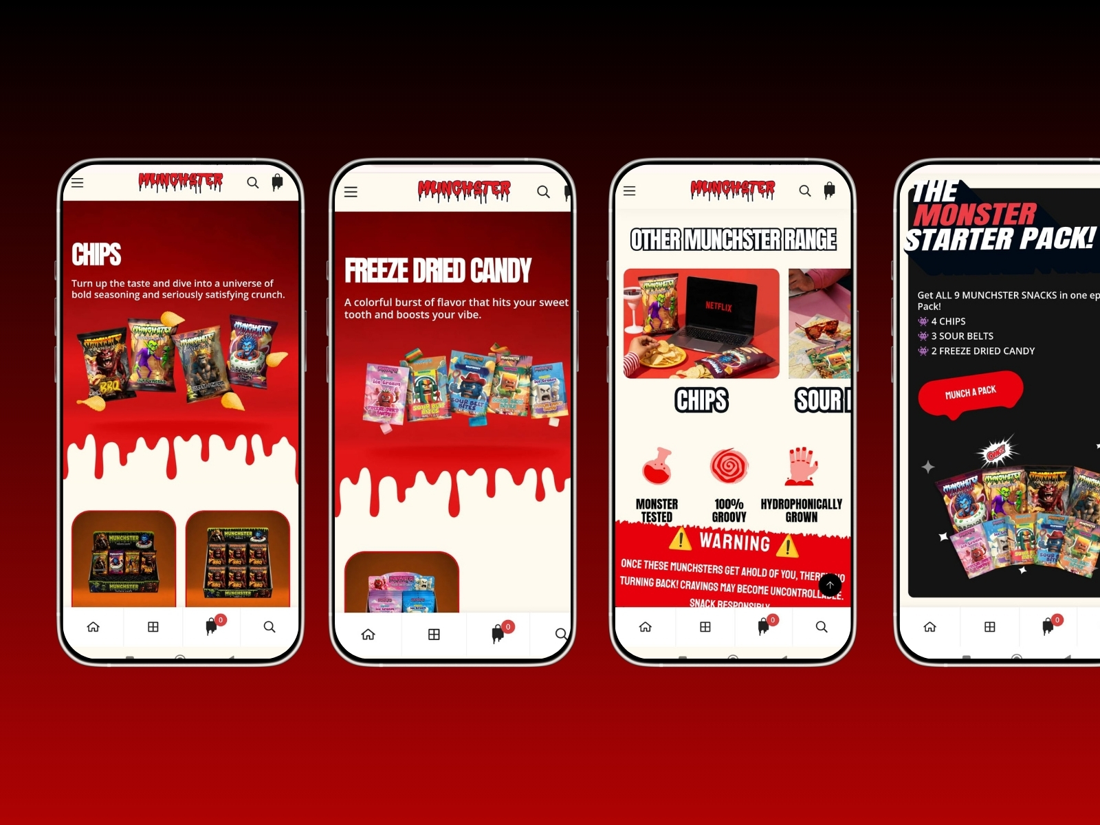
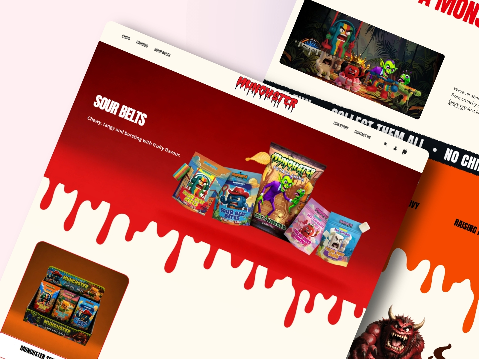
Dedicated browsing experiences for Chips, Candies, and Sour Belts, making it easy to explore each range.
Product Pages
Product-focused layouts with strong imagery, flavor details, pricing, and clear purchase actions.
Product Discovery
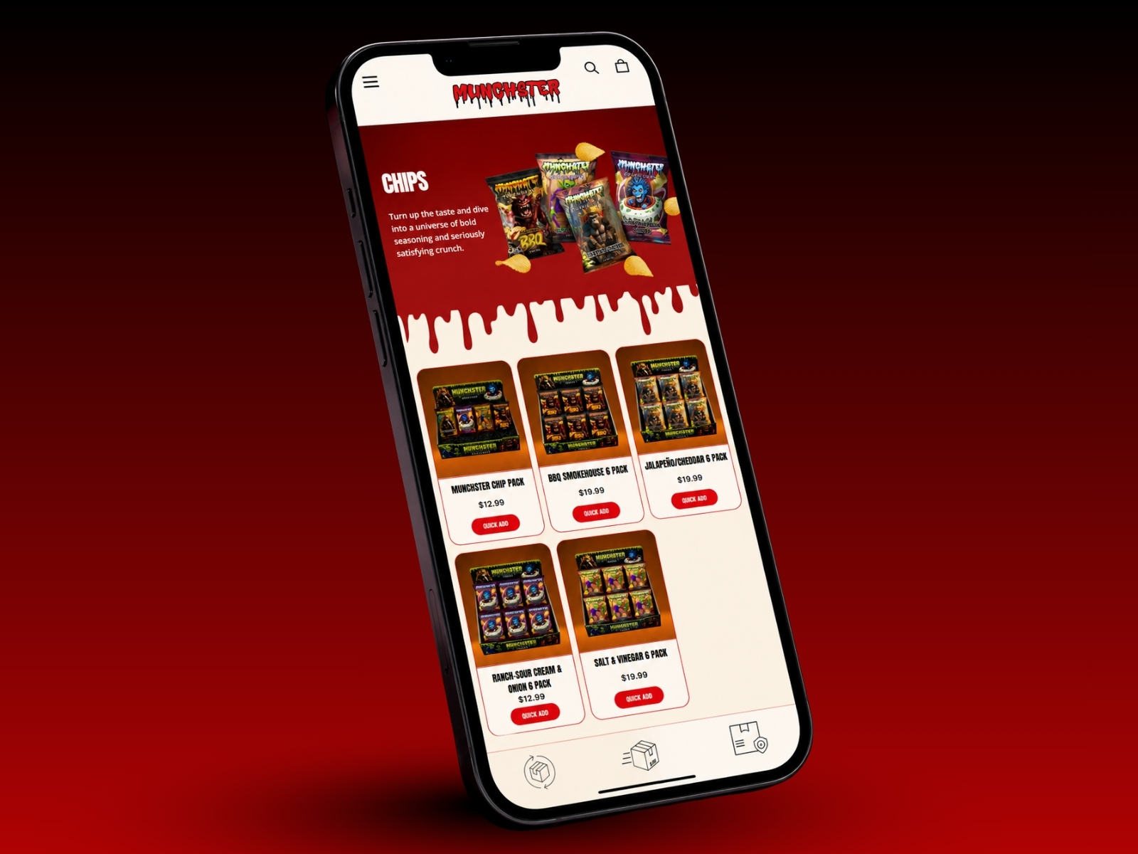
Category tabs and quick-add functionality help users browse and shop without unnecessary steps.
Mobile Experience
Responsive layouts keep product browsing, navigation, and CTAs easy to use across smaller screens.
Visual Design
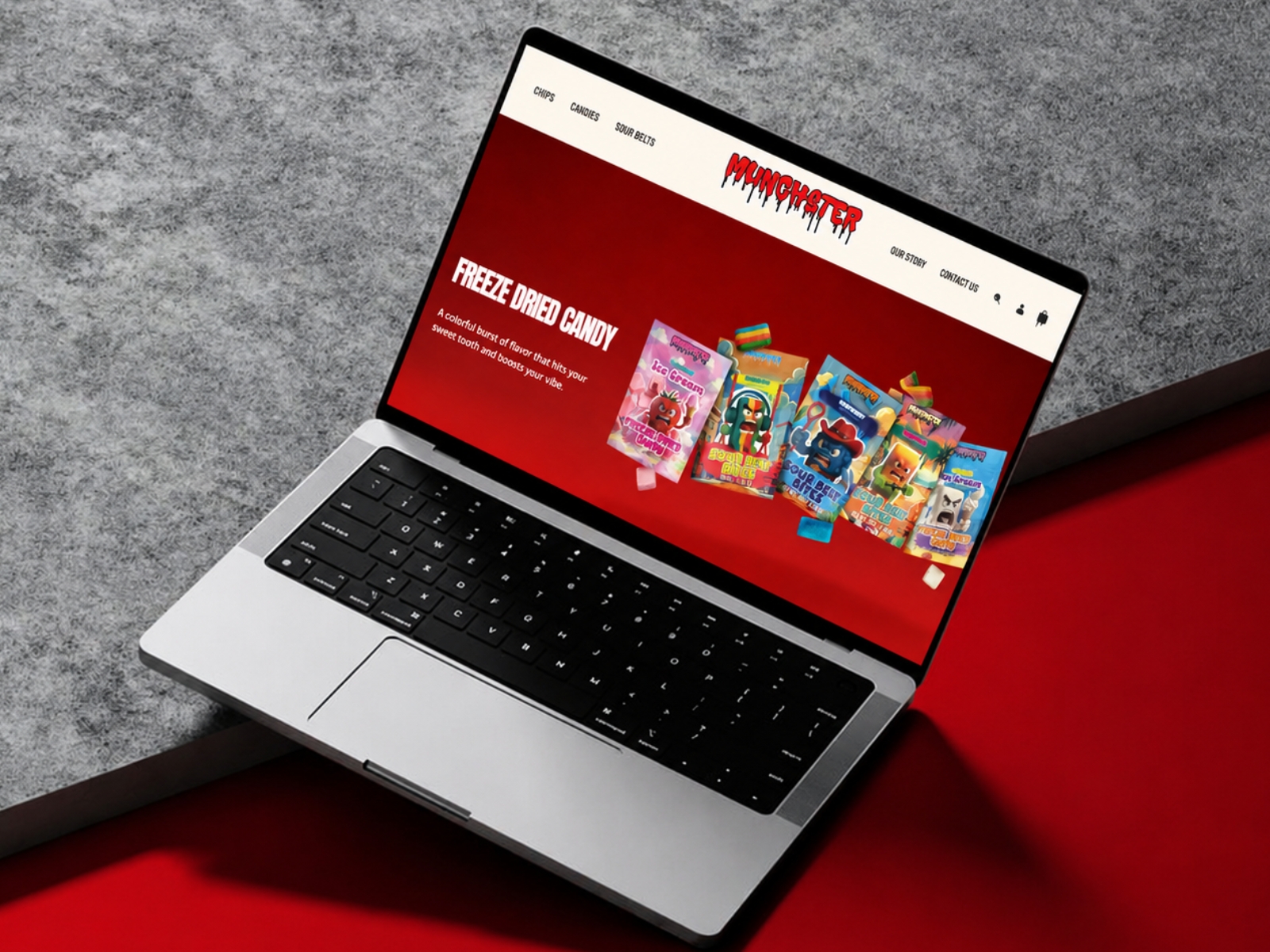
The interface uses a dark, high-contrast visual style with vibrant accents, oversized typography, monster illustrations, and bold product imagery.
The design system combines expressive display fonts with readable supporting typography to keep the experience playful while maintaining clear hierarchy.
Brand-Led Ecommerce
Beyond selling snacks, the website creates a world around the Munchster brand.
Sections such as “Meet the Monsters,” “Monster Tested,” “100% Groovy,” customer reviews, and the Instagram feed add personality, social proof, and discovery throughout the shopping experience.
Final Outcome
The result is a bold D2C snack ecommerce website that combines brand personality, product discovery, and conversion-focused UI/UX.
From exploring snack categories to discovering individual flavors and making a purchase, every page is designed to keep the experience fun, clear, and easy to navigate, while giving Munchster a scalable foundation for future products and collections.