Elevating D2D Work with Comprehensive Branding and Application Development
- Client
- D2D Work
- Industry
- Comprehensive Branding and Application Development
- Services
- Design, Website Development, Wordpress, D2D development
CASE STUDY
Objective
For our client D2D Work, the goal was to establish a distinctive brand identity and enhance user experience through a new application.
We Started with a Brand Brief
Our journey began with a thorough brand brief, where we delved into understanding D2D Work’s core values and objectives. This initial step laid the foundation for a tailored strategy that aligned with the brand’s vision.
Approach
Armed with insights from the brand brief, our agency meticulously selected a color palette and typography that would define D2D Work’s visual identity.
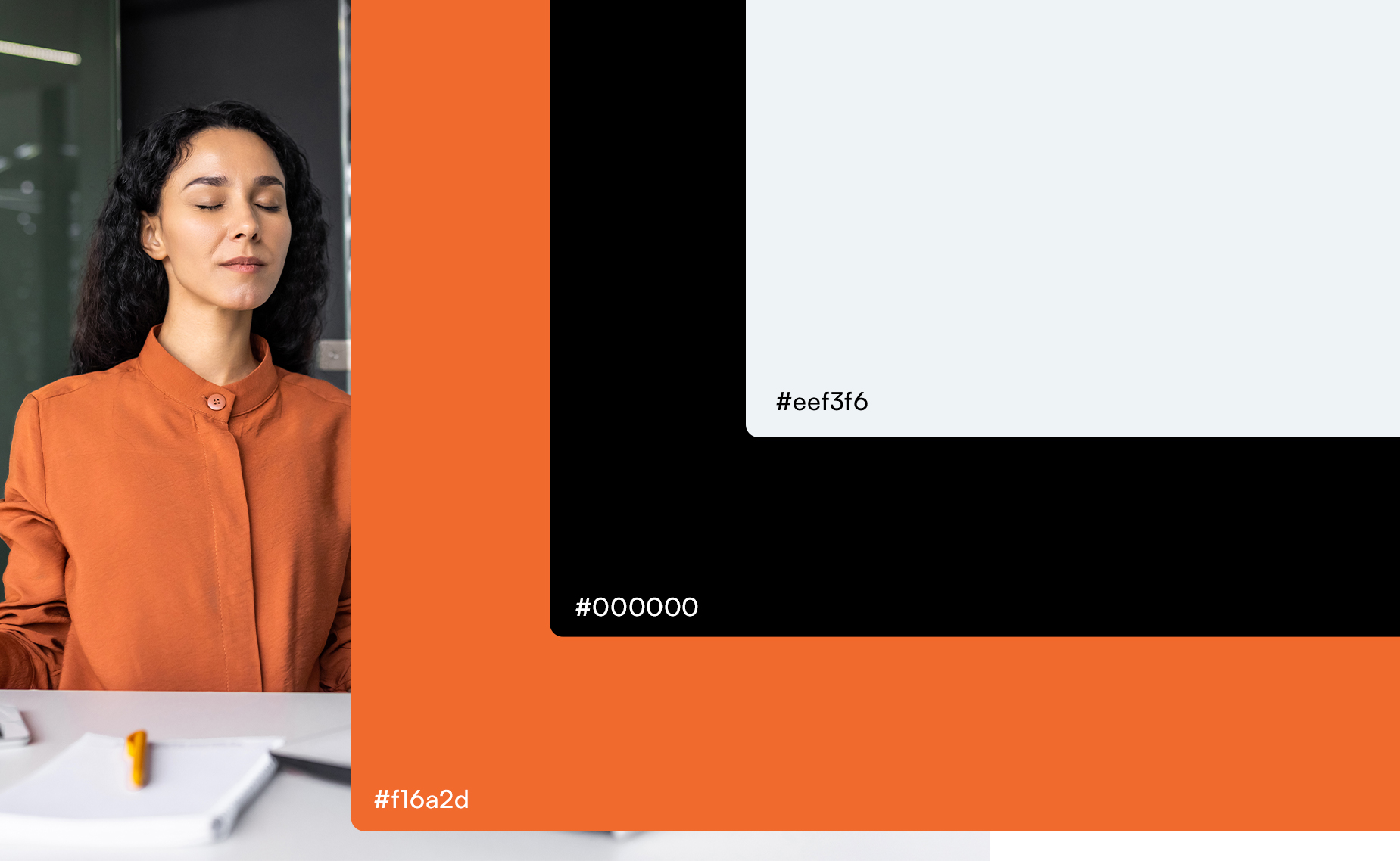
Color Palette
We strategically chose shades of orange and grey, complemented by black accents, to evoke a sense of vibrancy, professionalism, and modernity. The warm undertones of orange added a touch of energy, while the subtle grey tones conveyed sophistication. Black was introduced sparingly to create contrast and highlight key elements, ensuring a harmonious balance throughout the brand.
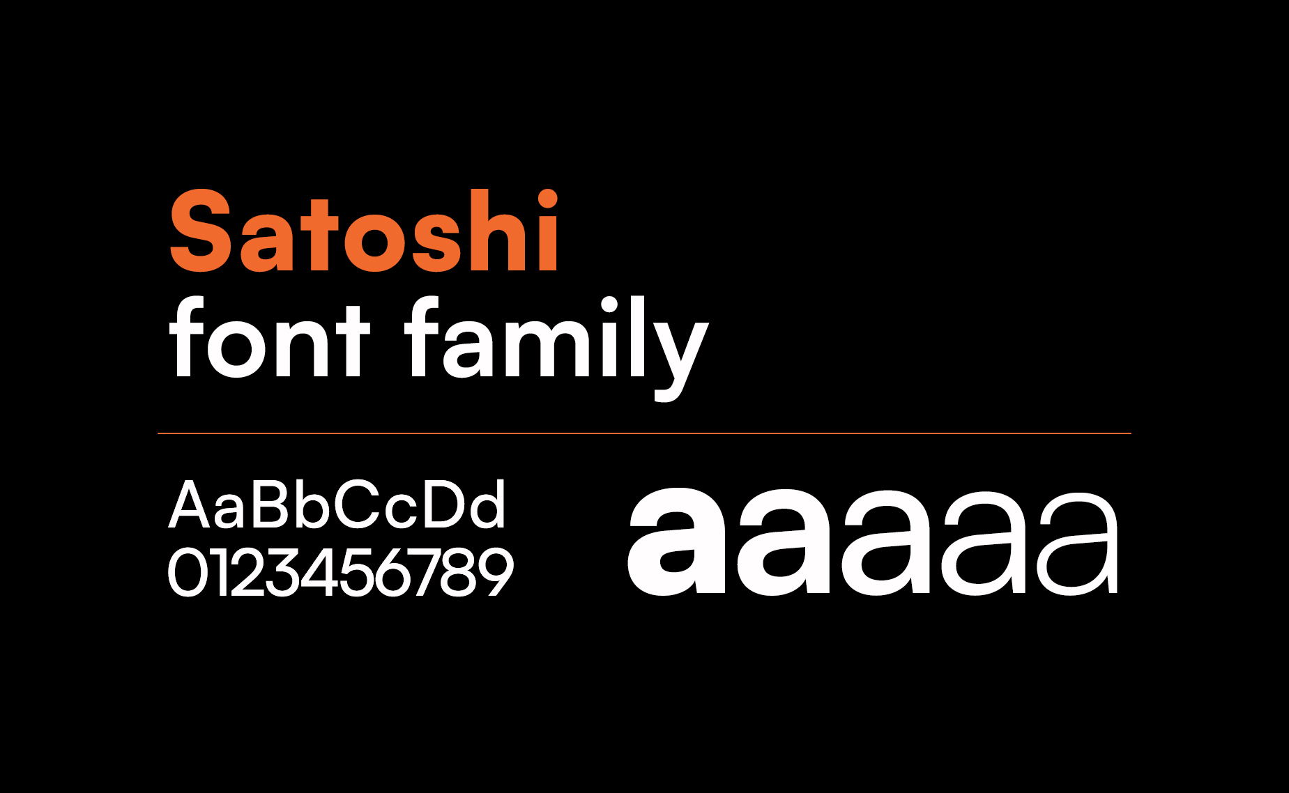
Typography
For the typography, we opted for the Satoshi Sans Serif font. Its clean lines and modern aesthetic perfectly aligned with D2D Work’s brand personality. Satoshi Sans Serif not only provided readability but also added a contemporary touch to the overall visual identity. Consistent use of this font across various brand assets maintained a cohesive and professional look.
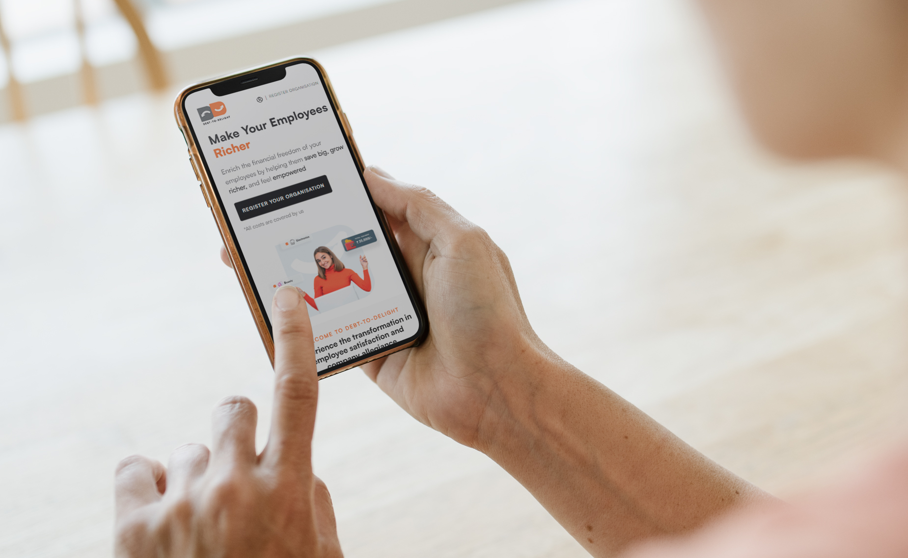
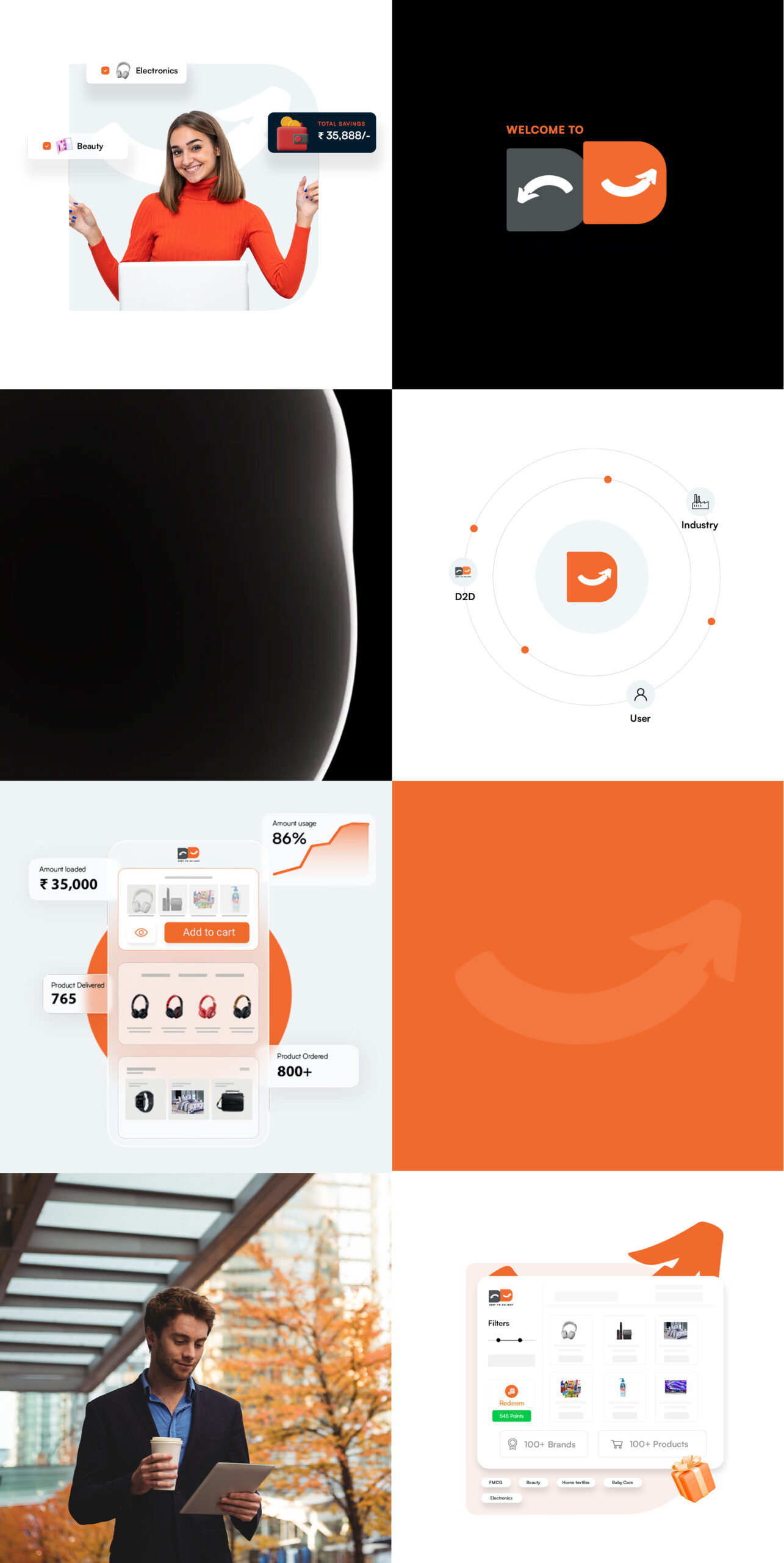
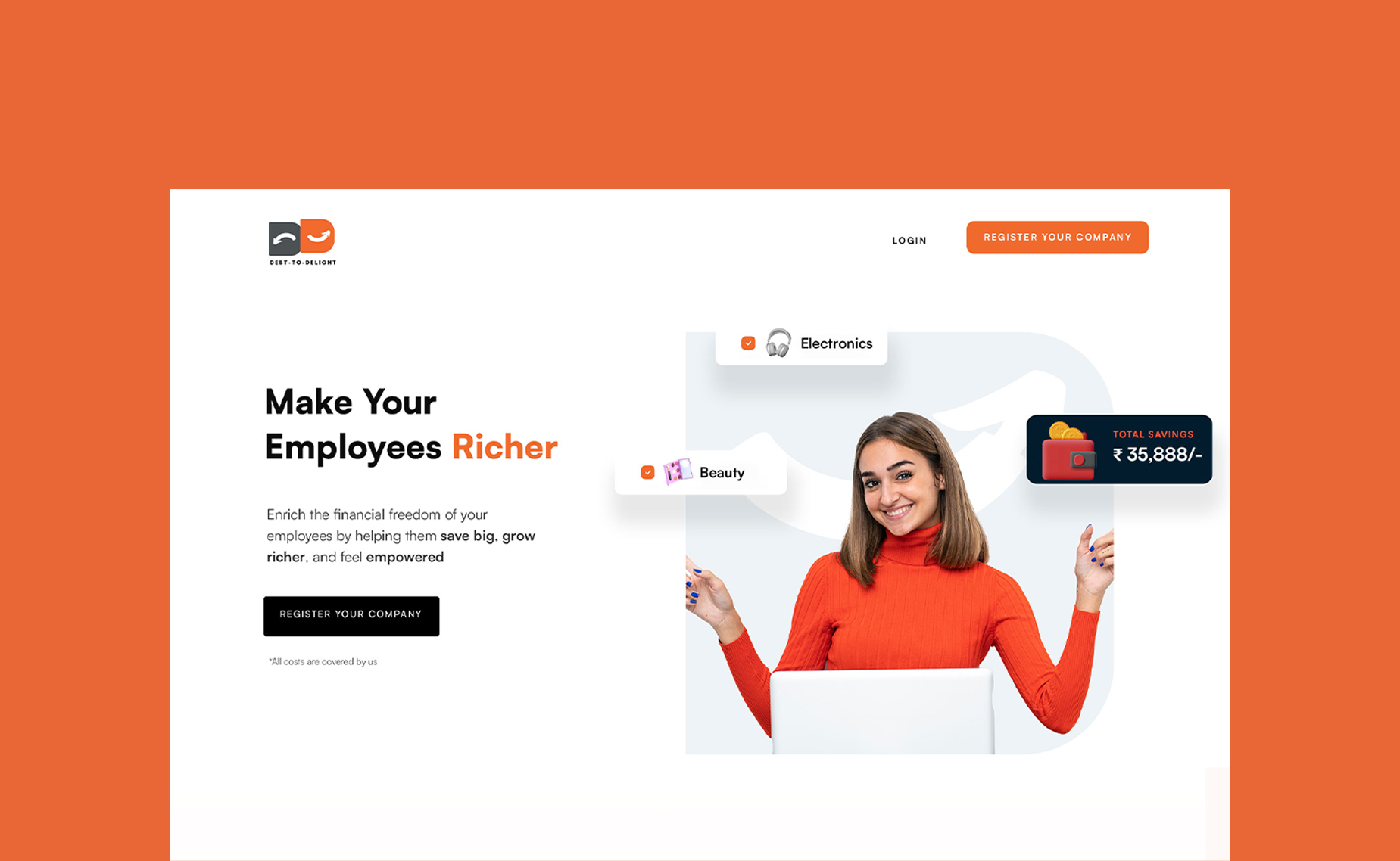
Landing Page Transformation
These carefully chosen colors and typography were seamlessly integrated into the redesigned landing page, creating a visually cohesive and engaging interface. The new aesthetic immediately captured the essence of D2D Work, making a memorable first impression on visitors.
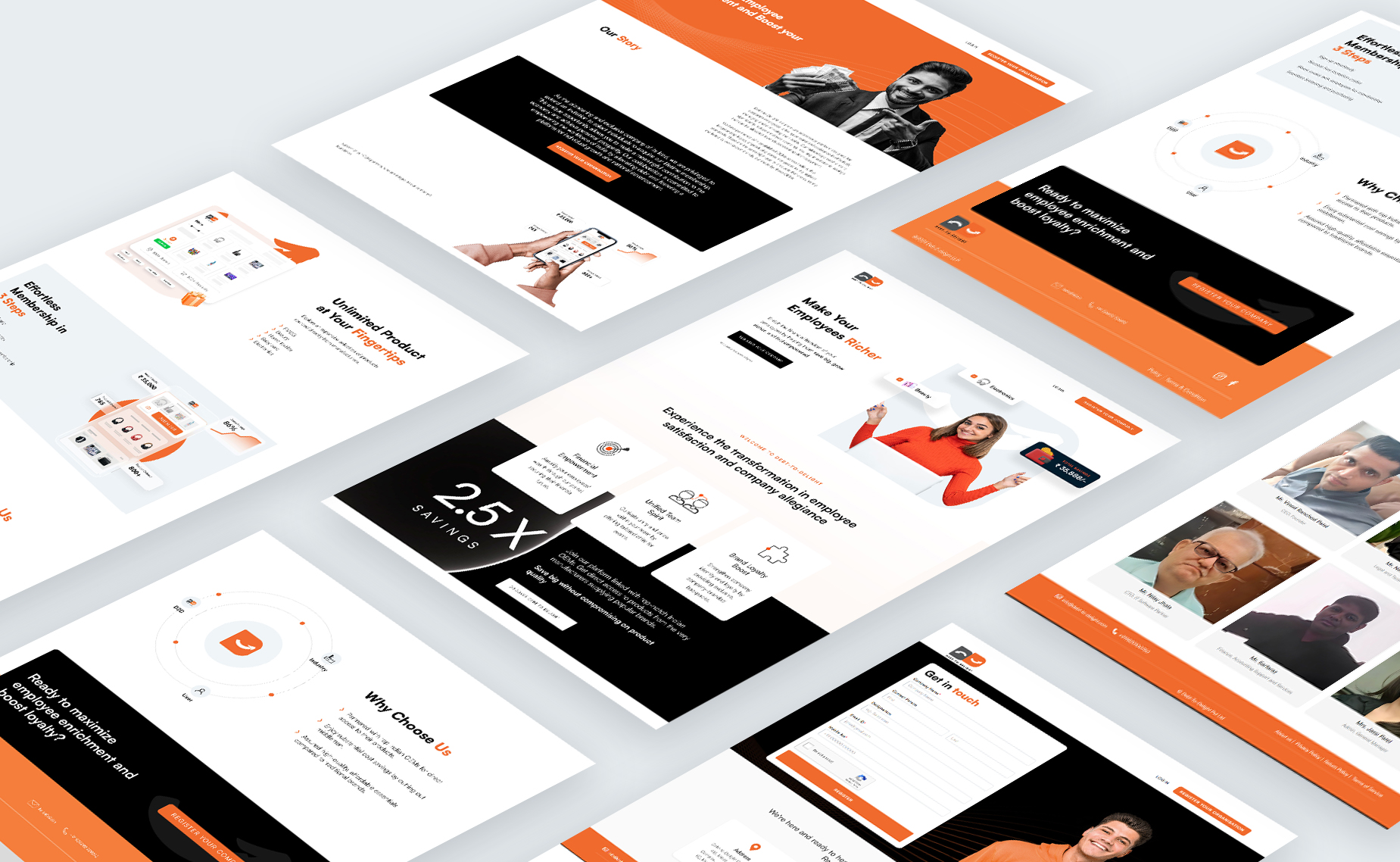
Strategic Messaging on Landing Page
To amplify D2D Work’s value proposition, our team crafted strategic messaging on the landing page. Clear and concise copy highlighted the brand’s vision
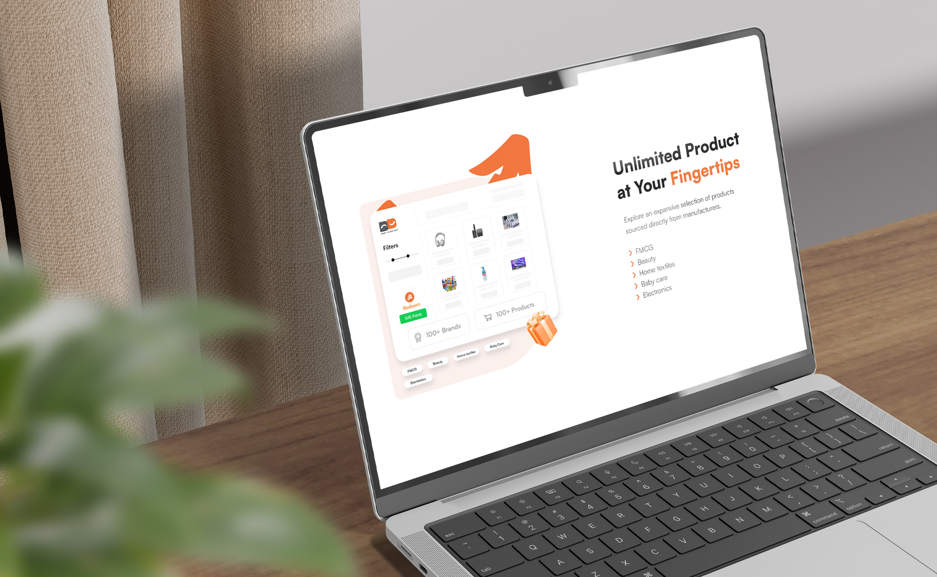
Application Development
Simultaneously, our team translated the chosen color palette and typography into the application design. The result was an intuitive and visually appealing application that not only met the functional requirements but also provided users with a visually cohesive experience.
Outcome
The integration of the carefully curated color palette and typography across the application and landing page resulted in a cohesive and recognizable brand presence for D2D Work. The warm, energetic tones of orange, balanced with the modernity of grey and black accents, combined with the clean lines of Satoshi Sans Serif typography, created a visually stunning and memorable brand identity. The user-friendly application now aligns seamlessly with the enhanced brand, fostering positive user interactions and setting the stage for sustained growth.