Karatland Website Design & Development Case Study
- Client
- Munchster
- Industry
- Snacks
- Services
- Website Design & Website Development
CASE STUDY
A jewellery brand centred on love
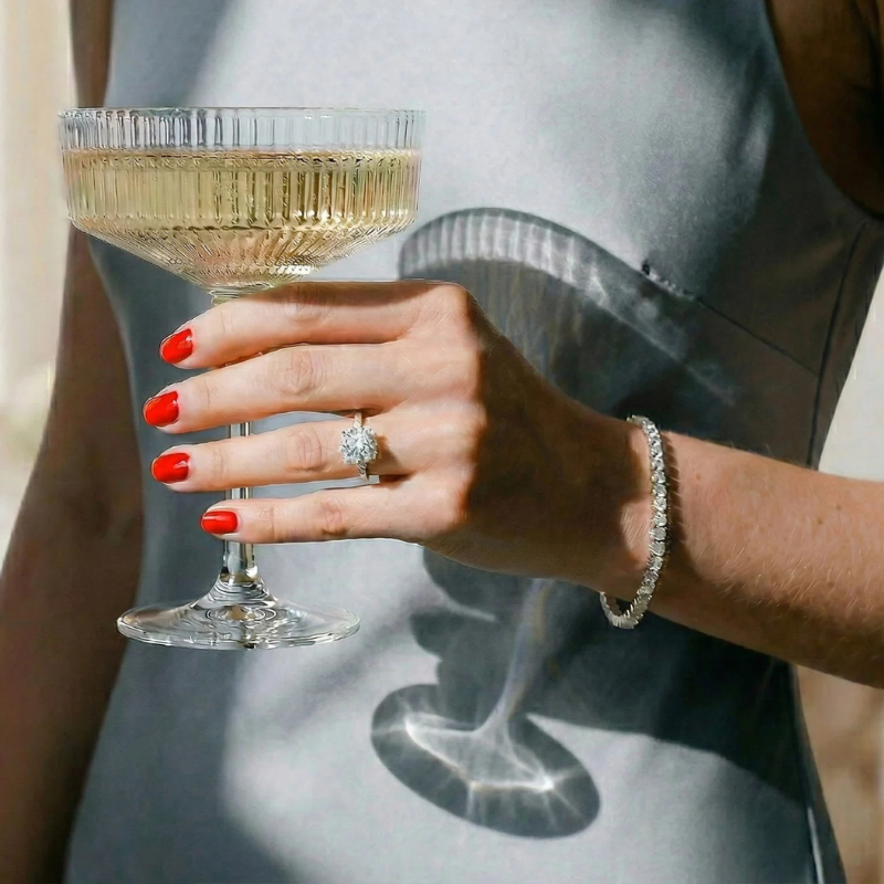
Karatland is a Canadian jewellery brand specialising in engagement jewellery, where every piece represents a meaningful moment. The objective was to create a digital experience that captured the emotion of finding the right ring while making the brand’s diverse collections easy to explore.
The challenge was to balance expressive visual storytelling with a clear and intuitive shopping journey.
The thinking behind the design
For Karatland, we took a more expressive approach to the visual direction. The aim was to create a distinctive jewellery experience that felt romantic and refined while helping customers navigate the range with ease.
A colour palette built around love
We used red, white, and black to establish the visual identity. Red adds warmth and emotion, white creates space for the jewellery, and black brings contrast and sophistication.
A stronger focus on visual storytelling
We gave imagery a more prominent role in the experience, using product-focused visuals and editorial layouts to communicate the significance of engagement jewellery while keeping the products central.
Simplifying collection navigation
With multiple jewellery styles to discover, we structured the collections to make browsing more intuitive. Clear categories help customers explore the range and move towards products that suit their preferences.
Bringing the experience together
We brought the visual direction and customer journey together through UI/UX design, Shopify development, collection architecture, and relevant integrations. The focus was on maintaining a consistent brand experience while making product discovery straightforward across the storefront.
The result is a jewellery shopping experience that combines emotional storytelling with organised navigation, helping customers explore Karatland’s collections with greater clarity.
Our scope: Strategy, UI/UX Design, Shopify Development, Collection Architecture & Integrations
My recommendation is to use “The thinking behind the design” and “Bringing the experience together” across both case studies. They’re straightforward, agency-led headings that let the work speak for itself without making the copy feel overworked.