Wanbury Website Revamp: Mobile-First & SEO-Friendly
- Client
- Wanbury
- Industry
- Pharmaceutical manufacturing
- Services
- Website Design & Website Development
CASE STUDY
Client Overview
Wanbury is a global pharmaceutical leader with a singular mission — to make quality healthcare and wellness products accessible and affordable. As pioneers in API manufacturing with a strong international presence, Wanbury wanted their website to match their reputation: credible, future-ready, and impactful.
Their previous website was dated, content-heavy without hierarchy, and lacked the modern UI/UX design needed to engage investors, partners, and stakeholders. They approached us to completely revamp their digital presence, focusing on:
- Corporate storytelling that conveys their mission, vision, and values.
- Mobile-first UI/UX for global accessibility.
- Structured architecture for scalability and SEO.
- Performance-optimized, secure platform for long-term stability.
Challenges
- Outdated design that didn’t reflect corporate stature.
- Poor content organization, making it hard for stakeholders to find key information.
- No mobile optimization, resulting in high bounce rates.
- Lack of engaging visuals and interactive elements.
- Weak SEO structure with inconsistent headers and metadata.
Our Design & Development Approach
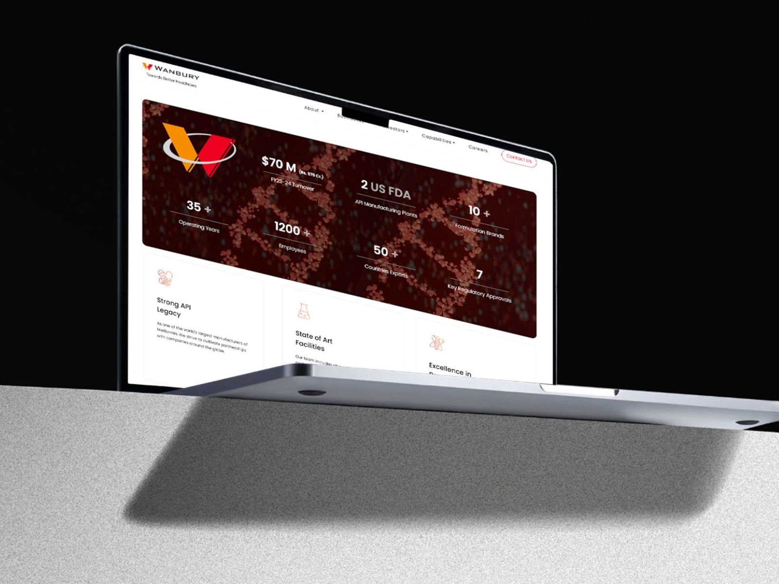
1. UX Strategy & Content Architecture
We started by mapping user journeys for diverse audiences — from investors and partners to potential employees and regulators. The new IA (information architecture) ensured:
- Clear navigation to Plants, R&D, Reach, and Compliance pages.
- Grouped content for corporate storytelling and operational highlights.
- SEO-friendly content hierarchy using H1–H2 tags.
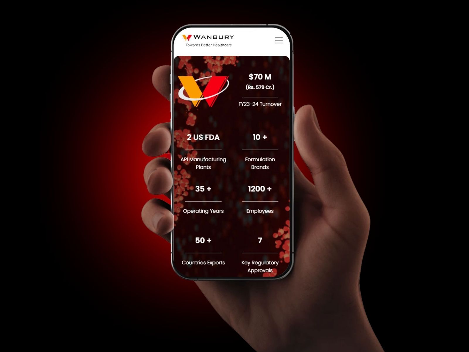
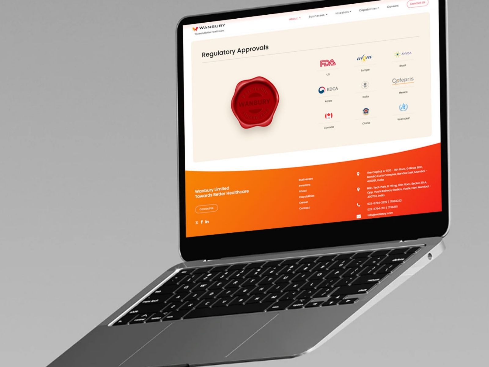
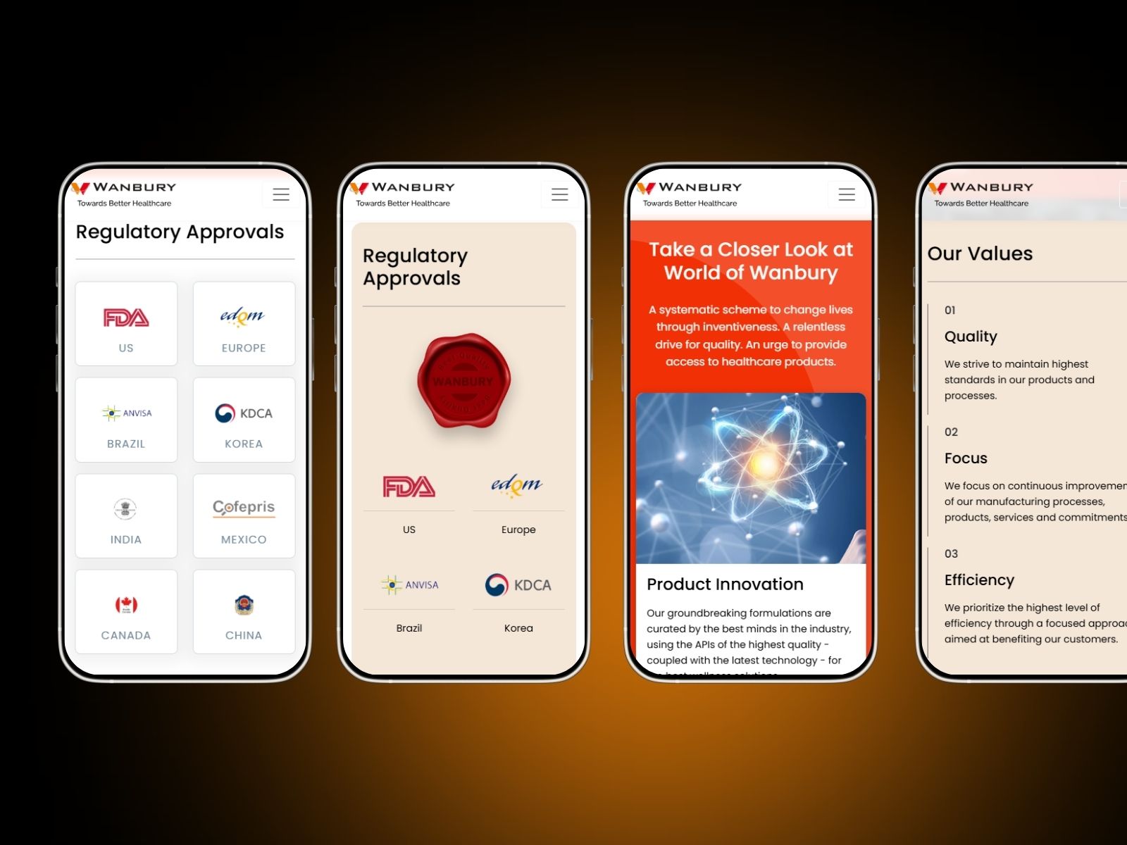
2. Mobile-First UI/UX Design
Knowing that stakeholders often access the site via mobile, we designed for small screens first:
- Card-based layouts for quick scanning.
- Thumb-friendly navigation menus with collapsible sections.
- Optimized typography hierarchy for readability on all devices.
- Brand palette: corporate orange, soft beige, and clean white for trust and clarity.
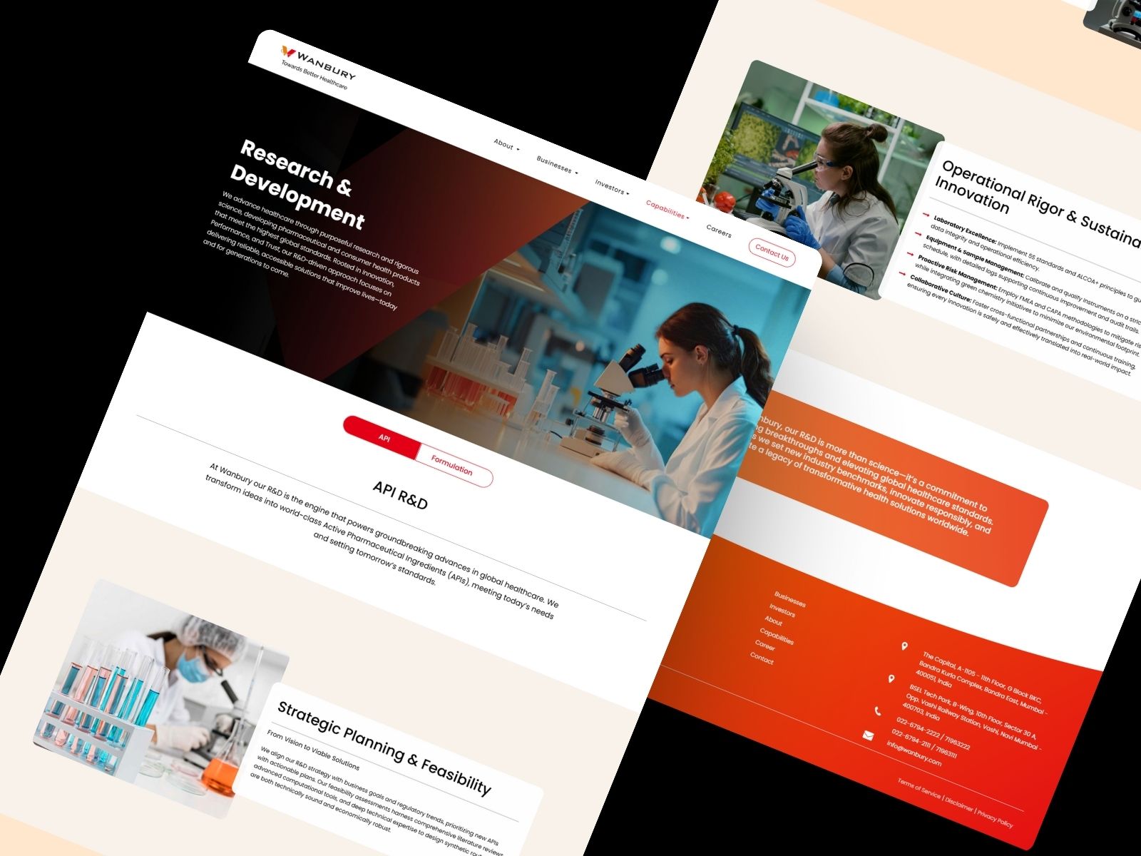
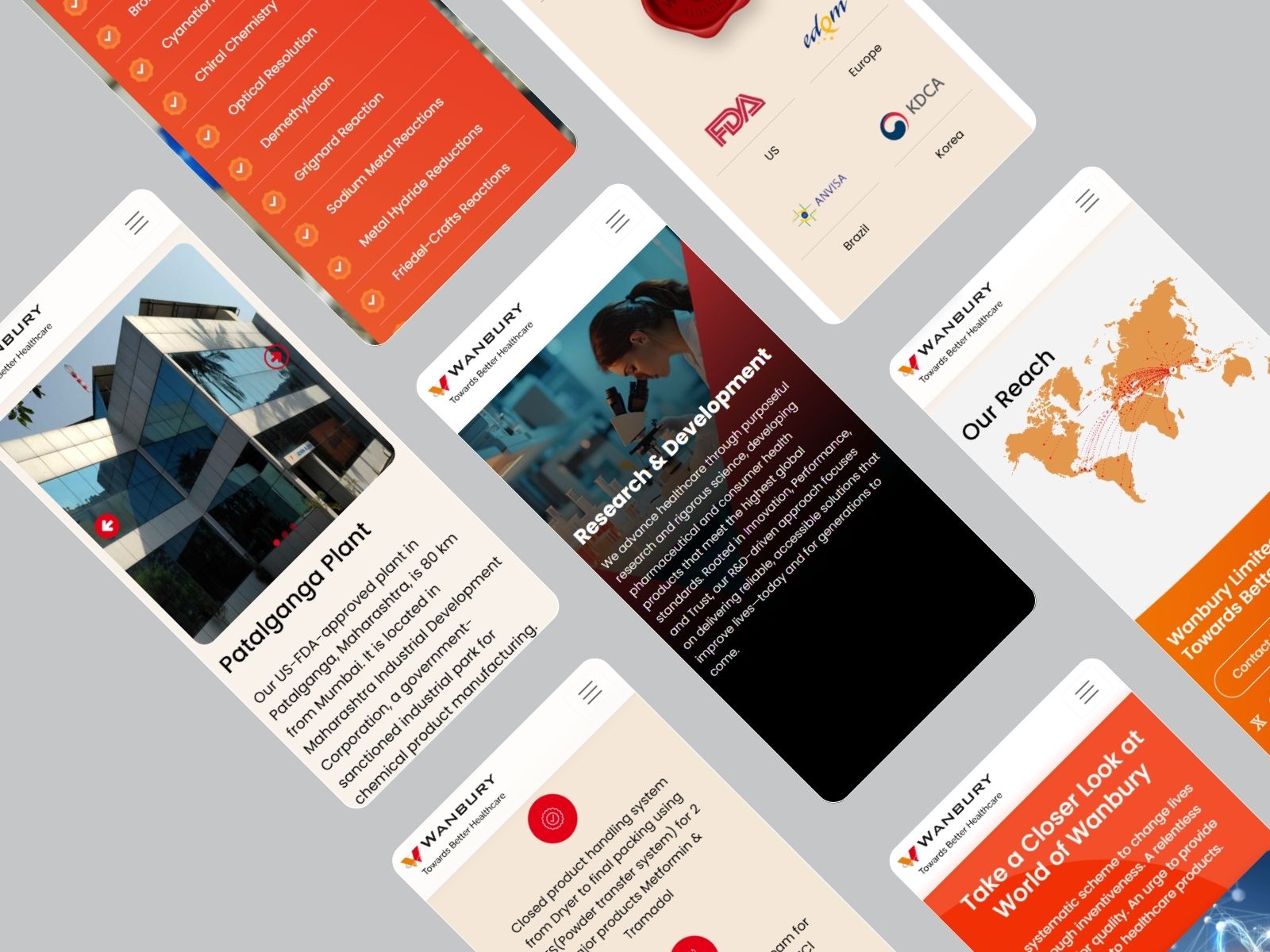
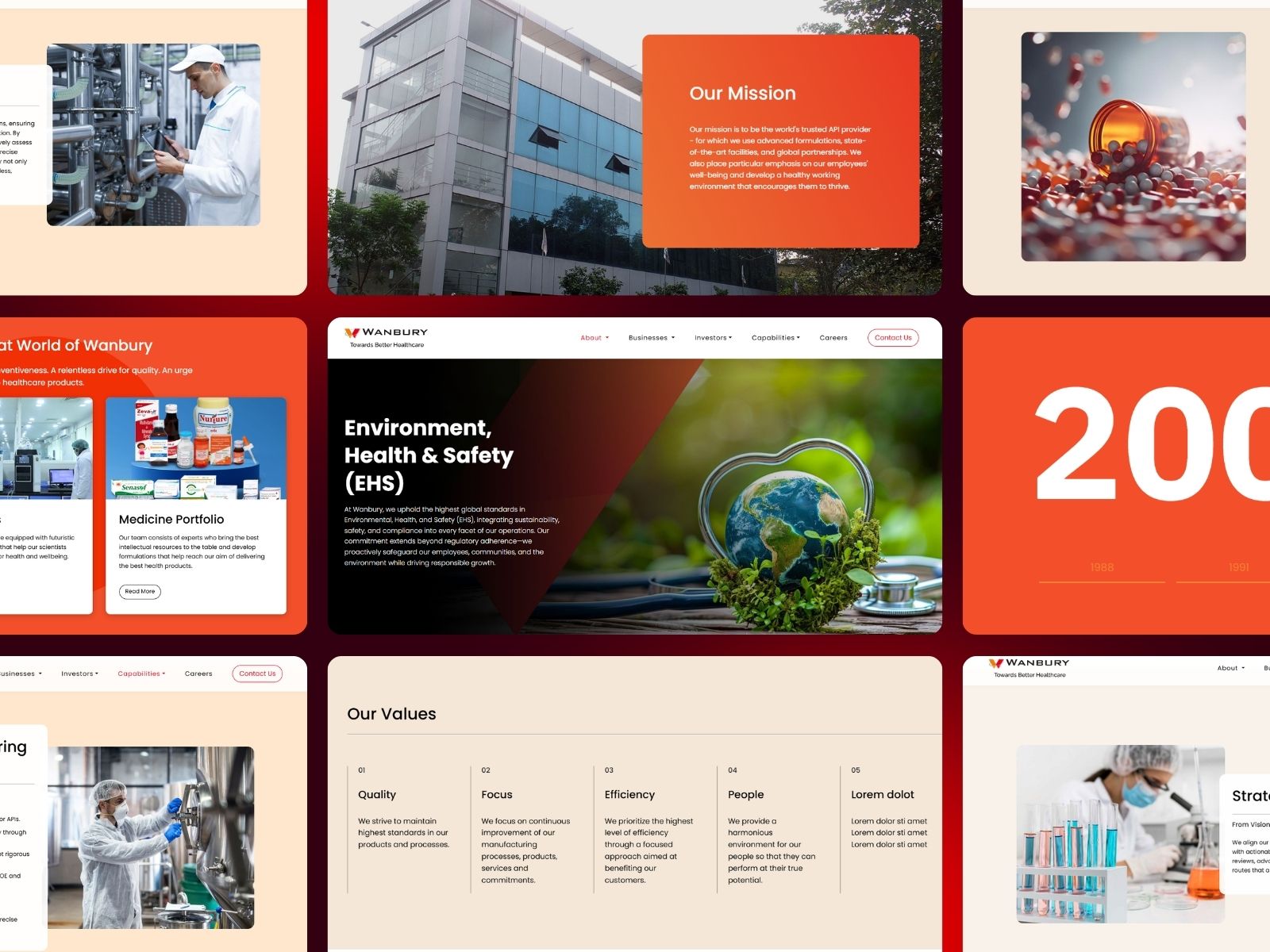
3. Visual Storytelling
We replaced dense text with:
- High-quality site and plant imagery.
- Infographics to show global reach.
- Icons for manufacturing capabilities and certifications.
- Clear, bold CTAs that direct visitors to key sections.
4. Technical Performance & SEO
- Clean code for faster load times.
- Schema markup for better search engine visibility.
- Optimized metadata and image tags for brand and industry keywords.
- Secure hosting setup with HTTPS for trust and compliance.
Conclusion
Our partnership with Wanbury resulted in a corporate website that is as forward-thinking as their pharmaceutical innovations. By combining structured content strategy, mobile-first UI/UX, and performance-focused development, we delivered a platform that builds trust, communicates leadership, and supports their global mission.