SaaS Web Development & Design: How to Build Websites That Convert
Your SaaS website isn’t just a digital storefront — it’s a UX-driven conversion engine. With thoughtful UI design, intuitive navigation, and user-centric content flow, you can turn casual visitors into loyal customers. In today’s fast-moving SaaS space, strong UX isn’t optional — it’s your competitive edge. This guide breaks down how to design a high-performing SaaS website rooted in real UI/UX principles.
Table of Contents
- Why SaaS Web Design Matters More Than You Think
- 7 Tried-and-Tested SaaS Website Design Tips
- Define Your Audience Before You Design
- Show, Don’t Just Tell – Display the UI
- Craft Headlines That Actually Hook
- Don’t Skip the CTA (It’s What Drives Conversions)
- Make Navigation Effortless
- Structure Your Website to Keep Visitors Around
- Rethink the Free Trial — Offer More Than One Way In
- Top Examples of Effective SaaS Website Design
- Final Thoughts: Build Smart. Convert Better.
Why SaaS Web Design Matters More Than You Think
Let me ask you a quick question — when was the last time you stuck around a poorly designed website?
Exactly.
In the world of SaaS, your website isn’t just a digital business card. It’s your lead magnet, your conversion machine, and often — your first interaction with a potential customer.
If your design doesn’t immediately communicate clarity, credibility, and value, visitors won’t stick around to explore your product. They’ll bounce — likely straight to a competitor with a better user experience.
That’s why investing in UI/UX design for SaaS platforms is no longer optional — it’s critical. From seamless onboarding flows to intuitive user interface design for SaaS dashboards, every interaction should be crafted to keep users engaged and guide them toward action.
In fact, a well-optimized SaaS website doesn’t just look good — it solves problems fast, highlights your value proposition instantly, and eliminates user friction across devices.
Whether you’re launching a new SaaS solution or revamping an outdated interface, I’m breaking down the proven strategies for creating conversion-driven, SEO-friendly SaaS websites — packed with real-world examples, actionable tips, and high-performing design principles.
Let’s dive in.
7 Tried-and-Tested SaaS Website Design Tips
These practical, high-impact tips can help turn your website into a customer-generating powerhouse.
1. Define Your Audience Before You Design
Let’s be real — if you’re designing your SaaS website without truly understanding who you’re designing it for, you’re not just missing the mark — you’re wasting time, budget, and opportunity.
User-centric design starts with deep audience research. Before you even think about color schemes or wireframes, ask yourself:
- Who is my ideal SaaS user persona?
- What specific pain points are they trying to solve with my product?
- Are they at the awareness, consideration, or decision stage of their buyer’s journey?
- Do they prefer to engage with a free trial, interactive product tour, on-demand demo, or a live walkthrough with a specialist?
Understanding these nuances helps you build a web experience that feels custom-made for them — and that’s where personalized UX design really shines.
Pro Tip: Speak their language — not yours.
Your SaaS website copy should mirror how your audience thinks and searches. Use high-intent long-tail keywords that align with what they’re actually Googling.
For example:
- “All-in-one team collaboration tool for hybrid workplaces”
- “Inventory management software for multi-location retailers”
- “Secure cloud-based accounting platform for freelancers”
Using this kind of targeted language not only boosts your SaaS SEO strategy, but it also makes your messaging feel instantly relevant — leading to higher engagement and conversions.
Remember: Great SaaS design starts long before the pixels hit the screen. It starts with empathy, strategy, and understanding your users inside out.

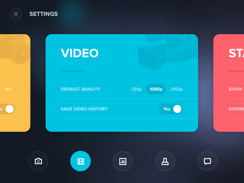
2. Show, Don’t Just Tell – Display the UI
Let’s face it — no one wants to wade through endless text to understand what your software does. Visitors don’t just want to read about your features — they want to see your product in action.
A high-converting SaaS website makes visual storytelling a priority. If your product’s user interface (UI) is clean, modern, and intuitive, show it off! This builds trust, credibility, and excitement from the first scroll.
Here’s how to make your product come alive on the screen:
- Add high-resolution UI screenshots of your dashboard, key features, and user flows
- Include short explainer videos or product walkthroughs to guide first-time visitors
- Use animated GIFs to demonstrate interactive elements like drag-and-drop features or real-time collaboration
- Position product visuals above the fold — don’t bury them! This is prime real estate on your homepage
Your goal here is to reduce friction and help visitors instantly think, “Yep, this looks like it’ll work for me.”
When you visually showcase your SaaS product’s interface, you’re not just showing how it works — you’re showing how easy it is to use. That’s a huge conversion booster.
Pro Tip:
Optimize all visual content for SEO by using descriptive alt text like “real-time project dashboard for SaaS teams” or “email campaign builder UI for small businesses.” This improves accessibility and search visibility.
In short — don’t just describe the benefits of your SaaS tool. Demonstrate them with real product visuals that speak louder than words.

3. Craft Headlines That Actually Hook
Your headline is the first thing users notice — and often, the reason they stay or leave.
A good SaaS website headline should be:
- Clear and to the point
- Emotionally relevant
- Focused on the outcome your product delivers
Forget vague claims like “#1 CRM platform.” Instead, highlight the value. Try:
“Close more deals with a streamlined sales dashboard”
“Never send a broken email again — test in real time”
These headlines feel personal, speak directly to pain points, and reflect the product’s core UI benefits without over-explaining.
Pro Tip: Pair your headline with a clean, responsive layout and a strong visual hierarchy. A well-designed hero section with focused messaging can dramatically improve engagement — especially when optimized for mobile UX.

4. Don’t Skip the CTA (It’s What Drives Conversions)
Your CTA isn’t just a button — it’s a guidepost in the user journey. A well-placed, well-written call-to-action can turn casual visitors into committed users.
Here’s how to make it work:
- Use action-driven text: “Start My Free Trial” feels more personal and effective than “Sign Up Now”
- Keep it short — 3 to 5 words is ideal
- Place CTAs across key touchpoints: your homepage, pricing section, product pages, and demo flow
First-person CTAs like “Get my free demo” often convert better — they feel more user-focused and intuitive.
Combine this with clean button design, consistent placement, and smart contrast to ensure your CTAs stand out across devices — especially in responsive SaaS UI design.

5. Make Navigation Effortless
If users have to guess where to go next, your site isn’t working.
Effective SaaS website navigation should feel intuitive — guiding users through your product without friction.
Here’s what helps:
- Stick to clear, familiar labels like “Features,” “Pricing,” or “Resources”
- Limit menu items to 5–7 for clarity
- Ensure your navigation is fully responsive across all devices
- Add a search bar if you’ve got lots of content or documentation
- If you use icons, label them — always
Simple navigation isn’t just good UX — it’s essential for keeping users engaged and increasing conversion rates on SaaS product landing pages.

6. Structure Your Website to Keep Visitors Around
You might have a powerful SaaS product, but if your website is just blocks of text, users will leave before they discover it.
A well-structured layout enhances user experience in SaaS web design and keeps visitors engaged longer. Most users don’t read — they scan. Your goal? Guide their attention with visual clarity and logical flow.
Here’s how to do it right:
- Break up content using bullet points and whitespace
- Add infographics, product visuals, or UI mockups to explain complex ideas
- Use drop-down menus or accordions for content-heavy sections
- Follow a clear structure: homepage → core value proposition → key features → call-to-action
This kind of user-centered website structure not only improves engagement but also supports better SEO and usability — especially when paired with responsive UI/UX layouts and clean information architecture for SaaS platforms.
Good structure isn’t just design — it’s strategy.
7. Rethink the Free Trial — Offer More Than One Way In
Free trials are great — but they only convert if your SaaS product is intuitive from the start.
If there’s any learning curve involved, don’t assume a trial alone will seal the deal. Instead, give users more flexible entry points tailored to their preferences and comfort levels.
Try these options:
- Interactive product demos with guided UI walkthroughs
- Live or on-demand webinars for hands-on support
- “Schedule a call” or personal onboarding sessions
- Freemium models with clear upgrade paths
- Real-world use cases and case studies that showcase value
By offering multiple low-friction touchpoints, you’re creating a smoother user onboarding experience for SaaS platforms, especially for complex tools.
A one-size-fits-all trial isn’t always enough — thoughtful, UX-driven alternatives can drive better engagement and long-term conversions.

Top Examples of Effective SaaS Website Design
Need some inspiration for your own SaaS web design? Here are a few standout platforms that blend aesthetics with usability — and convert like pros. These examples showcase UI/UX best practices for SaaS websites in action:
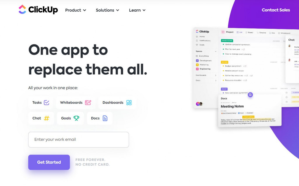
ClickUp
ClickUp nails the basics of clean, conversion-friendly design with:
- Smart use of whitespace for improved readability
- Clear, action-oriented CTAs like “Get Started – It’s Free”
- Strong visual hierarchy that naturally guides the user journey
Their user interface design supports every interaction, making complex task management feel simple.
InVision
As a design tool, InVision practices what it preaches:
- Beautiful, brand-consistent UI that reflects its creative audience
- Bold, benefit-driven headlines like “Design Better. Faster. Together.”
- CTAs placed strategically at scroll points for frictionless engagement
Their layout demonstrates a deep understanding of responsive SaaS UX design.

Adyen
Adyen’s homepage is a masterclass in minimalist SaaS website design:
- A clear value proposition: “Accept Payments Everywhere”
- Lightweight navigation with dropdowns to reduce cognitive load
- Clean UI elements that keep the user focused on core offerings
The site feels premium while remaining easy to navigate across devices.

Litmus
Litmus proves that good design and clarity drive action:
- Straightforward, benefit-first headlines that speak to email marketers
- CTAs like “Never Send a Broken Email Again” that reflect user pain points
- A thoughtfully structured layout that supports both new and returning users
Their use of microcopy, call-to-action design, and UI flow is built to convert.
These brands understand that SaaS web design isn’t just about looks — it’s about creating a smooth, intuitive experience that leads users from interest to action.

Final Thoughts: Build Smart. Convert Better.
At the end of the day, your SaaS website isn’t just a design project — it’s your growth engine.
When done right, it becomes a 24/7 sales rep, a product showcase, and a trust builder — all rolled into one. But that only happens when UI/UX design and conversion strategy work hand in hand.
Here’s what I want you to take away:
- Know your audience deeply — design for their needs, not yours
- Lead with visuals, headlines, and layouts that offer instant clarity
- Make every scroll, click, and interaction intuitive across all devices
- Use strong, user-focused CTAs that guide visitors to action
- Offer multiple, low-friction entry points into your product experience
And if you’re serious about scaling your SaaS business with high-converting web design, let’s talk.
At Emerge Digital, we specialize in building user-first, performance-driven SaaS websites that drive results — not just clicks.
Ready to turn your site into a conversion machine?
Let’s build something great together.
Explore more
The 15 Best Sustainable Shopify Stores to Shop in 2025: Eco-Friendly Brands Leading the Way
15 Shopify Health Brands Redefining Wellness in 2025
15 Essential Features for Your Health and Wellness Store

About the Author
Priya, Co-Founder of Emerge Digital, is a UI/UX enthusiast with 15 years of experience. She’s passionate about crafting user-centered designs that exceed expectations, delivering meaningful and engaging digital experiences. At Emerge Digital, Priya blends her deep expertise with a commitment to client and user needs, driving innovative design solutions.