When running an ecommerce store, it’s easy to forget that visitor #3456 is a real, live person. A person subject to cognitive biases, persuasion techniques, psychological theories, etc.
Having a basic understanding of some of the most popular persuasion techniques can put you ahead of the competition. You’ll have more insight into why visitors abandon their carts, why they buy and how they’re persuaded.
More importantly, you’ll have insight into how you can turn theory into practice, science into cold, hard cash.
Here are 13 persuasion techniques that will give you an unfair advantage in the most important battlefield of all: the human brain.
1. Reciprocity
Reciprocity is a social norm that states that if I give you something, you’ll feel obligated to return the favor. Essentially, this allows me to ask for something in return rather than wait for a voluntary act from you.
Here’s where it gets really interesting. The two values don’t necessarily need to be equal. For example, if you hold the door for me, I’m more likely to say yes to buying you a coffee.
In her book, The Art of Asking, Amanda Palmer recalls working as a living statue. Painted white and dressed in a wedding gown, she handed out flowers on the street. She earned enough to pay her rent for over five years.
Now, she’s applying the technique to her ecommerce store:
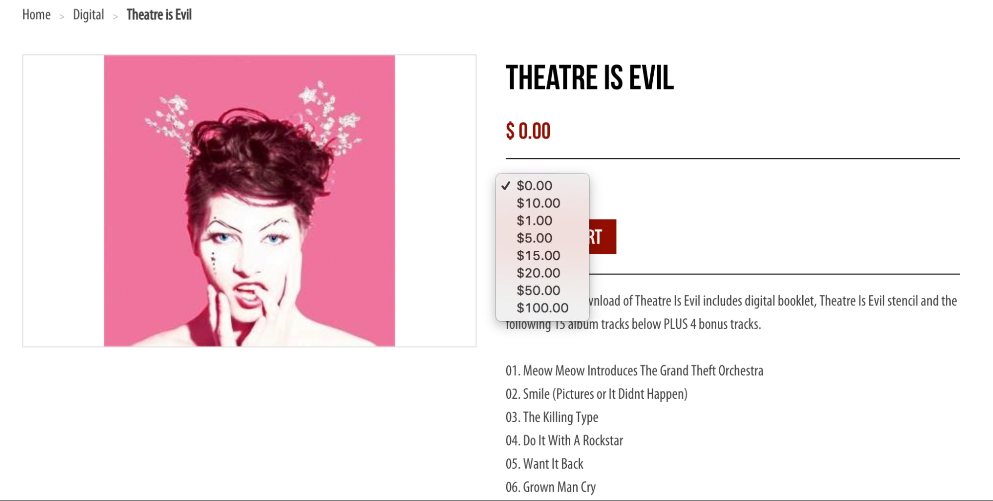
As you can see, customers can choose what they want to pay for the album. She provides the value, they choose how much they want to reciprocate.
Other ways to apply it to your store:
- Offer a tripwire, an irresistible and low price product designed not to make money, but to change the relationship from casual visitor to actual buyer.
- Offer a free gift or discount, including: free shipping, a welcome discount for first-time buyers, product samples, an unexpected free gift to go along with an ordered product, etc.
- Send appreciation cards and notes to existing customers.
2. Consistency
Consistency states that once you commit to something, especially in writing, you are more likely to follow through or maintain the stance. People like when their thoughts and actions are aligned.
Once you get someone to make a commitment, they begin to engage in self-persuasion. That is, they begin to justify related actions to themselves and others.
Chubbies plays on consistency in an interesting way:
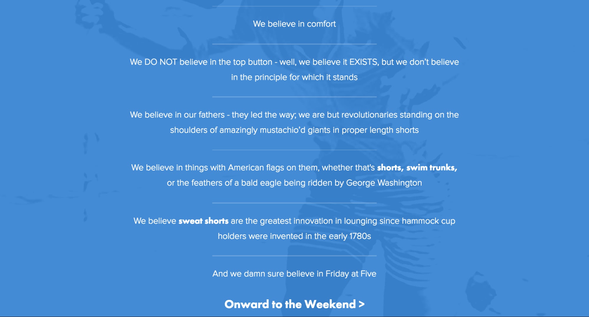
By listing their beliefs, they’re actively calling for people who share similar beliefs. If these beliefs resonate with a visitor, they’re more likely to buy because that would align what they think and what they do.
Other ways to apply it to your store:
- Push visitors to subscribe to your email list or download a relevant free resource. Once they’ve made the small commitment, they’re more likely to make a bigger commitment.
- Encourage social sharing at every stage. The more public the commitment, the better.
3. Social Proof
Humans are naturally social (yes, even before social media came along). As a result, we’re heavily influenced by those around us, especially if we hold them in high regard. Social proof states that you base your actions and beliefs on those around you.
You’re most likely to follow the lead of someone who is similar to you or in situations where you’re very uncertain. Often, there’s comfort in just doing what everyone else is doing.
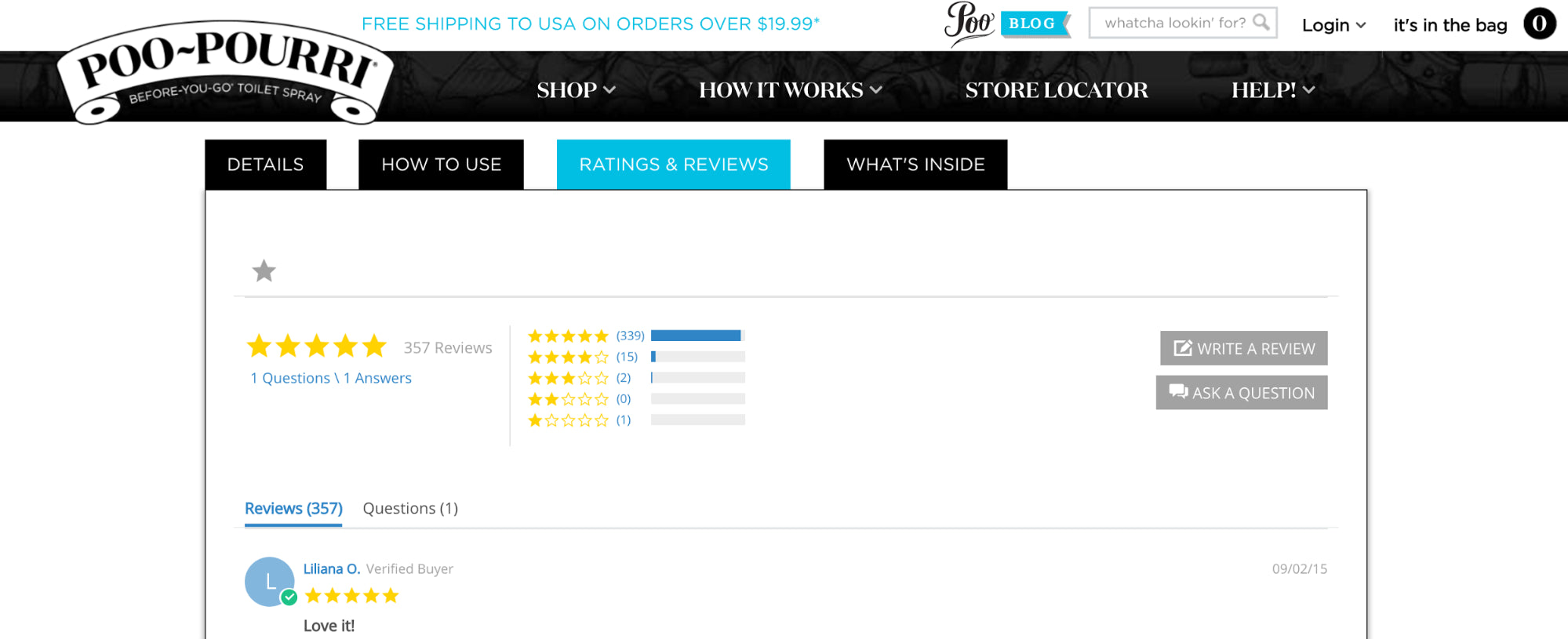
Ratings, reviews, share counts, testimonials… social proof is all around you.
Here’s an example from Poo-Pourri:
Other ways to apply it to your store:
- Have an influencer or expert endorse or provide a testimonial for your product.
- Show the number of people who have purchased recently or how many people are currently viewing the product.
- Add trust icons, like media logos and mentions.
4. Likeness
Likeness simply states that you tend to say “yes” to people you like. That comes down to two factors:
- Physical Attraction: Studies have shown time and time again that people who are physically attractive are more persuasive.
- Similarity: You are more likely to be persuaded by someone you deem similar to yourself.
This translates quite easily to store design and voice of customer copywriting. For example, which of these sites would you rather buy from?

I’m willing to bet it’s the bottom one with the cleaner, more attractive design (Happiness Abscissa).
Other ways to apply it to your store:
- Come across as a friend, not a big corporation. The more human and similar your brand seems, the better.
- Support the same causes as your customers. Some stores do this by donating a portion of profit to a relevant charity.
5. Authority
Authority states that you have a tendency to believe that if any expert or person of authority says something, it must be true.
There is a very famous study, the Milgram experiment, attached to this persuasion technique. It was conducted in 1961. Basically, two participants (a teacher and a learner) were placed in two different rooms. The learner was hooked up to an electric shock machine, which the teacher controlled.
A supervisor, wearing a lab coat, was also present. He told the teacher to ask the learner questions and shock him when he answered incorrectly. After every incorrect answer, the voltage increased (up to 450 volts).
The catch? The learner was an actor, making fake pain noises after each shock. The study explored how much pain the participants were willing to inflict on a completely innocent person if instructed by a person of authority.
As it turns out, a lot. Most teachers were willing to give 450 volts if instructed.
Gary Vaynerchuk capitalizes on his authority through his shop:
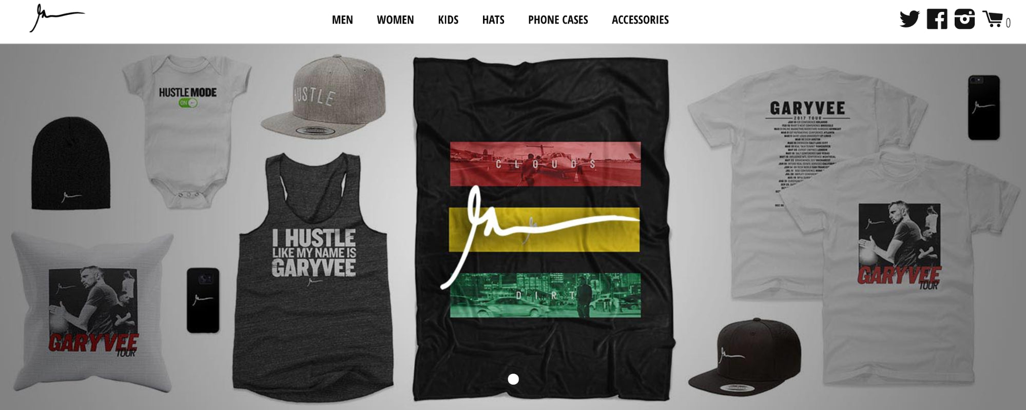
If you follow him on social media, you see him wearing these shirts. If you watch his videos, you’ve heard the lyric “hustle like my name is Gary Vee”.
How to apply it to your store:
- Build authority by highlighting qualifications (job title, product awards, etc.)
- Avoid cliché, vague awards and claims (e.g. “World’s best doughnuts!”)
- When in doubt, borrow authority from someone else via an endorsement, a product review, etc.
6. Scarcity
Scarcity states that when something is limited in quantity, you assign more value to it.
Remember when Johnny Carson helped create a toilet paper shortage in 1973? During his opening monologue of The Tonight Show, he made a joke about an upcoming toilet paper shortage. People rushed out to buy it, creating an actual nationwide consumer toilet paper shortage.
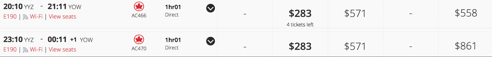
Scarcity, too, is all around us in ecommerce. Anyone who buys plane tickets online will recognize this:
Here it is on Hammock Town, too:

The closer that number gets to 0, the more persuasive.
Other ways to apply it to your store:
- Offer limited-time only discounts and deals. A countdown to when the discount or deal ends can spur purchases.
- In the cart, show how much the visitor saved with a call to action to checkout before the savings expire.
- Offer free express shipping or something similar to those who purchase before a certain time of day.
7. Price Anchoring
Price anchoring states that the first price presented plays a big role in the decision-making process.
For example, the price is regularly $129.99, which is noted first. But it’s currently on sale for just $59.99. That first price, $129.99, serves as an anchor, making the discounted price seem like a total steal.
Here’s how Natural Force does it:

And here’s how Greats does it:
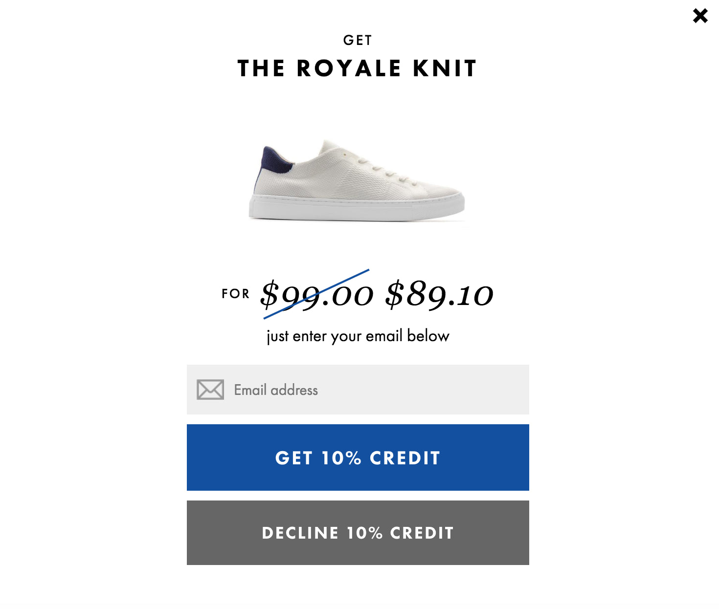
The first, higher price sets the stage and becomes the anchor that makes the second price so much more appealing.
Let’s say Greats didn’t use price anchoring. $89.10 might seem like too much to spend. But the $99 original price clearly indicates that it isn’t. You might actually find price anchoring limits comparison shopping as well.
8. Familiarity
Familiarity states that you prefer the things and people you are familiar with. Yes, seriously. Studies have even found that you’re more likely to fall in love with someone the more often you see them. Your happiness is actually correlated with how many things you’re familiar with.
This fondness for familiarity is why you’ll often find the cart in the top, right-hand corner of a store. Or why you’re so attached to the neighborhood you live in. Or why you tend to order the same one or two meals at your favorite restaurant.
Familiarity comes down to three factors:
- Cognitive Fluency: How easy is it to think about something?
- Prototypicality: How similar is it to others in the same category or industry?
- Habit: How well does it match previous, similar experiences?
This is why knowing your audience is so important. Being familiar with the experiences and language they’re expecting can be incredibly useful for increasing conversions.
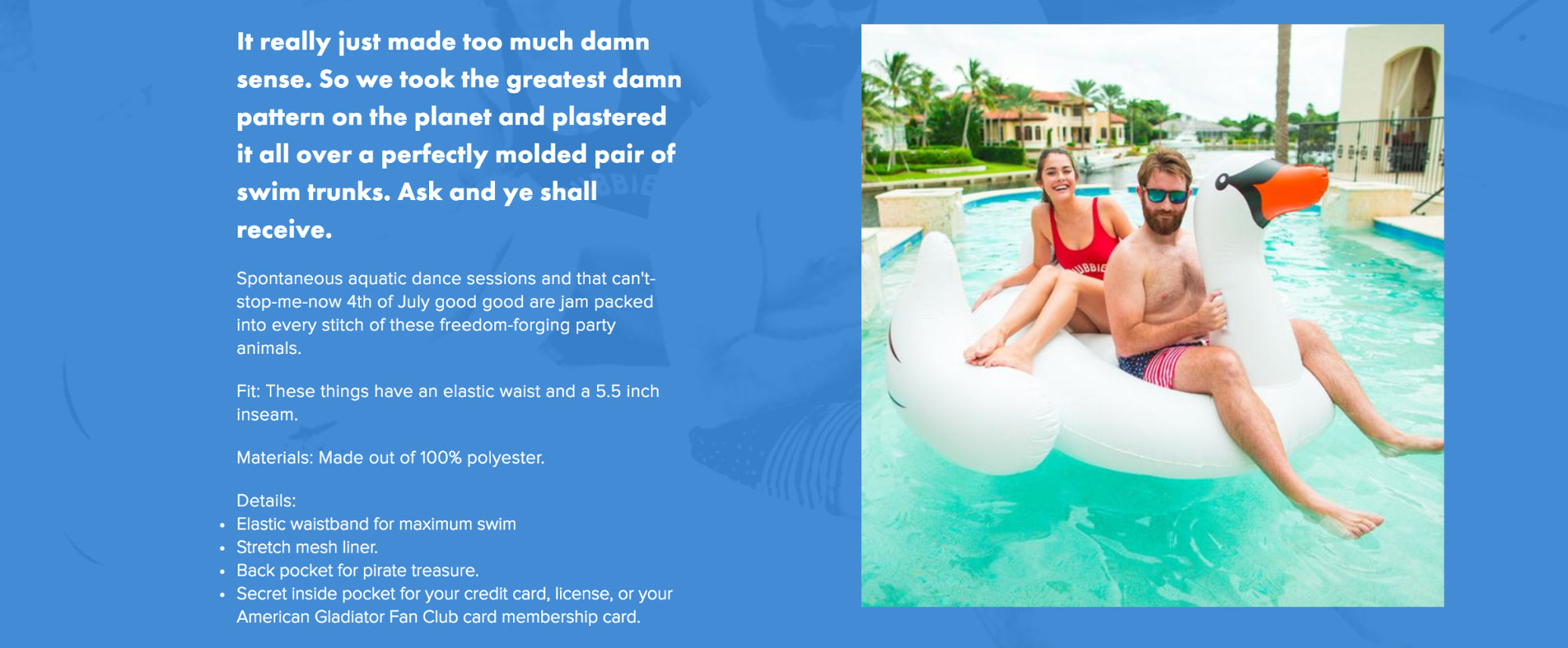
Chubbies is known for voice of customer copy:
And so is The Oatmeal:

They both simplify as much as possible, follow existing prototypes and even sound familiar.
Other ways to apply it to your store:
- Use a simple design that’s low complexity and low on clutter. Don’t rage too hard against the machine. Stick with a prototypical design that works as expected for the ecommerce industry.
- Use words and phrases your visitors will find familiar and scannable. Speak as they would speak, if you will.
- Take a cue from the types of calls to action your direct and indirect competitors are using. How do they match up? You don’t want to copy them, but you want to make sure you’re meeting expectations.
9. Attentional Bias
Attentional bias states that you pay more attention to emotionally stimulating factors and downplay other factors. The more intense and touching something is, the more attention you pay to it. Makes sense, right? That’s why fear and sex tend to be so persuasive.
We all remember that Sarah McLachlan commercial.
So, when WWF is trying to raise money to save and support animals, they tug on the heartstrings a bit with emotion-evoking visuals:
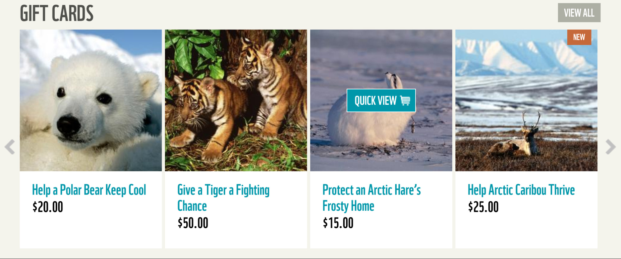
A happy, thriving baby polar bear who could keep cool all thanks to you? That’s a pretty positive emotion. It’s no surprise this type of messaging is conveyed over and over again through copy and images.
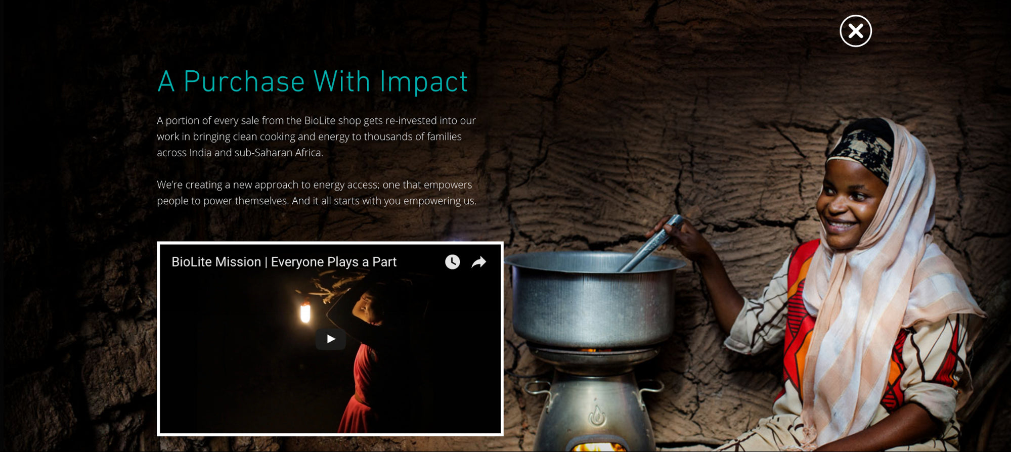
BioLite does something similar:
Other ways to apply it to your store:
- Conduct some qualitative research to determine what emotional state people arrive in. Do they come to you stressed, desperately seeking a solution? This will help you determine whether you should take advantage of the natural emotional state or try to change it.
- Font, color and images all have emotional values. Be purposeful when choosing them.
- Writing copy that tells a story can help you make an emotional appeal.
10. Visual Cueing
Visual cueing states that your attention and focus while visiting a site can be managed and directed by design.
CXL Institute recently conducted an interesting study on visual cueing. They compared six different visual cues against the control (no visual cues):
- Human looking away
- Human looking towards
- Hand-drawn arrow
- Triangular
- Line
- Highlight
The results? Visual cues don’t impact how quickly something is spotted, but they do impact how much attention is paid to something. In this case, a signup form. The hand-drawn arrow performed the best, for anyone interested.
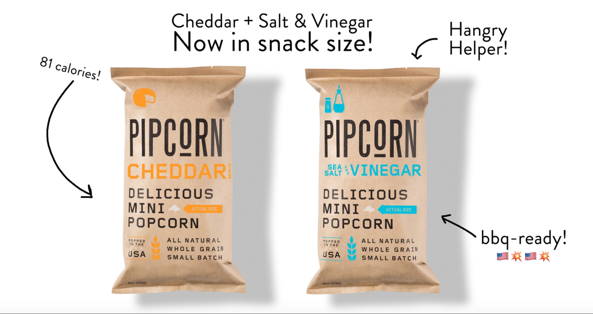
Pipsnacks is certainly no stranger to visual cueing, using it to draw attention to the product (and its benefits):
Other ways to apply it to your store:
- Use visual cues to direct visitors down the page, especially if you have valuable product information below the “fold”.
11. Loss Aversion
Loss aversion states that you strongly prefer to avoid losses than to acquire gains. According to Daniel Kahneman, a psychologist, we typically fear loss twice as much as we enjoy success.
So, to put that into perspective, your visitors fear not liking your product twice as much as they think they’ll enjoy the benefits of having your product.
Perhaps that’s why some stores so prominently display their return policy. Like Muse:

And Tortuga:

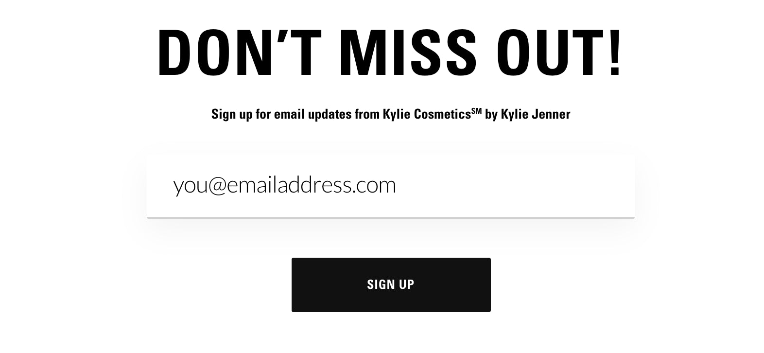
Or why Kylie Cosmetics framed their email subscription call to action this way:
It’s worth noting that there are some exceptions. Kahneman has found that people decide differently, depending on whether the decision is framed as a loss or a gain. So:
- If you want someone to make a risk-averse choice, focus on what they will gain by making the choice you want them to.
- If you want someone to make a risk-seeking choice, focus on what they will lose by not making the choice you want them to.
Other ways to apply it to your store:
- Use your images and other visuals to show the loss scenario instead of the gain scenario.
- Choose the wording of your offers carefully. “Don’t miss out on our summer sale: 10% off all t-shirts.” might work better than “Take 10% off t-shirts.”
12. IKEA Effect
The IKEA effect states that the more effort we invest into something, the more we value it. Anyone who has spent three hours putting together an IKEA dresser knows how this feels.
Product customization is a great way to trigger this effect. The more effort your visitors put into customization, the more they value the product. You might find that this reduces cart abandonment and increases conversions.
StandDesk does this well. In fact, they invite you to build your desk, not buy it:
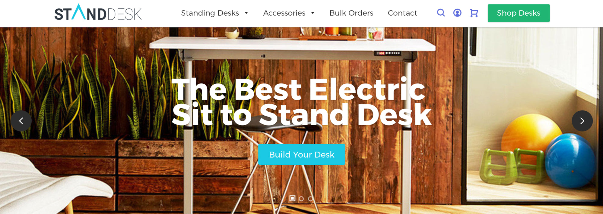
All of the customization options require thought and effort from the customer. No, they’re not trying to assemble a dresser with an Allen key for three hours, but it does become a labor of love along the way:

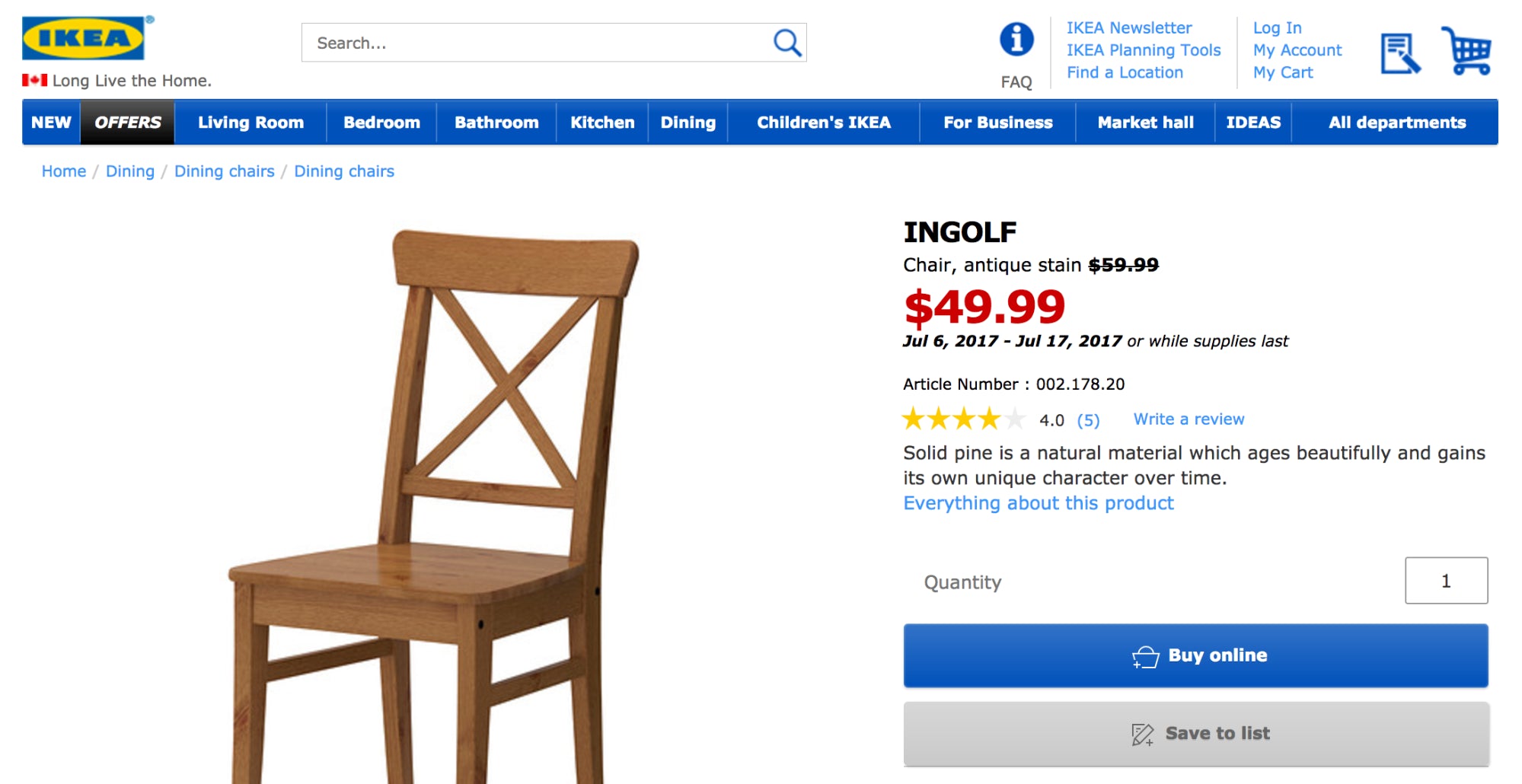
13. Paradox of Choice
If you’re offered one option, the choice is clear: do or do not buy. When you’re offered two options, your brain focuses on choosing between the two. Suddenly, the idea of not buying anything at all is muted.
In that case, offering more than one option can help make a sale.
However, if you offer too many options, analysis paralysis comes into play. With so many options, you can’t decide and end up choosing nothing at all.
This is known as the paradox of choice. The key, of course, is finding the right balance of options.
It’s why IKEA puts two calls to action on their product pages:
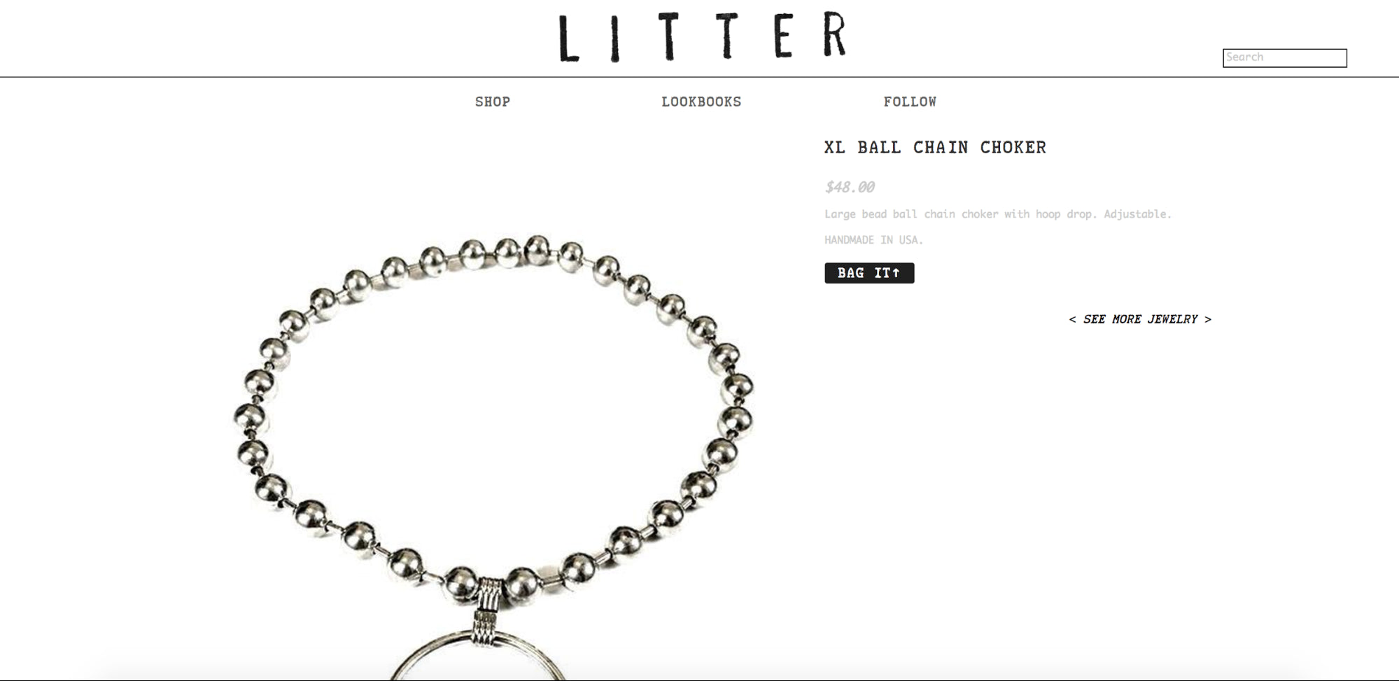
Just like Litter:
And Kinky Tease:

I remember at CTA Conference in 2015, Bart Schutz spoke about a test he had run relating to choice. He found that even adding a “Print This Page” link beside a previously lone call to action boosted conversions.
Of course, this paradox also has inventory implications.
Conclusion
The truth is that psychology and persuasion techniques don’t always translate well to the online marketplace. However, these 13 persuasion techniques have certainly proven that they have a place in ecommerce. At the very least, they’re worth experimenting with.
Leave a comment below if I’ve missed a persuasion technique that’s worked particularly well for you.
Post Credit : https://www.shopify.com/blog/13-persuasion-techniques