This is the time to increase the number of loyal and repeated customers with correct UX optimization.
When it comes to the conversion rate for e-commerce, you need to consider the customer journey on your website.
Because if you understand your customers’ problems and needs, you can improve their experience and drive conversions.
This article will discuss 22 tips for conversion rate optimization with benchmarks of top e-commerce websites.
Why is UX Crucial for E-commerce Conversion?
UX is one of the most precious factors of business because UX is a great determinant.
While many elements indirectly influence e-commerce conversion, UX is representative of customers’ journeys.
Therefore, UX has a close relationship with
- Conversion rate optimization
- Boosting conversion rate
- Increasing customer satisfaction
- Creating customer loyalty
- Reducing cart abandonment rate
- Improving the brand image
- Caring about the mobile compliance of website
There are many points that can be affected by the connection between the UX and E-commerce conversion, so let’s not waste time!
Valuable UX Tips for Converting More
These 22 UX tips will help you make your website user-friendly.
Whether you run your business now or be a new beginner, it is best for you to make it user-friendly now before it gets too late.
1. Have an Effective Homepage and Category

Your homepage creates the first impression for your customers. If you have an engaging homepage design, it is more likely your visitors will stay on your website.
Adidas has a successful homepage, and category design with 68.7 performance points based on what Baymard Institute shared.
They have a simple homepage with all the required elements.
What are the elements of a successful homepage?
Adidas displays newly launched and popular products without cluttering the homepage. Simplicity increases usability.
It both catches the attention of visitors and gets up to date.
Presenting an organized and functional drop-down menu to access categories maximizes UX performance.
Make it easier for your customers to find the products they are looking for with a well-arranged category section to increase the conversion rate.
2. Make On-Site Search Simpler
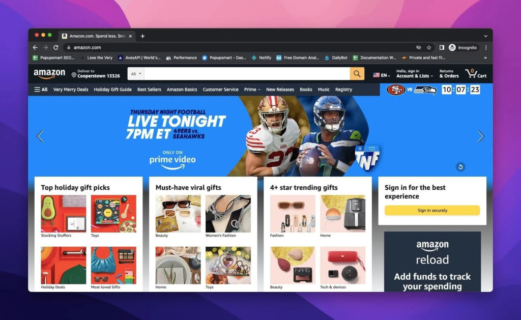
You need to assist your customers to ensure they find what they are looking for. A user-friendly on-site search bar drives conversion, more sales, and increases engagement.
Benchmarks of Amazon show that they have an amazing on-site search performance of 84.0.
Amazon provides an easy-to-use search box with a simple dropdown menu to specify the product the customers are searching for.
What are the best practices of on-site search?
- Enable autocorrect, autocomplete, filters
- Auto-suggest and recommendation
- Typo-tolerant search box
- Provide extensive filters and facets
- Mobile-search compatibility
3. Improve Product Listing & Filtering Performance
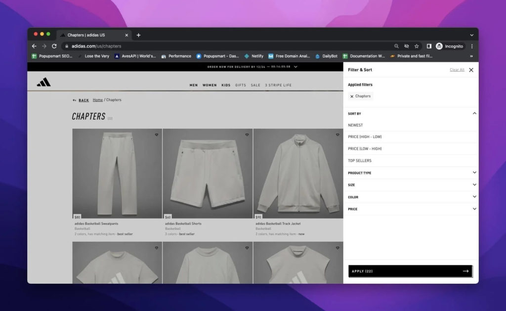
Optimize product listing and filtering performance to provide an effective product search and increase conversion rate.
Adidas’ current product listing and filtering performance is around 37.
What elements does Adidas include in a product listing?
Adidas provides comprehensive specifications in filtering the products such as;
- Gender
- Product type
- Product category
- Color
- Size
- Material
- Brand
- Price range
4. Allow Product Comparison
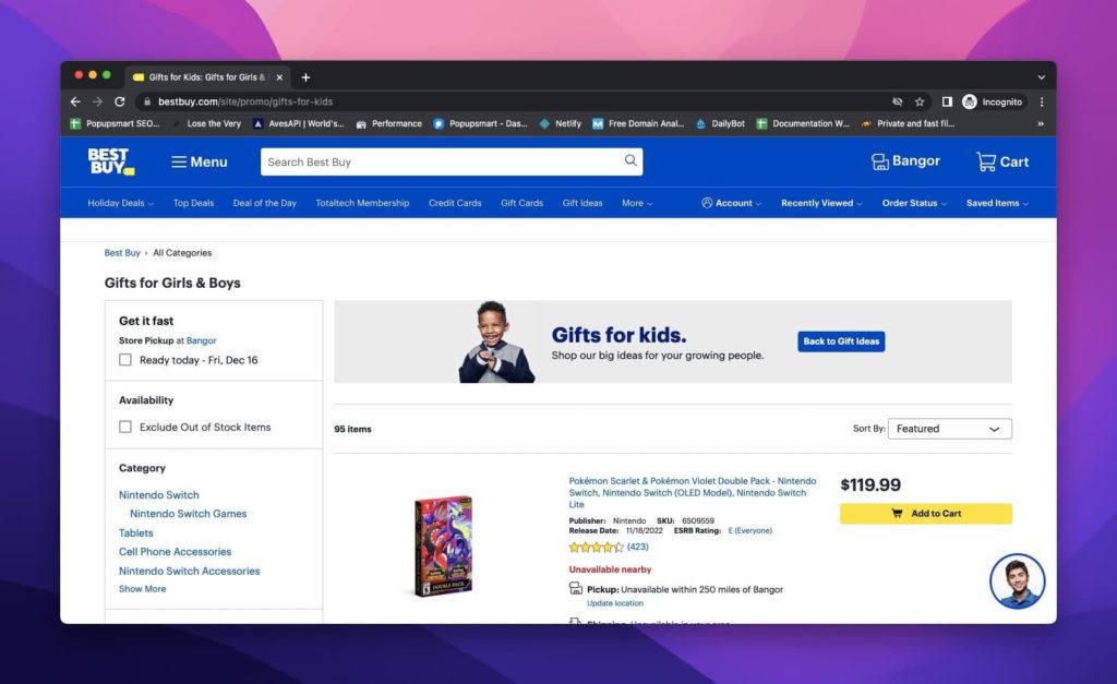
It is no secret that online shoppers compare products. You can convert visitors into customers by allowing them to compare your products.
The benchmark of Best Buy shows that they are one of the top-ranking e-commerce sites, according to baymard.com.
Best Buy provides product comparison through which customers can compare the products’ features and prices.
The important point is to know your customers’ deciding criteria. Then, you can achieve a successful conversion rate optimization.
5. Optimize Your Product Page Layout
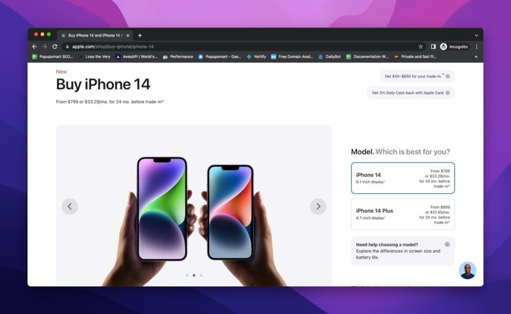
Cluttered and complex product pages decrease conversions and sales.
Having a clear and satisfactory product page layout is an important step in conversion rate optimization.
The latest e-commerce benchmarks show that Apple has a decent product page layout performance.
Apple presents product information, options, and product comparison on a simple and effective product page layout.
Moreover, they include video tutorials to be more helpful for customers who cannot decide.
6. Define Your Products Efficiently

Online shoppers carefully examine the products’ information before making a purchase. Defining your products in detail and providing high-quality images or videos of your products is essential for a better conversion rate optimization.
Apple’s benchmarks prove that they have an amazing image gallery UI, and they improve interaction with the evolving world.
You can optimize your product page for a higher conversion rate by displaying high-quality images demonstrating your product’s features.
Apart from Apple, Home Depot has a perfect product description performance with extensive and detailed product descriptions that bring conversions!
7. Use Clear CTAs
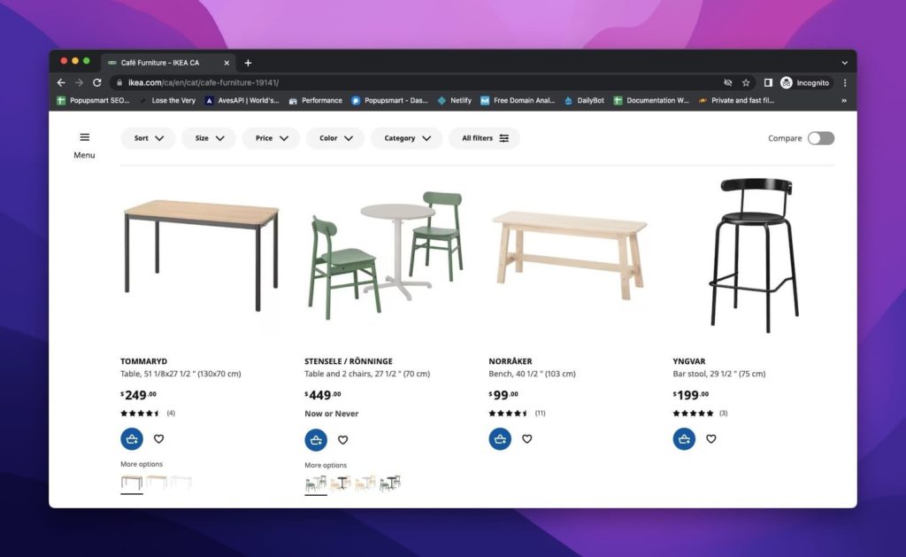
Clear calls-to-action improve user experience since they increase your website’s usability.
IKEA presents a cart icon to add the product to your cart and a heart icon to save the product for your next shopping or so.
Since these icons are universal, it is not that hard to understand and shop from Ikea.
You should use striking CTAs on your popups as well. User-friendly popup services like Popupsmart that can seamlessly integrate with your website and provide modern popup designs that boost conversion.
8. Include Social Proof
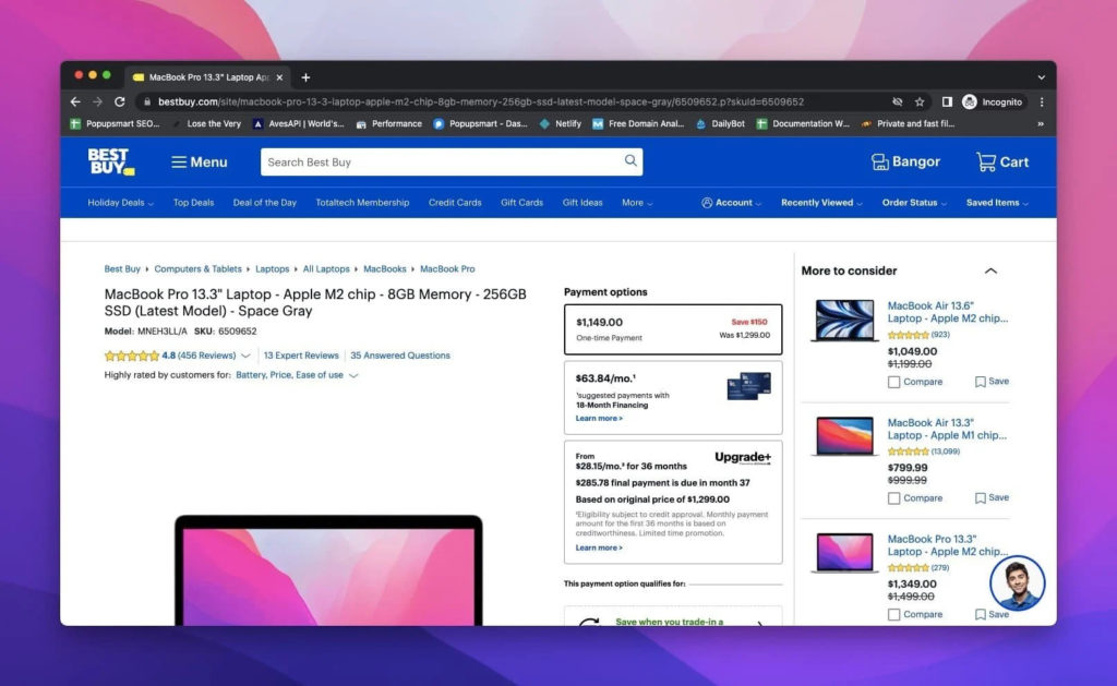
Social proof is the cornerstone when it comes to deciding whether to buy a product or not.
Include product reviews and ratings on your website for a higher conversion rate.
Best Buy has a great ‘user reviews’ performance of 88.1. They give place to user reviews on the product pages, which improves overall UX performance.
Using popups to display social proof is one of the best practices to gain customer trust and increase conversions. To get inspiration, you can check social proof popups.
9. Allow Guest Checkout and Account Selection
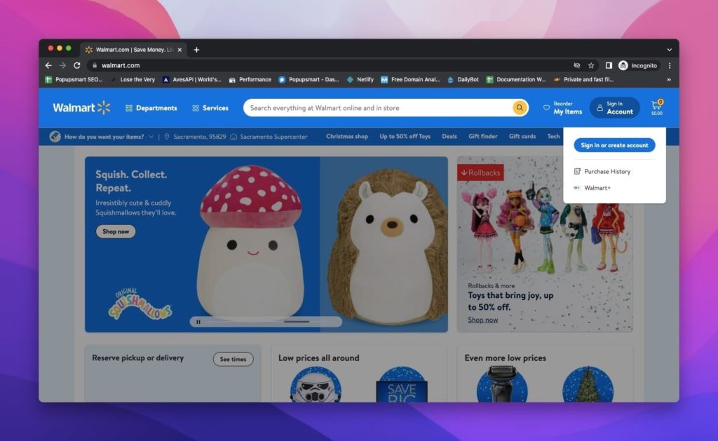
Not all your visitors have enough patience and time to create an account to buy your products.
Therefore, you should allow guest checkout and account selection for a successful conversion rate optimization.
Plus, creating an account should be simple to urge people to start.
Based on what Baymard’s research on Walmart suggests, Walmart has a good account selection and creation performance of 76.9.
They have a shortlist of required input fields that do not drive customers away.
10. Get Rid of Complex Password Creation
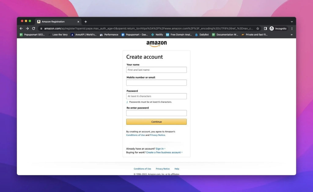
Improve customer account performance to optimize your e-commerce website for a higher conversion rate.
Your customers, either repeated or new, manage their shopping process and brand engagement via their accounts.
Amazon provides a mediocre customer accounts performance of 37.8.
You can optimize your website for better customer account performance like Amazon.
How?
Make the account creation process easier by eliminating complex password creation, which makes customers leave your website.
11. Offer Free Shipping and Shipping Options
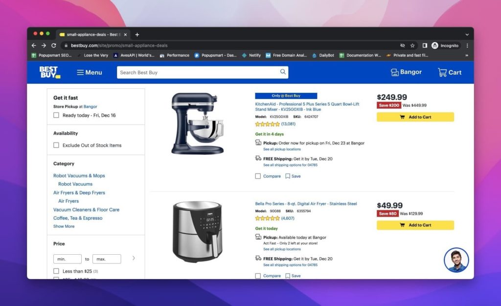 Everyone loves free shipping! Include a free shipping sign, and it will magically convert more customers.
Shipping is a crucial factor to consider in online shopping. Make sure you provide enough shipping options to optimize UX.
Best Buy’s customers seem satisfied with their shipping and store pickup performance which is 95.6.
They provide free shipping for many products and allow free store pickup. Moreover, they give the estimated delivery time, shipping options, and information.
12. Keep the Required Forms Simpler
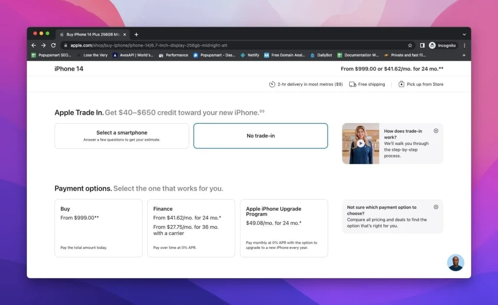
Long and complex input fields decrease UX performance.
You should avoid asking for unnecessary information.
It is best if you know the necessary ones that are enough to know your customers and their expectations.
Apple keeps the required data simple and to the point. Their customers find it decent since their customer & address information performance is 52.7.
13. Enable Autocompletion
 An autocompletion feature is an important part of a practical on-site search.
Many top e-commerce brands like Amazon use autocomplete feature on their search bar.
Why is autocompletion important?
- Providing alternatives to the searched product
- Confirming the availability of the product
- Guiding the customers
- Helping to eliminate misspelling
14. Improve Data Persistence & Validation Issues
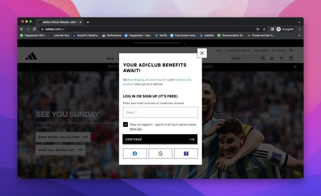
Customers expect to complete their purchases as fast as possible.
You may lose your leads due to continual validation errors.
Nobody likes to fill in the same information over and over!
Benchmarks show that Adidas has validation errors & data persistence performance of 85.3.
Create a smooth online shopping journey for your customers like Adidas, and you will see the difference.
15. Use Drop-Down Correctly
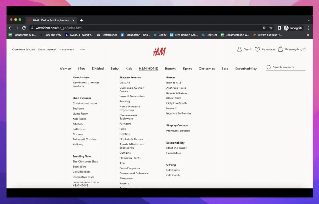
Drop-down menus are like a compass for users to navigate through your website until they reach the products they are looking for.
You should test your drop-down menus beforehand to guarantee the usability of your website and maximize the conversion rate.
Other than the category drop-down, the ‘my account’ drop-down is also essential to improve UX.
Benchmarks of H&M indicate that their drop-down usability is mediocre.
H&M has an account drop-down performance of 27.3, unlike most of the top performed e-commerce websites.
16. Review and Edit Cart Items
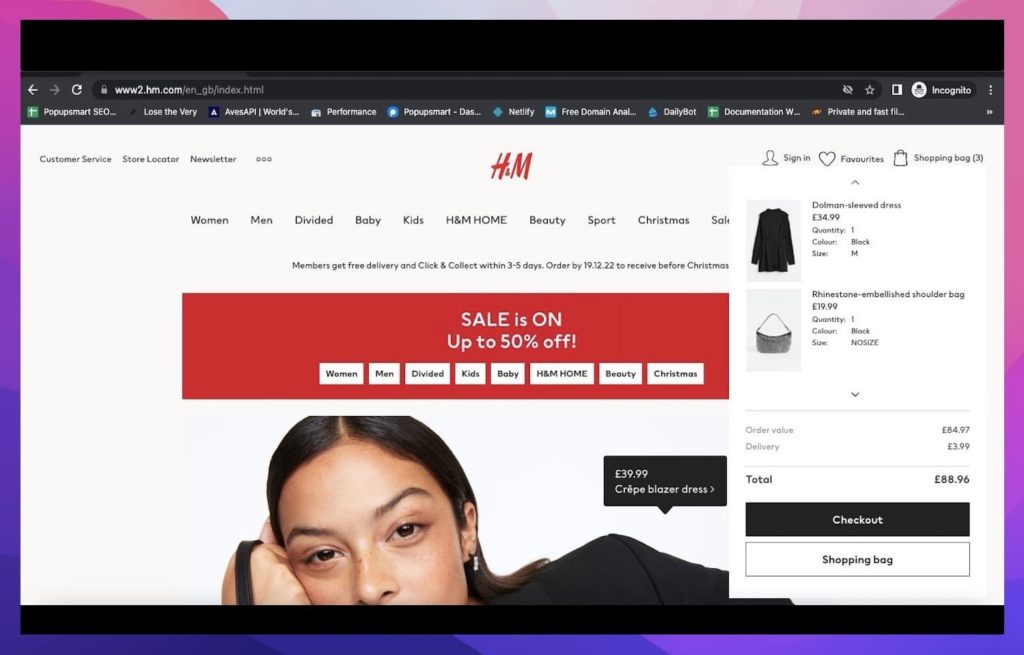
Order review allows customers to check the general details of their order before completing the purchase.
You can enable order review and editing cart items to drive conversion.
H&M has an order review performance of 57.0, which is decent.
17. Effective Customer Accounts
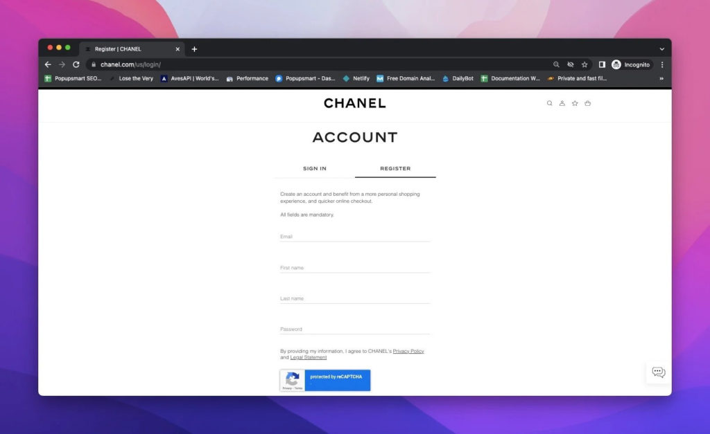
Customer accounts enable registered customers to interact with your e-commerce website. Through registration, your customers can;
- Make product reviews
- Engage with the brand community
- Get product recommendations via email
- Store billing data
Chanel has one of the best customer accounts UX performance which is 62.1.
You can optimize the conversion rate by creating user-friendly and efficient customer accounts.
18. Provide Better Order Tracking
![]()
Customers see order tracking as a must-have feature of an e-commerce website.
Better order tracking means driving more sales and conversion.
Shipment failures and lack of order tracking information cause bad reviews and loss of customers.
What are the best practices for order tracking?
- Tracking number and its link
- Estimated delivery time
- Tracking information on the website
- Order number and tracking by user login
- Notifications of delivery status
19. Make Order Return Simpler
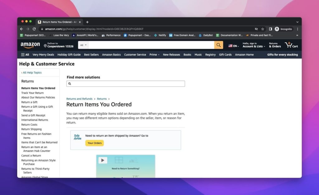
Creating the right return policy for your e-commerce business is essential for conversion rate optimization.
If you have a too-generous return policy, customers may abuse this, and you will end up losing lots of money.
Likewise, if you put scary words like ‘we are not responsible’ on the policy, customers will hesitate to buy, and you lose potential income. order-return-amazon
Amazon seems to have a great return policy that customers like.
The latest benchmarks indicate that Amazon’s order return performance is 125.0!
What is the general return policy of Amazon that makes it satisfactory? Products shipped from Amazon.com can be returned within 30 days of receipt of shipment in most cases.
Product return opportunities wipe away online shoppers’ hesitations about the products, which leads to more sales and conversion.
20. Full Mobile Compliance
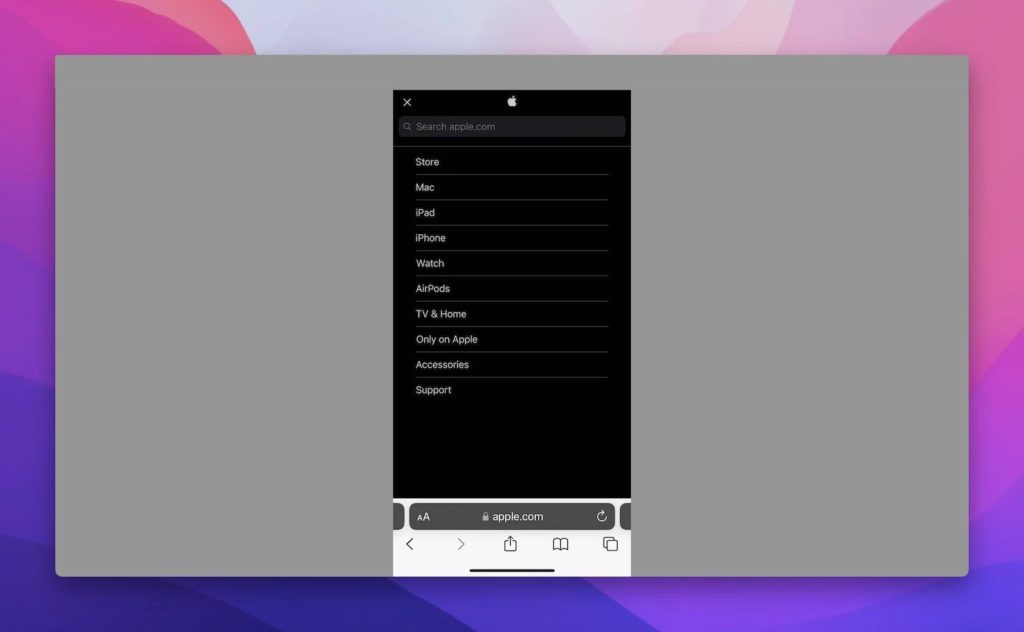
Nowadays, mobile e-commerce sales affect total e-commerce, which means you should optimize your e-commerce website for mobile compliance!
You can see the ultimate growth in your business if you provide mobile e-commerce.
UX benchmarks show that Apple’s mobile performance is 44.3. They provide a clean mobile interface that allows a simple online shopping experience.
Aim to increase the UX performance of these for better mobile e-commerce and conversion rate optimization:
- Mobile homepage
- Main navigation and categories
- Mobile on-site search
- Product list
- Mobile checkout
- Mobile forms
We know the importance of mobile compatibility for better UX performances. That’s why Popupsmart’s mobile popups are UX-friendly.
21. Test Your Website

Better be on the safe side than sorry!
You should test your website’s overall performance before completing your conversion rate optimization.
This way, you will give no place to discrepancies or errors that will lower your conversion rate.
What are some types of testing for e-commerce websites?
- Usability test
- Functionality test
- A/B test
- Database test
- Security test
- Performance test
- Mobile application/ responsiveness test
22. Have an Attractive Overall Design

You have tested your website, and everything works just fine; what now?
It is important to pay attention to the e-commerce website design.
Make the right impression on your customers by creating a beautiful website design that reflects your brand.
To have an eye-catching design you can optimize;
- Fonts
- Images
- Coherence
- Color schemes
- Mobile-friendly site-wide design
- Highlighted products
Commonly Asked Questions
What is UX in E-commerce?
UX is how your visitors can interact with your website. You can consider UX the hole journey of your visitors, starting with knowing you and lasting until customer satisfaction after buying the product or service.
What are the Phases That Affect UX?
The phases one can go through do change the mindset about the brand and the product, so be careful while building them.
Some of the most vital steps to consider are:
- Discovering the website
- Learning and finding the product
- Exploring the details of the product
- The cart to collect goods
- The payment and checkout process
- The confirmation part to decide
Is UX More Important Than UI for E-commerce?
The answer is open to discussion because both serve to increase conversion and the time spent. While UX focuses on the user experience on the website, UI deals with the visual design of the website mostly. Also, the research suggests that the UX doubles the conversion rate of UI when good UI and UX performances are considered.
Conclusion
Though conversion rate optimization varies according to business and industry type, it is possible to lead it carefully.
We hope that with these 22 tips for conversion rate optimization with benchmarks top e-commerce sites, you can drive more conversion by keeping an eye on your UX.
Keep testing until you find what works best for your e-commerce site.
Content Credits: https://popupsmart.com/blog/ux-tips-for-ecommerce-conversion


