During a recent update to our E-commerce User Experience report series, we were encouraged by some e-commerce website design improvements, while discouraged to see old problems sticking around and some new ones emerging.
In comparison to the findings from our previous research of e-commerce website development, we were happy to see larger product images that help answer users’ questions, robust reviews that provide context around feedback, and easier application of discount and coupon codes, helping bargain hunters complete purchases.
We saw some new issues as well, including a trend toward hiding or minimizing product descriptions and details. An old problem remains sites that make it difficult to know when an item is added to the shopping cart. And new, cleanly designed sites emphasize another problem: cluttered and dated Customer Service sections of sites.
The Good: Bigger Product Images
Whether due to increasing screen sizes and resolution, more spacious visual designs or for the benefit of the site experience, sites are embracing large product images.
Images have grown in size on product pages, with more detail visible. We all know that a picture is worth a thousand words and on e-commerce sites, a (good) picture is worth a thousand dollars. In usability testing, users glean product details from images, including details that aren’t covered in the product description. Large images can show more detail, and multiple views offer even more information. Pictures of products in use or context go a long way to answering customer questions. We’ve seen a user realize that a toaster had big enough slots for bagels and another know that coasters had feet that would protect her wooden furniture, simply by looking at product images.
The increase in image size is not only seen on product pages. Category pages, which often cram as many tiny images of products on one page as possible, are also using larger images. This lets users see detail early on in the shopping and comparison process, helping users spend their time exploring the right products.
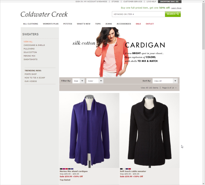
Product images are larger on many sites, such as on a category page from Coldwater Creek, allowing shoppers to see more product detail.
While on the topic of images, for good measure we need to reiterate the old finding that pictures that look like banner ads will be ignored, and that stock photos hurt more than they help. When we recommend big, detailed photos, we mean photos of the actual products (including photos of products in use or in context).
The Good: More Robust Reviews
Reviews help users understand more about the quality and use of the product. Reviews can answer questions or address concerns that users have about the product, because they’re written from the perspective of people who needed or wanted, and actually used the product. Offering reviews are helpful, but sites are increasingly taking reviews further by offering additional information about the reviewer or by better summarizing the reviews.
Many sites are adding details to reviews: relevant details about the person writing the review, such as gender or age, or particular product criteria for evaluation, such as sizing or quality. Sites are recognizing top contributors and letting readers rate the value of the review. They are summarizing keywords and phrases used in positive and negative reviews, or even highlighting quotes from useful or descriptive reviews.
Such additional information, when done well, can help make it easier for users to get the full benefit of others’ opinions. Reviewer details let users find reviews that are pertinent to their situation or use, and review summaries help users wade through large numbers of reviews to see what common issues or strengths the product has.
The Good: Coupons You Can Use
In the past, we have watched users struggle and struggle to use coupon codes and qualify for discounts on sites. We’re happy to see that some sites are making it easier than ever for shoppers to apply for discounts or even to receive them automatically. If a discount is advertised on a website, automatically apply the discount to users who qualify. If discount or coupon codes are available, make it easy to enter and use those codes, long before users get to the payment page in the checkout process. Users want to see discounts applied as early in the shopping process as possible.
Though sites may make using discounts difficult to increase sales totals, preventing users from being able to use or take advantage of discounts erodes trust and may frustrate users to the point that they no longer want to shop on the site. Further, making it easy to qualify for discounts has another advantage: we’ve seen plenty of users decide to spend more money on a site to qualify for free shipping.
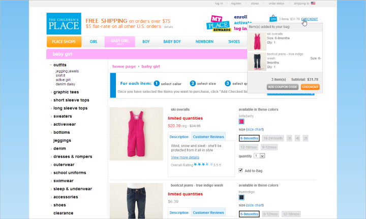
The Children’s Place allowed users to click a button to Add Coupon Code in the shopping-cart preview that appeared in the upper right corner of the page. This button led to the shopping cart, where users could enter and apply the discount while shopping, rather than having to wait until the payment page of the checkout process.
The Bad: Smaller and Hidden Product Descriptions
Product descriptions seem to be disappearing on many e-commerce websites. They’re located in the far reaches of web pages, away from product images, entirely hidden behind links, and shoved into small boxes. This may be a desktop design change influenced by designing for mobile, as companies try to create concise information for use on large and small screens alike.
While the growth of product images is commendable, it cannot be at the expense of product descriptions. Descriptions can answer questions about use, benefits, care, materials, and measurements. This is not to say that a 1,000-word treatise on a product needs to be visible as soon as the page loads, but users have to be able to quickly and easily find and use the product description when they want to.
Product information on sites can be layered. If space is tight, include a summary or brief description at the top of the page, with a clear link leading to additional detail. Ensure that the summary information is clear and descriptive. Users will dig for details, but they shouldn’t have to hunt to find the product information in the first place.

Product descriptions on Estee Lauder’s site were crammed into boxes that had space for only 4 narrow lines of text.
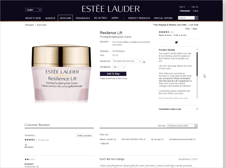
Expanding the product description on Estee Lauder’s site simply expanded the box containing the description, forcing users to scroll the description to see product details. For mobile users, it may be necessary to defer additional content to a secondary screen, but don’t give desktop users even less space to work with than they would have had on an average smartphone.
The Bad: Adding Items to the Cart
Users shouldn’t have to guess if an item has been added to the shopping cart. Many sites fail to give adequate feedback about this crucial action.
This is e-commerce 101. Users don’t want to scour the page to find out if an item was added, and you certainly don’t want them to leave the shopping process to find out if something is in the shopping cart or not. The action needs to be immediately confirmed.
Feedback can be accomplished in a variety of ways, from taking users to the shopping cart to using an overlay or modal. However, what does not work is adding a single line of text to a page, or updating the number of items listed near a shopping cart link or icon. Users overlook these subtle changes.
Subtle design changes that were likely intended to keep shoppers immersed in the shopping experience can instead act as a distraction. If users don’t know if an item was added, they may leave the shopping process to check the cart. Others may add the item again. If shoppers don’t realize they’ve done this, they get to the shopping cart and blame the site for the fact that multiple items have been added rather than the one they intended.
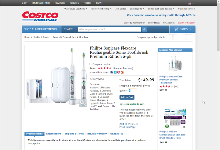
Costco added a single line of text (in green, beneath the Add to Cart button) to indicate an item was added to the cart. This was too subtle a change on the page.
The Bad: Cluttered Customer Service
Many e-commerce web design companies have become more open and airy over time. Until you go to the customer-service area of the site. So many customer-service sections remain the cluttered, cramped, and dreary dungeons of e-commerce sites.
If a customer is going to the customer-service area of your site, he is probably already encountering a problem or struggling with a question. What kind of a sign does it send to your customers when the area of the site where you ask users for their money is clean, fresh, and friendly, and the area where you answer your customers’ questions is cold, dark, and dreary?
As designs change and are updated over time, don’t neglect the customer service section of the site. Outdated designs can be troublesome to users if they are inconsistent with the rest of the site. Users may wonder if policies are up to date or doubt the accuracy of the information presented. Further, tiny types and walls of text with huge swaths of content are harder for users to read and understand.
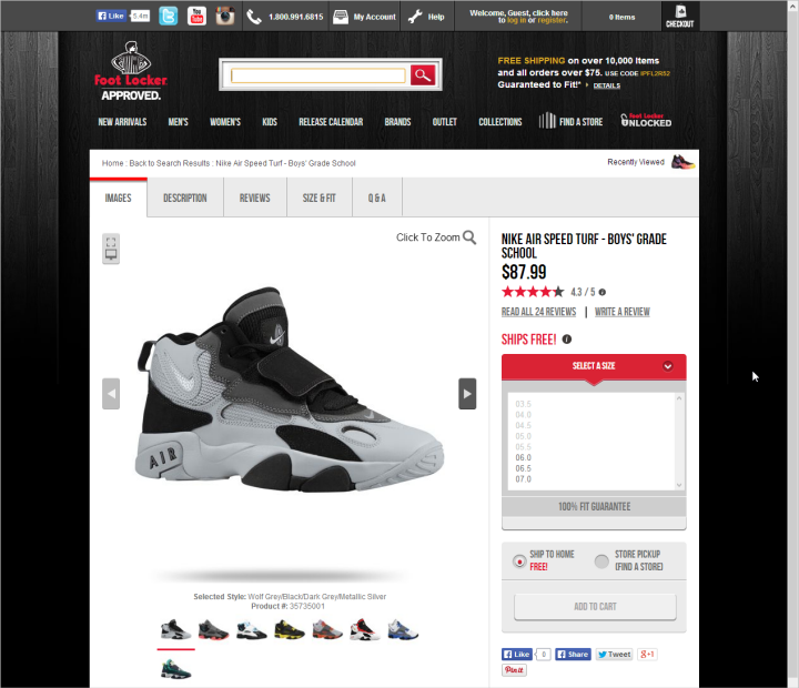
Product pages on Foot Locker’s site used plenty of white space, big images and larger text.
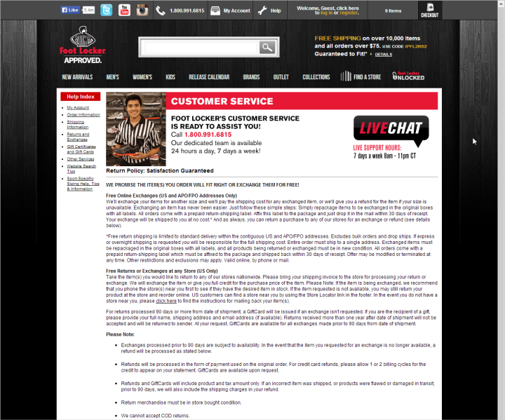
Customer Service pages on Foot Locker’s site looked cramped and crowded by comparison.
Consistent Findings
We began studying e-commerce usability back in 2000, and with each new edition of our Ecommerce User Experience report series, we see the early guidelines remain solid even when evaluating the newest e-commerce designs. Issues and design solutions that we identified in our previous editions persist today, sometimes in new forms.
Content Credits: https://www.nngroup.com/articles/e-commerce-usability/