our business website is an essential piece of your marketing and sales success, but where do you start?
Looking for SEO Services
I don’t think many would disagree with this statement: Your website is an essential part of your business and a modern marketing strategy.
A business website, when strategized, designed, and built effectively, can be what They Ask, You Answer calls your very “best salesman” — answering questions and collecting and nurturing leads while others are asleep, and never needing a vacation.
But that’s all the more reason the process of redesigning or building a new site can raise heart rates across your team.
Where the heck should you start? There are so many moving parts (design, lead generation, content creation, just to name a few), it can be difficult to know where to begin or even how to begin planning out your website strategy.
IMPACT has over a decade of experience building websites for our clients, while also helping them successfully establish their online presence. So, in this article, we help you distill down the first things you need to do in order to build or revamp the strategy of your site.
We’ll share the six most essential pieces that should be a part of your 2022 website strategy:
- Your website’s primary goals
- An inventory of your content
- The story you plan to tell
- A plan for video and new content
- A plan for self-selection
- A technical setup and launch plan
1.Your website goals
One of the first orders of business in creating your website strategy is to determine the primary things you want to achieve with your website — what are your goals, what does your target audience need to do on your website, what do your site visitors need to convert on?
Perhaps your goals are to boost web traffic or generate leads to meet your sales goals. Whatever they may be, these business goals need to be at the crux of your website strategy. With them defined, you can make data-driven decisions about the pages, user experience, and conversion paths needed to accomplish them.
Your target audience might take multiple pathways to accomplish the same goal, but putting in some deep thought for each of these will give you a lot of insight into how to build your website strategy to support each journey.
As often the first page audiences encounter on your website, your homepage can play a huge part in accomplishing your goals and is a good place to start planning.
Thinking of the homepage, in They Ask, You Answer, Marcus Sheridan (keynote speaker, author, and IMPACT partner) prompts the question, “How do we get them to page two?”
Put yourself in your target audience’s shoes and determine what they want and need to do in order to accomplish your goals when they land on your website.
Some examples include:
- Speak to someone or make a purchase. Depending on the nature of your business, this “Bottom of the funnel” action may vary. Regardless of what it is, you need to make it easy to complete or navigate to on your homepage.
- Learning more of your products or services. With this in mind, you will want to make sure to highlight your product or service pages, offer a page to learn more (and maybe even include a product/service video — more on that later). Product or service pages help a user understand an overall category or grouping of products or services and help them to determine which is the right fit for them.
- Learning your price. Price is one of The Big 5 topics potential buyers are searching and considering when making a purchase. Your homepage should make it easy to navigate to finding this information.
Note: You’ll also want to think this through for mobile devices. Your web strategy will likely be simplified and more pointed on mobile.
2. Show you care
At IMPACT, taking inventory of your content is one of the most important steps in developing your website strategy.
This includes not only your blog articles, but your videos and web page copy. Taking note of what you have and what gaps need to be filled will help you determine what needs to be on your website and accounted for in your website strategy (and also give you insight for your content strategy).
Our website team starts in a handy SEO tool called Screaming Frog. Here, they perform a crawl of the existing site and its performance in search engines which they export and start analyzing.
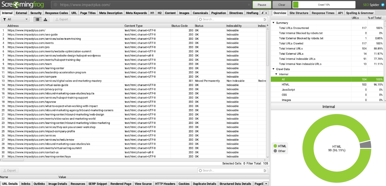
Next, the business team makes a first pass at what pages should be kept, combined, or killed to accomplish their goals and facilitate the buyer’s journey to them. This piece of your web strategy is your opportunity to take stock of what you have and what works well, and layer in your plans for what new pages you need.
Ultimately, your content inventory will give way to a site structure that includes a combination of pages you want to create, balanced with pages that may already exist on your website.
With your content in hand, a good strategy for website structure should help you see a few things:
- How your navigation menu (or menus) should work
- The structure and organization of information in your website
- Pages you need to create that may not be represented in your navigation
- What will be in your footer
3. The story you plan to tell
Once you’ve determined the pages you have and those you need, it is time to think about the kind of content that goes on those pages. Of course, this will depend on the goal of the page at hand, but that aside, your pages should be telling the same story.
It doesn’t mean we’re not focused on the specific page or user journey, it just means we’re focused on the overall story and value of the company as much as we’re thinking about the strategy of each section.
At IMPACT, we suggest using The StoryBrand Framework when developing your website strategy. Following this, the hero of a page should always:
-
- Say what you offer
- Explain how it makes life better
- Tell people how to get it
From here, you’ll want to think through what information a user will want to learn on that particular page, what their next step should be, and how to move them to that step.
Here you’ll focus on reducing noise, and help make the next step in the path as clear as possible to the user. To decide what to put on each page, ask yourself the following questions:
- How did the user end up on this page?
- Why did they choose to come to this page?
- Where should they be going next?
- What information do they need in order to be comfortable taking the next step?
- How can I make that next step as clear as possible for them?
With these questions, you should be able to get a pretty good idea of what kinds of information should live on the page, what calls-to-action you should feature, and how to keep the user moving through their journey.
Page strategies can take a lot of different forms. They could be simple notes of the different sections you want on each page, or they could be a sketch of the page if you are more visual.
4. A plan for self-selection
I’ll say it again: your website can and should be your best salesperson.
Modern buyers don’t want to be sold to. They can spot sales pitches from miles away and want to be able to go through their buyer’s journey at their own pace without being hassled or rushed.
Knowing this, effective web design gives buyers pretty much everything they need to feel ready to buy or to go ahead and make the purchase without ever speaking to someone at that company.
Aside from content, one powerful way of doing this is through a self-selection or self-configuration tool.
The quick-and-dirty explanation of a self-selection tool is that it is any type of interactive feature (i.e. a quiz, form, etc.) that customizes the experience of a website to your user — for example, guiding them to the information or product that best matches their specific needs.
These usually fall into one of three common buckets:
- A pricing/cost calculator: This is exactly what it sounds like; a tool that helps you evaluate how much an action, product, or service will cost you.
- A build/design tool: This helps you personally create or identify the right solution or product for your needs. For example, take the WIX website builder.
- Customer onboarding tool: An experience that gets things set up correctly for a new user. Think of how when you first sign up for Twitter or other social media platforms, they ask you for a few interests so they can suggest people for you to follow.
Overall, these tools create a “seller-less” experience. They put the power into the hands of the consumer and free your sales team up to work on the leads that really need that one-on-one attention.
If you’re not ready to create something this robust just yet, your website strategy can start with something simple (e.g., a dropdown in the hero that allows you to choose your persona).
Self-identification pages such as industry pages or buyer-type pages, are where a user can click on the category they most identify with and get taken to a page with all the information that applies to them.
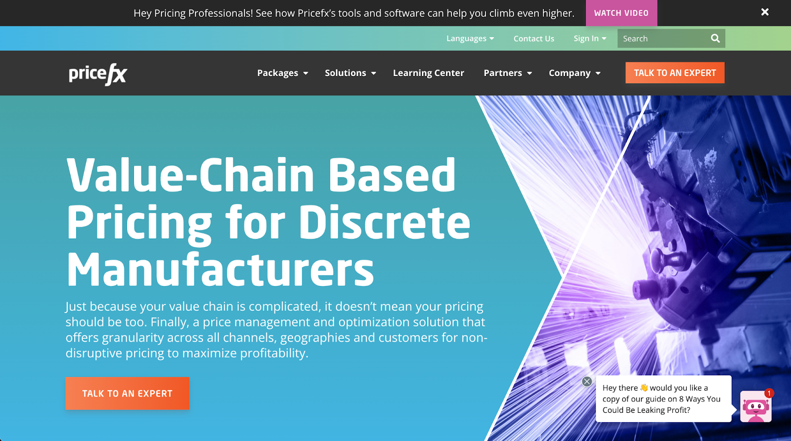
Here is a great example from IMPACT client Pricefx:
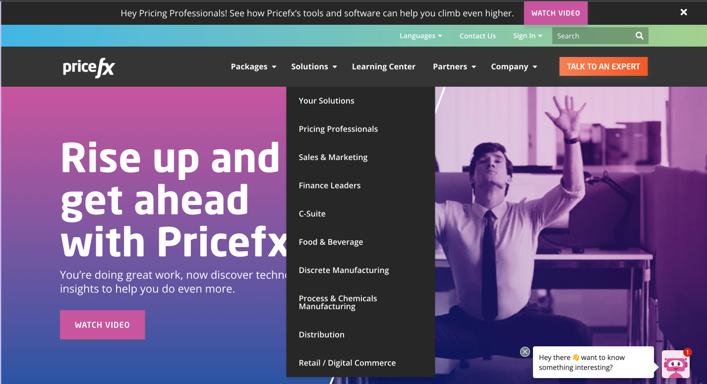
Simply hover over the “solutions” tab in their menu, and you’ll see options to select your industry and be taken to a page catered to it.
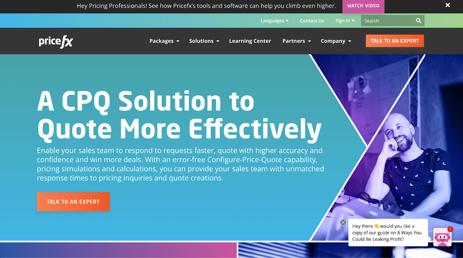
Note differences before the marketing and manufacturing pages.
5. A plan for video and content
Ultimately, your website is a place to deliver and share content so, in your website strategy, you need to make sure you’ve accounted for a way to not only easily find and host it, but to publish new content.
At IMPACT and in They Ask, You Answer, we’ve found creating and housing all of your content in a Learning Center to be the most user-friendly and effective way to do this.
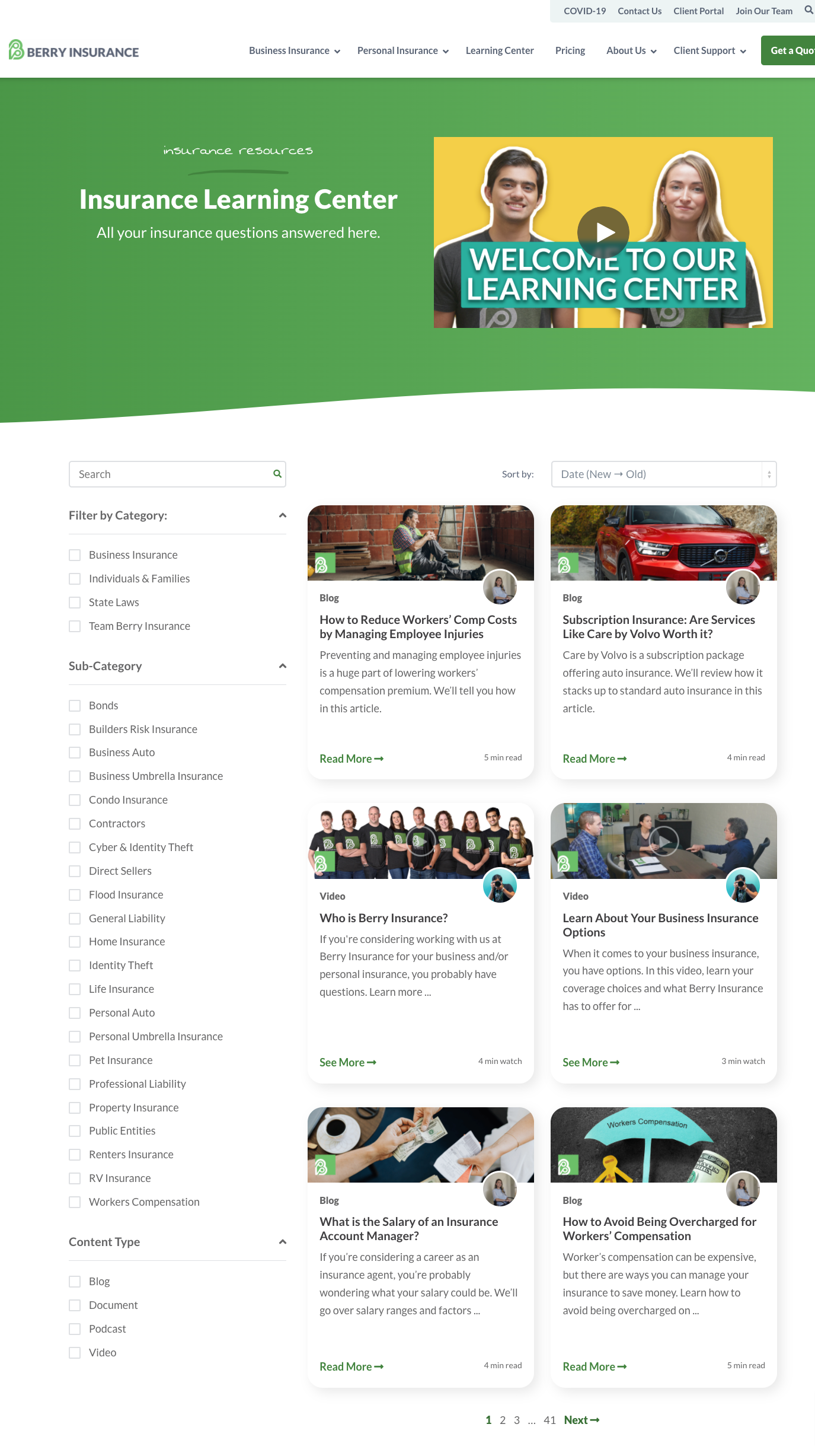
IMPACT client, Berry Insurance, does an admirable job with its Learning Center, including a host of mediums and filtering options.
Including a Learning Center on your inbound website instills the fact that you are a trusted authority in your area who truly knows what they are talking about, not just out to make a sale.
Your Learning Center should be home to all of your articles, online courses, templates, infographics, and of course, videos.
As we have mentioned many times before, one of the keys to marketing success today is video. It isn’t a “nice to have.” These days, it is an “absolute must.” So treat it that way.
In addition to your educational videos, make sure you have specifically outlined a strategy for what videos you need to create for your website and what pages those videos will live on.
We’ve talked ad-infinitum about The Selling 7 videos in the past, but here’s a quick recap to help you prepare your strategy.
The Selling 7 are the seven types of videos guaranteed to generate great results. Each of these videos has a place in your digital strategy beyond just your website. But at minimum, these seven types of videos should be making an appearance on your website. They are:
- 80% videos. 80% videos are those that answer the most common questions all of your prospects ask. While essential in the sales process and assignment selling, they are great on FAQ pages or “how it works” types of pages.
- Employee bio videos. These are short videos where your team speaks directly to the camera and introduces themselves. Include them on team or employee bio pages as well as your email signatures.
- Product/service page videos are videos describing your product or service, the pains it relieves, and the benefits it provides. You should have a product/service style video on (surprise!) every product or service page.
- Landing page videos are videos used on pages where you are asking visitors to fill out a form to help increase conversion on those forms. In them, you reiterate the value and benefit of converting and also explain what will happen after doing so.
- Cost videos are videos describing your pricing or how much a typical purchase might cost. They are perfect on pricing pages or service pages.
- Social proof/testimonial videos. These are videos depicting a successful customer journey from beginning to end, which are useful in a variety of places, but particularly impactful when discussed on the page about the product or service the customer is discussing.
- “Claims we make” videos. These are videos that demonstrate the claims you make as a business that set you apart from the competition. They are commonly shown on the homepage and/or about pages.
6. Technical setup and launch plan
Your technical setup and launch plan are a make-or-break part of your website strategy. Reflecting on the previously mentioned elements of your website strategy, identify any important functionality needed to accomplish them.
Some common things that come up are:
- Integrations between tools
- Support for e-commerce
- Interactive functionality (e.g. clickable maps, self-configuration tools)
- Forms and contact collection
- Subscription and email follow-up
- Video hosting platforms and tools
- Database functionality
You may need the help of someone a bit more technical to recognize all of these items or identify areas of your strategy that would require them.
It is important to collect all of the functionality needs you have (or potential desired future functionality) and determine the best platform to manage your website that allows for those things.
This is one of the most important, and often overlooked, steps in the process. Many people try to do this first and forget about it. Don’t make that mistake. Your website strategy and the technology you need to support it are intertwined. So while it’s likely one of the first things you should do, it is something that may need to evolve as the rest of your strategy does.
Last, but not least, you need to have a plan for how the launch of your website will be executed. Again, this may vary depending on the actual elements on your website, but this checklist captures some basics every website launch strategy should include.
WWTBW: What would the buyer want?
There are so many things to think about when building your website strategy, so don’t be stressed out if you are feeling a bit overwhelmed.
If you keep in mind one simple guiding light, it will help you make the right decisions at each stage in the process. It all boils down to one simple phrase:
WWTBW: What would the buyer want?
Stop making decisions based on what the business wants from its website and start thinking about what you would want as if you were your own target audience.
Think about the last time you visited a website as a buyer. What did you want?
Use that perspective for everything you do, and you will be golden. Lastly, keep in mind your website is never done, and you should constantly be adding new items to your strategy, but starting with the right foundation will make it infinitely easier.
Content Credits: https://www.impactplus.com/blog/best-website-strategy-tips
