10 Ways to Turn Your Website into a Lead Generation Machine
Your website is a powerful tool, working 24/7 to attract potential customers and turn them into leads. But how do you make the most of this opportunity?
Here are 10 proven ways to squeeze more leads out of your website, transforming it into a lead generation machine:
In this guide, we’ll explore powerful techniques that can elevate your B2B marketing strategy, inboud marketing & lead generation efforts to drive conversions.
- Optimize for Search Engines (SEO)
- Clear Navigation
- Calls to Action (CTAs) that Convert
- Harness the Power of Social Proof
- Structure for Clarity and Concision
- Keep Your Forms Streamlined
- Embrace A/B Testing for Refinement
- Speed Up Your Website for a Speedy Conversion Rate
- Price it Right: Transparency Builds Trust
- Visual Appeal: Show, Don’t Tell
Optimize for Search Engines (SEO)
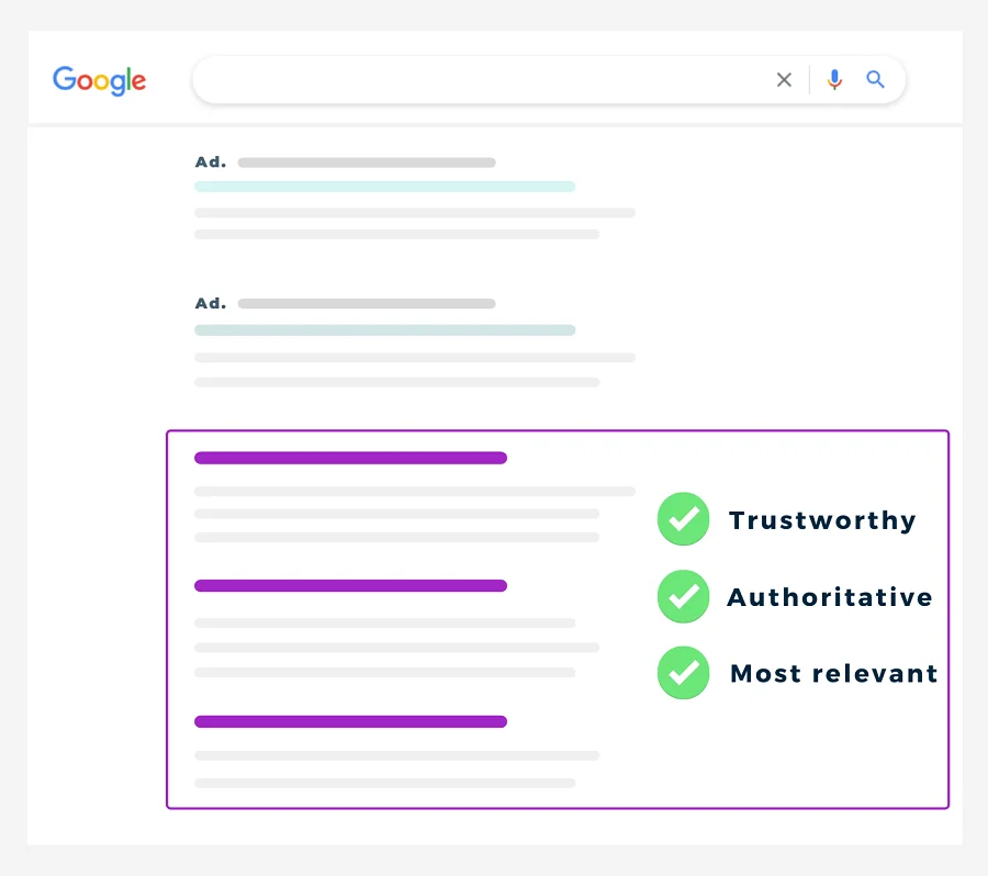
Imagine potential customers searching for your products or services online, but failing to find you because your website is buried deep in search results. Not ideal! To avoid this, befriend search engines like Google. Conduct thorough keyword research to understand the terms people use to search for what you offer. Strategically sprinkle those keywords throughout your website content, from titles and headings to product descriptions and blog posts. This will increase your website’s search engine ranking, making it more visible to potential customers actively seeking your solutions.
Actionable steps
Use free keyword research tools like Google Keyword Planner or SEMrush.
Analyze competitor websites to see what keywords they rank for.
Incorporate relevant keywords naturally throughout your content, avoiding keyword stuffing.
Clear Navigation
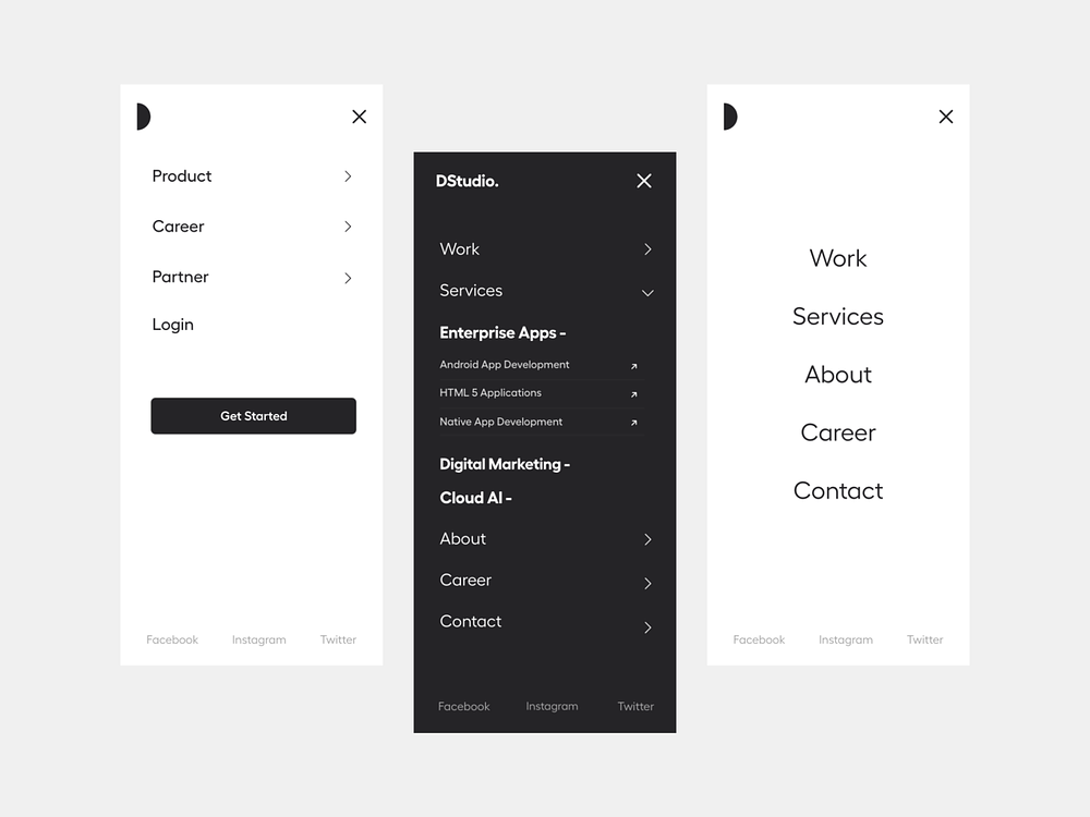
Think of your website as a well-organized store. Customers shouldn’t have to wander aimlessly through cluttered aisles to find what they need. The same goes for your website’s navigation. Make it intuitive and user-friendly. Put your most important information, like product and service pages, front and center in the main navigation bar. This ensures visitors can easily find what they’re looking for, keeping them happy and engaged on your website.
Actionable steps
- Limit the number of items in your main navigation bar to 7 or less.
- Use clear and concise labels for each navigation item.
- Organize your navigation bar logically, grouping related pages together.
- Consider using a mega-menu to display more options without overwhelming visitors.
Calls to Action (CTAs) that Convert
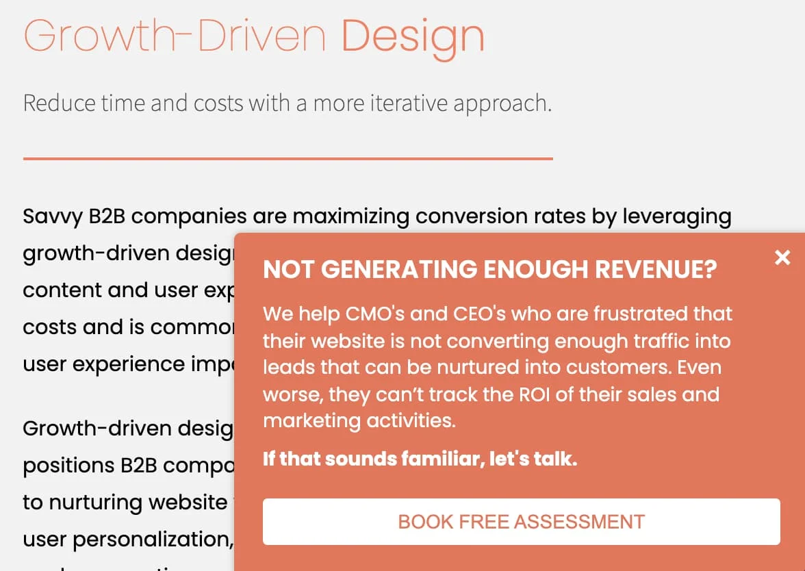
Don’t leave website visitors guessing about their next step! Be clear and direct with compelling CTAs throughout your website. A CTA is a message that tells visitors exactly what you want them to do, whether it’s signing up for a newsletter, downloading a free trial, requesting a consultation, or making a purchase.
Make your CTAs stand out with
- Clear and concise language: “Download Now” instead of “Click Here to Download.”
- Contrasting colors to grab attention.
- Strategic placement on your webpages, like at the end of blog posts, product pages, or your About Us page.
HubSpot identifies two main types of CTA: primary and secondary.
- Primary CTAs: These are your main conversion points, appearing prominently throughout your website (often in the navigation bar). Examples: “Book a Demo,” “Contact Sales,” or “Sign Up Now.”
- Secondary CTAs: Offer contextual alternatives based on specific pages or user journeys. For instance, a blog post might have a CTA to “Download our Free eBook” or “Read a Related Article.”
Bonus Tip
- Craft Compelling CTAs:
- Highlight user benefits: “Get Started and Boost Your Sales.”
- Create a sense of urgency: “Limited Time Offer” or “Download Before It’s Gone.”
Harness the Power of Social Proof
People are more likely to trust something if others do too. Leverage the power of social proof to build trust and credibility with potential leads. Showcase positive reviews, testimonials from satisfied customers, and logos from well-known clients you’ve worked with on your website. Seeing positive feedback from others can reassure visitors that you’re a reliable and trustworthy business.
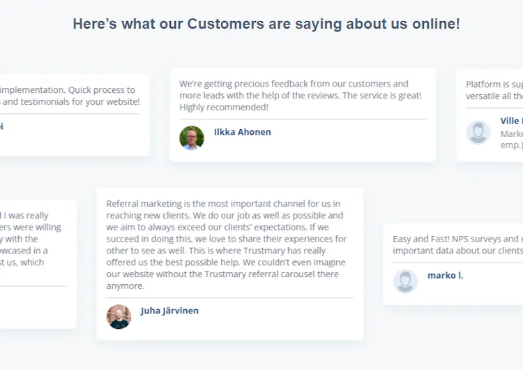
Integrate social proof in several impactful ways
- Aggregated reviews: Display real customer reviews from platforms like Trustpilot and G2.
- Customer logos: Feature logos of well-known clients or partners.
- Testimonials: Share quotes from satisfied customers, including their full name, title, and company for credibility.
- Case studies: Showcase specific examples of how you’ve helped clients achieve their goals.
Structure for Clarity and Concision
You only have a few seconds to grab a visitor’s attention before they click away. Make those seconds count with a **clear
and concise website structure. Start with a compelling headline that explains what you do and who you help, like “The All-in-One Marketing Platform for Small Businesses.” Then, use bullet points, short paragraphs, and clear headings to deliver the most important information quickly and easily. Avoid lengthy text blocks that can overwhelm visitors.
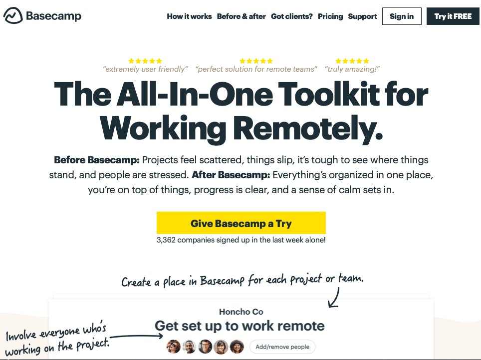
Actionable steps
- Craft a clear and concise headline that grabs attention and communicates your value proposition.
- Break down your content into short, easy-to-read paragraphs with clear headings.
- Use bullet points to list key features or benefits of your products or services.
- Limit your use of jargon and technical terms, focusing on clear and simple language.
Keep Your Forms Streamlined
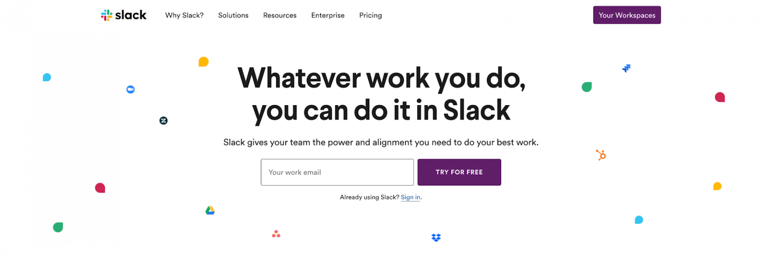
Don’t scare visitors away with long, complicated forms. People are busy and have limited time. Only ask for the essential information you need to capture a lead, such as email addresses or names. The shorter and simpler your form, the more likely people are to fill it out.
Actionable steps
- Identify the minimum amount of information you need to qualify a lead.
- Limit your forms to a maximum of 3-5 fields.
- Use clear and concise labels for each form field.
- Offer the option for visitors to sign up with social media logins.
- Thank visitors for completing your form and provide clear next steps.
Embrace A/B Testing for Refinement
There’s always room for improvement! A/B testing is a powerful technique that allows you to compare two versions of a webpage element, like a headline, CTA button, or even the layout of your entire homepage. By showing different versions to website visitors and tracking the results, you can see which one performs better in terms of generating leads. This data-driven approach helps you continuously refine your website and optimize it for maximum lead generation.
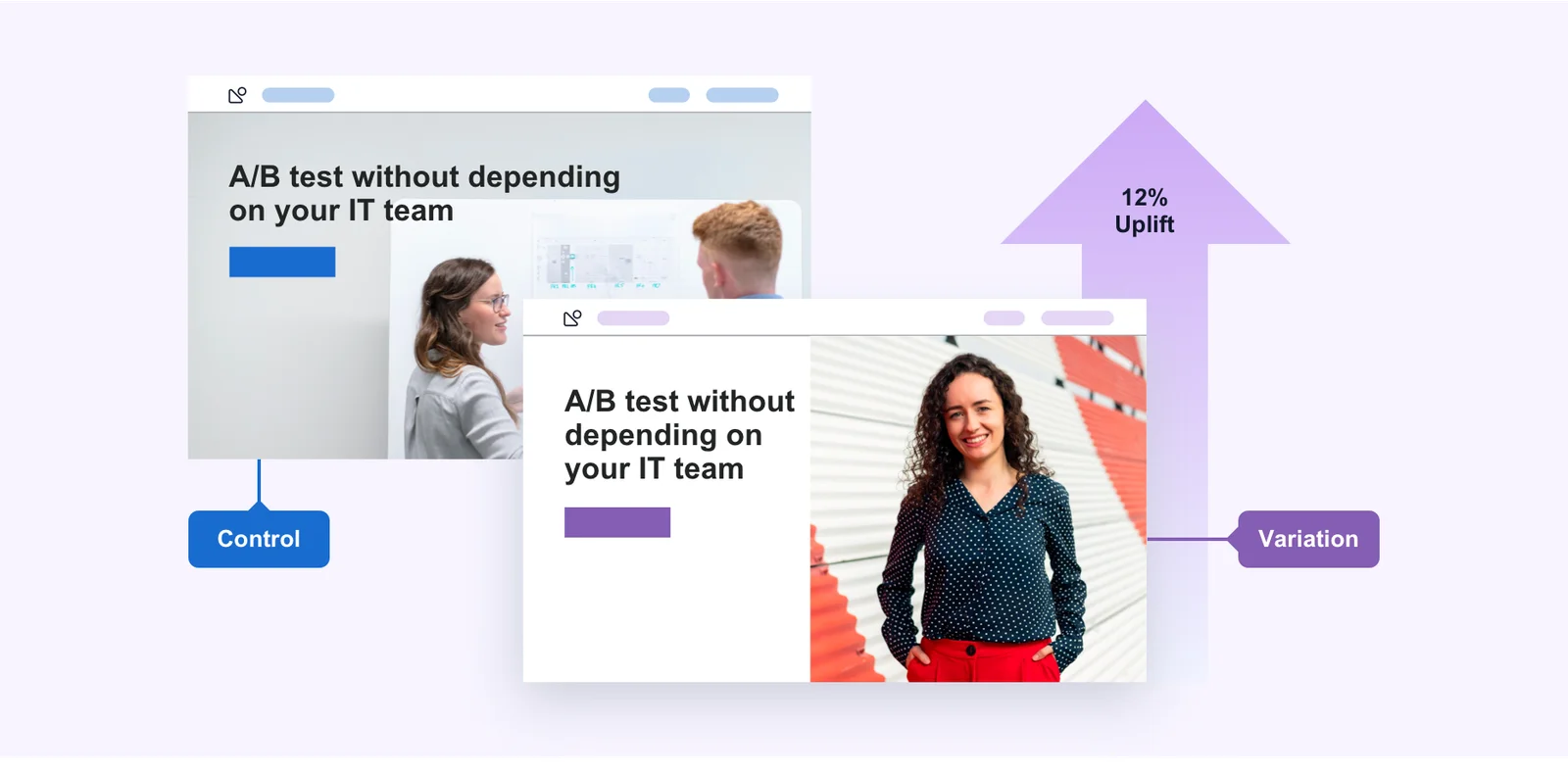
Actionable steps
- Choose a specific element you want to test, such as a headline or CTA button.
- Create two variations of the element with slight differences.
- Use A/B testing software to show each variation to a random sample of website visitors.
- Track and analyze the results to see which version generates more leads.
- Continuously refine your website based on your A/B testing results.
Speed Up Your Website for a Speedy Conversion Rate
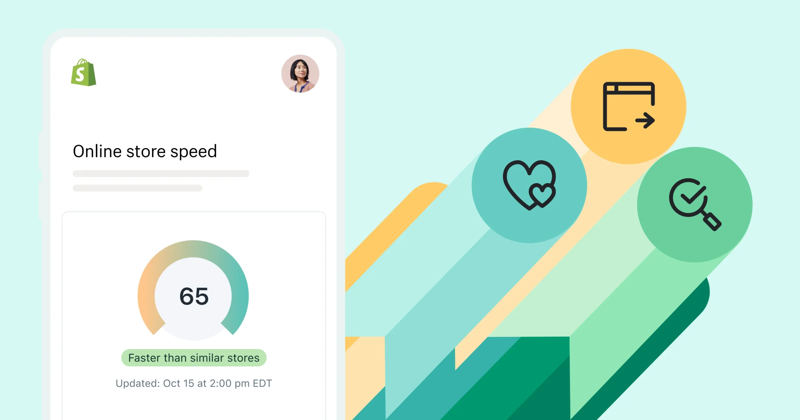
No one likes a slow website. In fact, studies show that website visitors bounce (leave) within seconds if a page takes too long to load. This can significantly impact your lead generation efforts. Here are some actionable steps to improve your website speed:
Choose a reliable web hosting provider with a good reputation for speed.
Actionable steps
- Optimize images and videos for the web to reduce file size.
- Minimize the use of large plugins and scripts that can slow down your website.
- Enable browser caching to improve website performance for returning visitors.
- Use a Content Delivery Network (CDN) to deliver website content from servers around the world, reducing load times for visitors in different locations.
Price it Right: Transparency Builds Trust
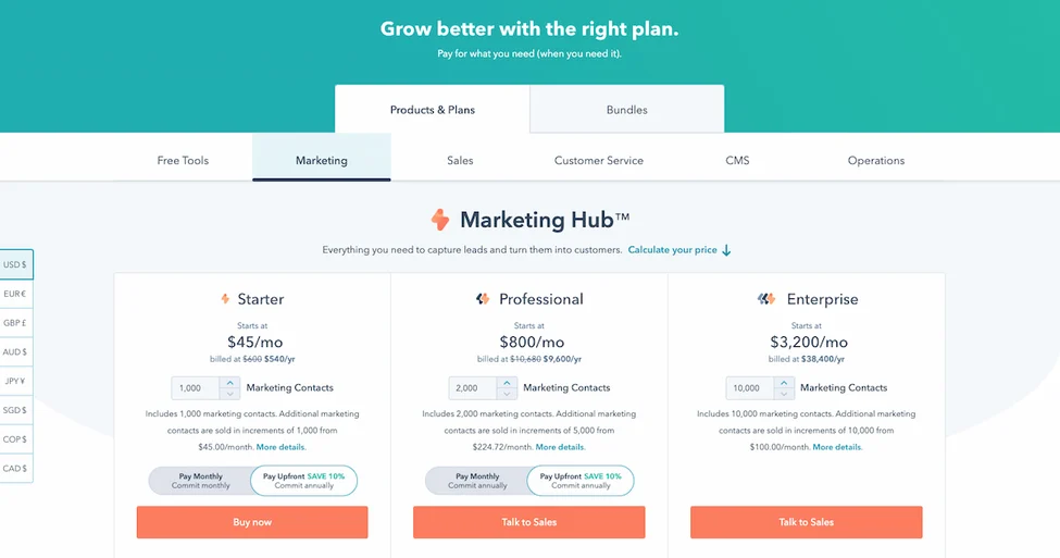
Don’t be afraid to show your pricing on your website, especially if your pricing is competitive. Transparency builds trust with potential customers and allows them to make informed decisions. Consider displaying pricing tiers for different packages or offering a sample price with a call to action for visitors to request a personalized quote if your pricing is more complex.
Actionable steps
- Research your competitors’ pricing to ensure yours is competitive.
- Develop clear and concise pricing tiers that cater to different customer needs.
- Highlight the value proposition and features included in each pricing plan.
- Offer a free trial or demo so visitors can experience your product or service before they buy.
- Use clear calls to action to encourage visitors to contact you for a personalized quote.
Visual Appeal: Show, Don’t Tell
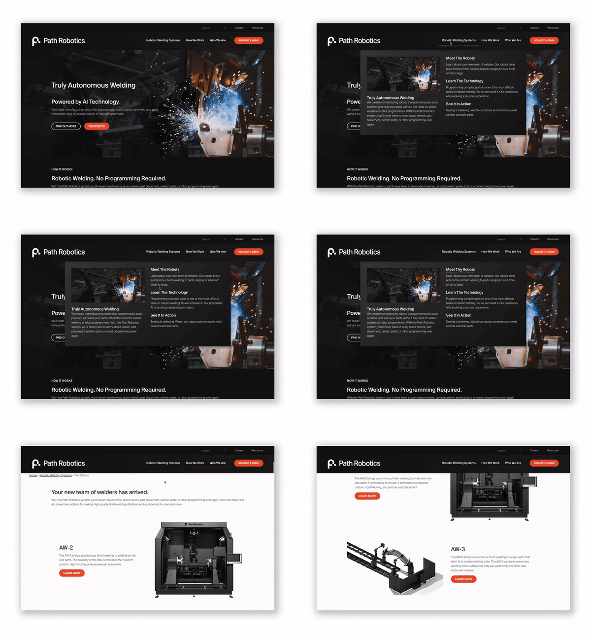
High-quality visuals are a powerful tool for generating leads on your website. People are more likely to be engaged by compelling images and videos that showcase your products or services in action.
Actionable steps
- Use high-resolution images and videos that are professional and visually appealing.
- Showcase your products or services from different angles and in various use cases.
- Incorporate infographics and other visual elements to break up text and present information in an engaging way.
- Optimize alt text for your images to improve website accessibility and SEO.
- Use visuals alongside compelling descriptions that highlight the benefits of your offerings.
By implementing these 10 actionable steps, you can transform your website into a lead generation machine, attracting more potential customers and turning them into leads for your business.
Further Read
Want more leads and sales from your B2B website?
Show potential clients you’re the real deal with social proof!
Ready to boost your business with top-notch leads? Our lead generation services in Mumbai and India are tailored for B2B success. Let’s spark your growth together! Contact us for expert lead generation services today !
We’ll help you build a B2b website that:
- Looks great
- Builds trust
- Gets results
Contact us today – let’s chat!


