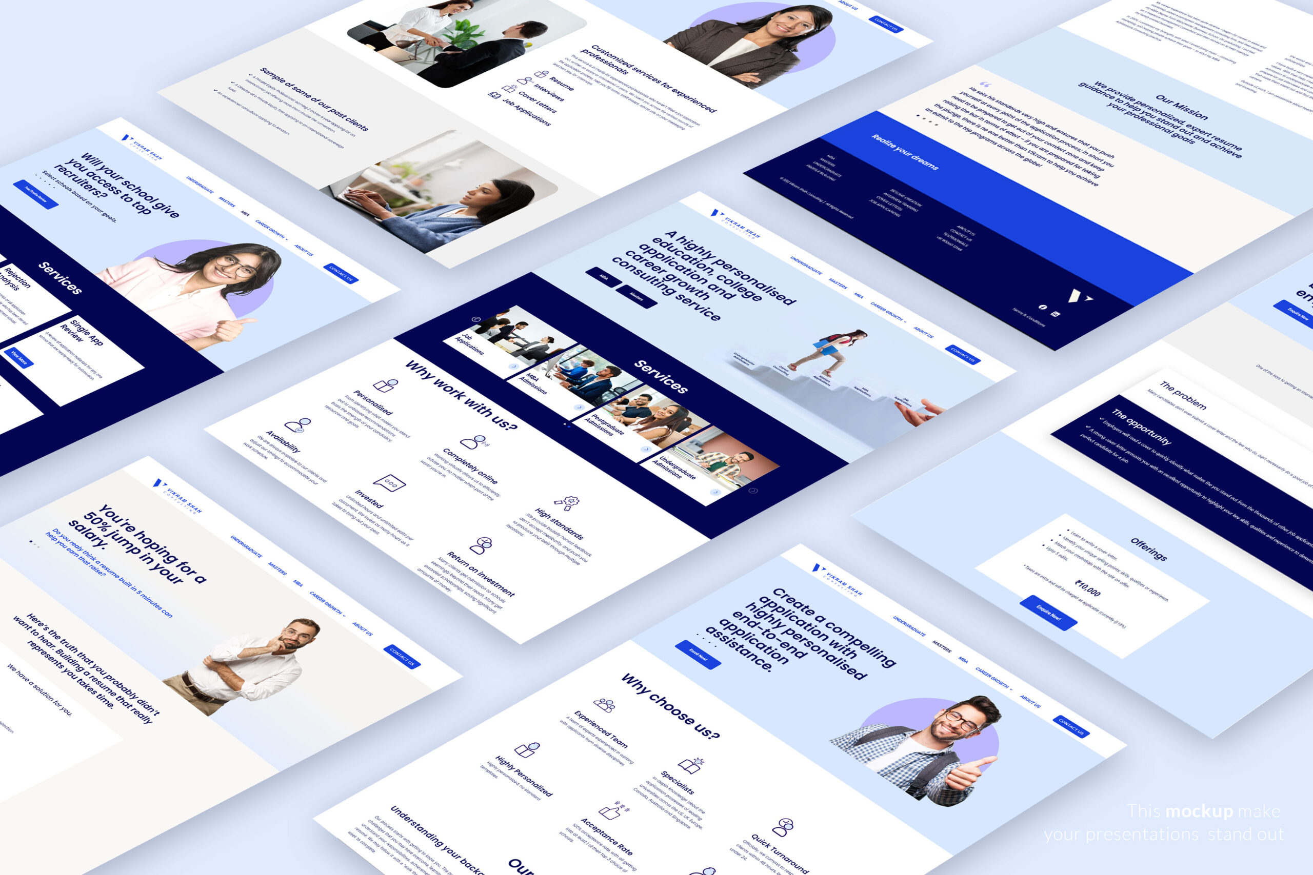
Vikram Shah - Personal Brand Website for an MBA Consultant
- Client
- Vikram Shah
- Industry
- MBA Consultant
- Services
- Personal Brand Website
CASE STUDY
Introduction
Vikram Shah, a seasoned MBA consultant, approached us to create a personal brand website that would effectively showcase his expertise and services. The goal was to establish a strong online presence and attract potential clients seeking MBA admissions consulting.
Challenge
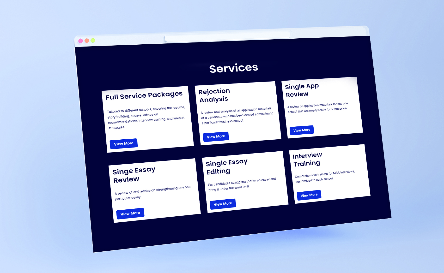
The challenge was to design a website that not only reflected Vikram’s professional image but also resonated with his target audience. It needed to be clean, structured, and easy to navigate, while also conveying his unique approach and value proposition.

Solutions
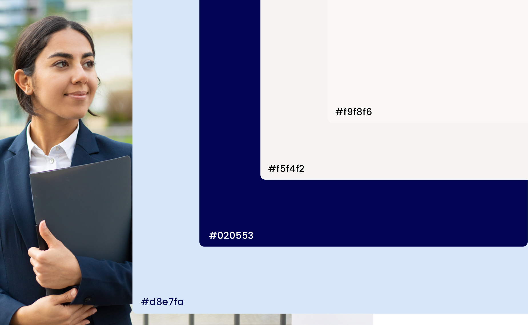
To address these challenges, we adopted a minimalist and modern design approach. The website featured a clean layout with strategic use of imagery and iconography to enhance the user experience. We used a color palette of blue, light blue, and beige to create a sense of trust and professionalism. The typography choice of Montserrat added a contemporary touch to the overall design.
Imagery
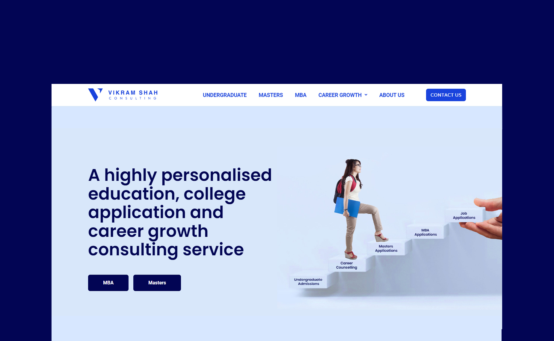
The imagery on the website was carefully selected to align with Vikram’s brand image. We used high-quality images that showcased his consulting services, as well as his personality and approachability. This helped to create a connection with visitors and reinforce his expertise in the field.
Iconography
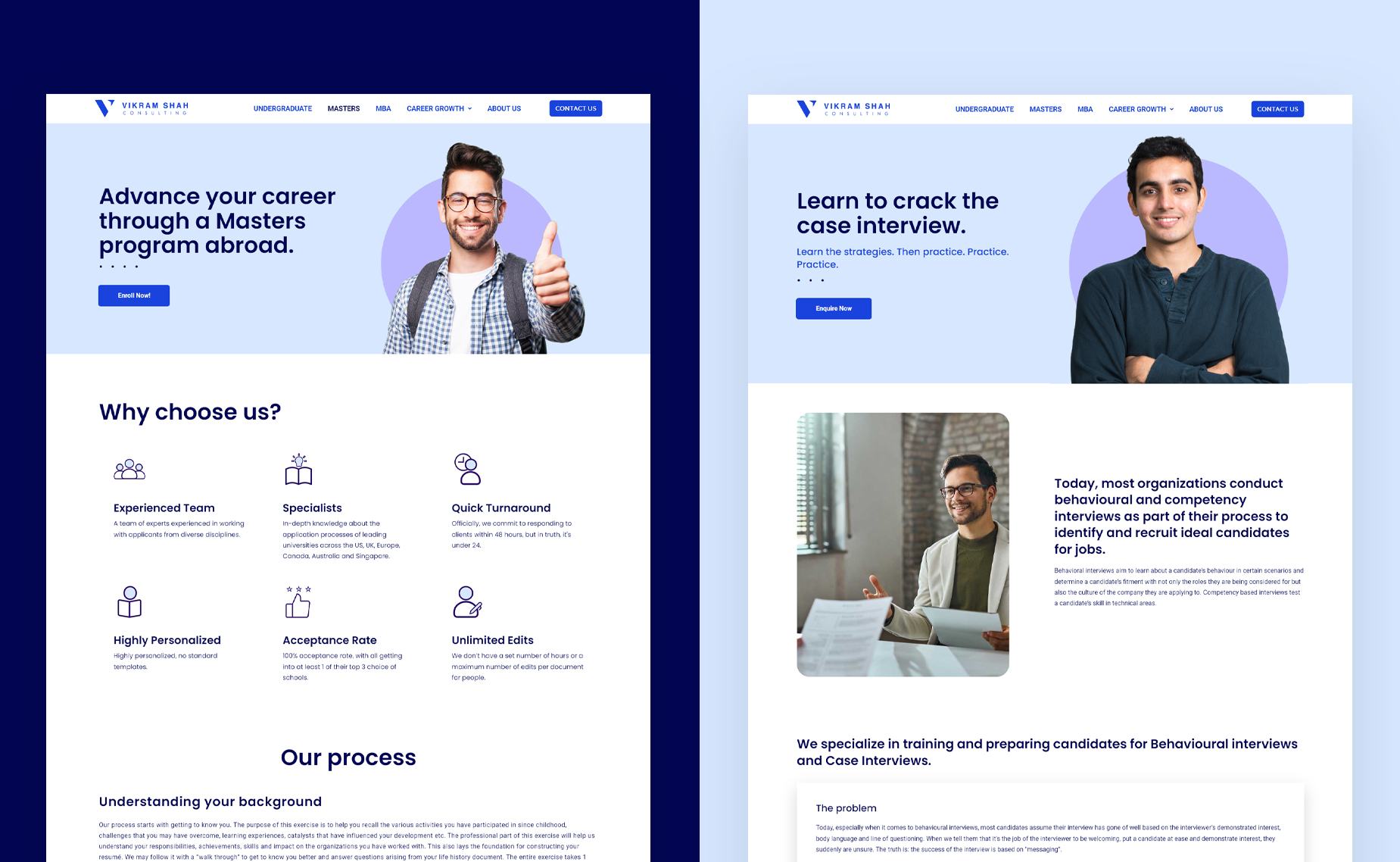
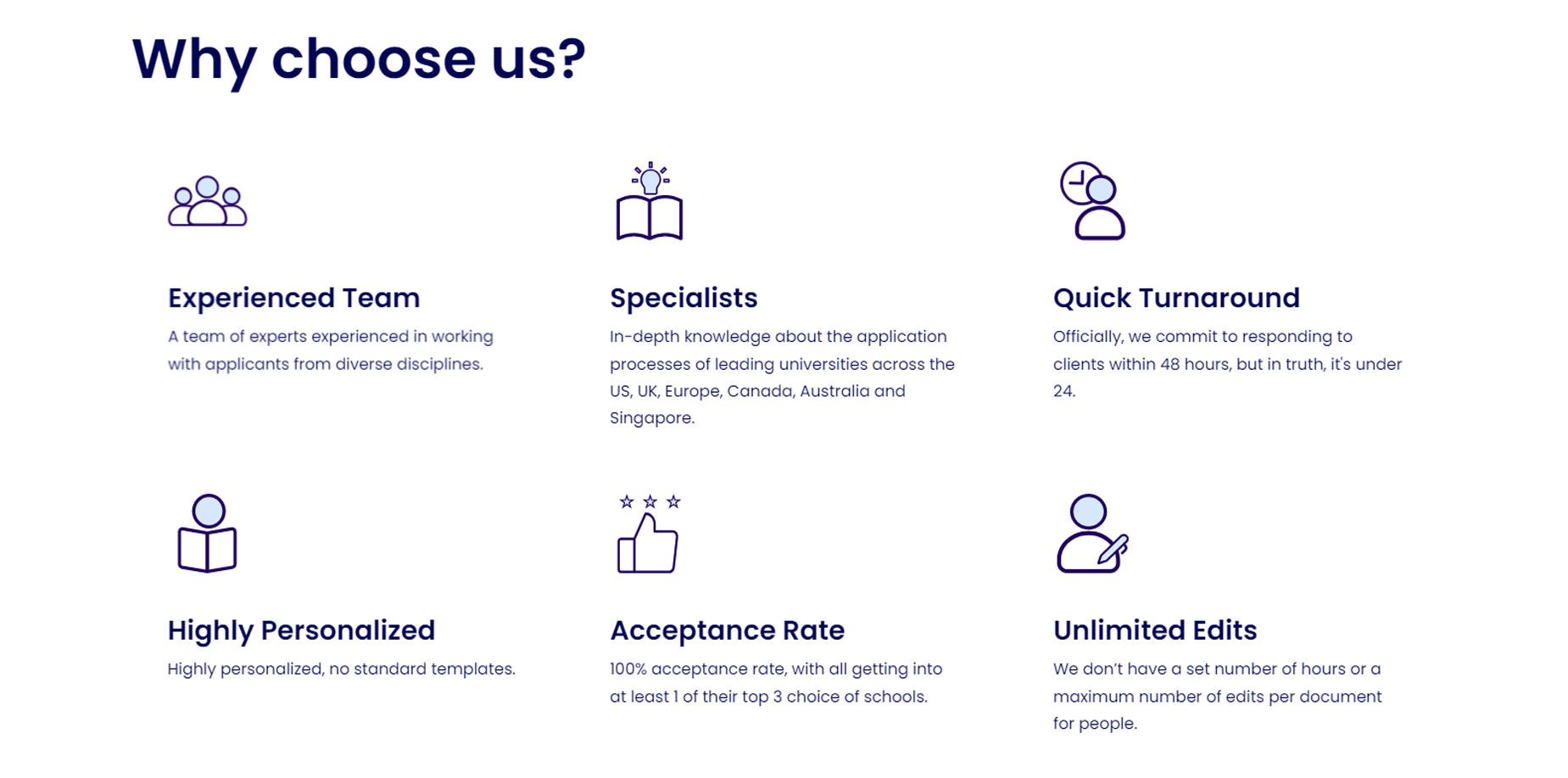
Iconography was used throughout the website to visually represent key concepts and services. These icons were designed to be simple yet meaningful, enhancing the overall user experience and making the content more engaging and easy to digest.
Colors
The color scheme of blue, light blue, and beige was chosen to convey professionalism, trust, and reliability. Blue is often associated with trust and stability, making it a perfect choice for a consultant’s website. The light blue and beige accents added a touch of sophistication and elegance to the design, creating a cohesive and visually appealing look.
Typography
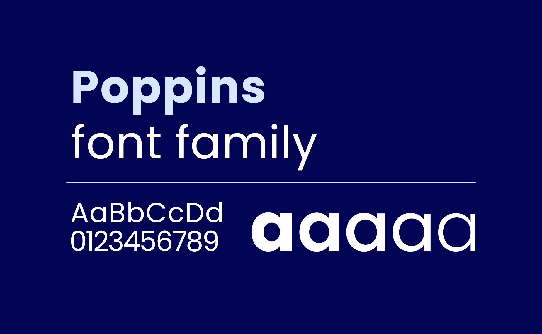
The use of Montserrat as the primary font added a modern and stylish feel to the website. Its clean lines and readability made it perfect for conveying Vikram’s message clearly and effectively.
Conclusion
In conclusion, the Vikram Shah personal brand website successfully achieved its goal of establishing a strong online presence for the MBA consultant. The clean and structured design, combined with strategic use of imagery, iconography, colors, and typography, helped to create a professional and engaging website that effectively showcased Vikram’s expertise and services.

