More to make your website reach millions of users. In our previous mail we gave you 10 ‘mantras’ for successful conversion of a website visitor into client
Do you know that organizations that take a systematic approach to maximizing user conversions are twice as likely to see a significant revenue increase?
Given this, you’d expect that more businesses will research and perform tests. But 61% of firms perform less than 5 tests a month.
The explanation for this is that MOST corporations are so wrapped up in the “business as usual syndrome,” my intuition tells me, and they only take a second to seek clarification about working on maximizing conversion.
In this post we’re going to go over what the highest converting websites do differently. But before we get into the details, we want to highlight a few points to get you thinking first:
- To create a convincing headline and landing page, you have 0-8 seconds. Most visitors exit after 8 seconds.
- Around 96% of people who come to your website are not ready to shop.
- The more landing pages you have, the more you are likely to collect leads.
- Product videos will raise product sales by 144%.
- A one second delay in the pace of your site will result in a reduction in conversions by 7%.
- A/B testing is now the preferred approach that has achieved the most results for many businesses.
Got that? Ok, let’s get into what the best do differently….
They Make Their Unique Value Proposition(s) Clear
The nucleus of your strategic edge is your value proposition. It clearly articulates why, instead of a competitor, anyone will want to buy from your company.
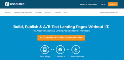
A great example of this is Unbounce:
 Unbounce’s value proposition, offering ease of use
Unbounce’s value proposition is perfectly evident from the moment you arrive on the homepage, as you would expect from a business specialized in conversion rate optimization, namely the ability to create, post, and validate landing pages without any I.T. Assist.
The presumed technological overhead of A/B testing is a significant obstacle to entry for many small businesses (and even larger companies), making Unbounce’s value proposition especially attractive.
This homepage also has a number of other features, such as a powerful, unmissable CTA and a simple three-step visual representation of how Unbounce’s solution works, that make the overall experience very persuasive.
The copy also specifically notes that Unbounce is mainly targeted at advertisers (a direct indicator of a very relevant target audience’s awareness and appeal), as well as the fact that users will create mobile-responsive landing pages that answer a very specific need or issue for certain marketers themselves.
Want to create a stellar website for your brand, click here to start your project now!
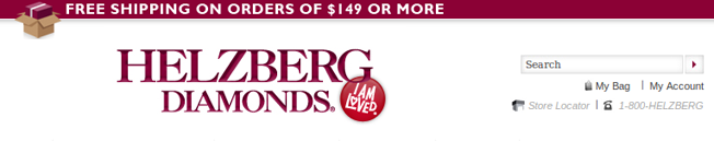
Another example is Helzberg Diamonds. They are a little more subtle about their USP, but they definitely address “Why you should buy from them”.
For example, they state free shipping on orders over $149:
Scroll down the page a little bit, and you’ll see some encouragements:
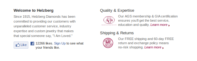
Having 12,266 fans on Facebook surely does not hurt their conversion rate, either.
What are the reasons customers should buy from you? Is it a money back guarantee? Free shipping? Find what yours are and make it clear.
They Test Their Calls-to-Actions
Hubspot featured a business on their blog that, by having a clear call-to-action that contributes to a white paper, boosted their conversions by 105.9 %. The company tells the user about the company & what they offer in this whitepaper.
In order to direct the customer, the organization also created a more powerful headline and used meaningful graphics. Just these three improvements led to their conversion rate more than doubling.
By making a clearer call to action, Mozilla boosted downloads of their prevalent Firefox browser. Free” performed better than “Try Firefox 3″ Download Now.” They made it clear that Firefox was free to download the software and called the viewer.
Proflowers, with some figures of about 40 %, is a platform known for high conversion rates. They make it easy for customers who are in a hurry to buy flowers – they can start by simply picking a day they need the flowers by:

ProFlowers eliminates any initial questions that the prospect may have. The prospect knows right away the answer to the question “can you get this to me by __?” They’re helping to overcome any obstacles to a purchase. See if you can do something like Proflowers has done—answer one of your most popular questions in a clear, above the fold headline. If some obstacles to prospects purchasing from you are:
“I don’t feel comfortable purchasing from a small company like yours” – then some ideas to help overcome this fear could be:
- Include a behind the scenes video of your company and how your operations work.
- Include a banner at the top with customer testimonials, each one showing for a few seconds.
- Give your unique value proposition right at the top. Tell how long you’ve been in business, how many orders you’ve shipped, customer satisfaction rate, etc.
Want to create a stellar website for your brand, click here to start your project now!
How do you find out what questions your customers have?
In order to receive their input, you can still ask your clients questions. Understanding the aching points, frustration and what they actually are looking for from your customer will help you build a site that converts higher. Qualaroo is a tool that allows you to do just that:
They Test Their Headlines
The headline can make or mar your website, and possibly a sale The first impression is quickly formed, as stated in the introduction, and the headline is a significant part of that perception. Testing and seeing what resonates with your visitors most is critical. There is no magical elixir, but you should follow some reasonable instructions.
37signals improved conversions of their Highrise product by 30% by having the headline “30-day Free Trial on All Accounts”. Their worst headline was “Start a HighRise Account”.
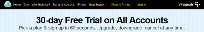
The important lesson from this is that it’s elemental to have a clear headline with a unique value proposition. “Start a HighRise Account” doesn’t tell of any benefit. They don’t give a solid alibi why they should sign up now. Consider having added free trial in your headline or try “Save X% and start [enter the benefit of your product]”. The important thing is to test to see what works.
CityCliq improved their conversions by making a clear headline that informs the user what they’ll benefit of. First, the tested headlines:
- Businesses grow faster online!
- Online advertising that works!
- Get found faster!
- Create a webpage for your business
The one that lead to more conversions:
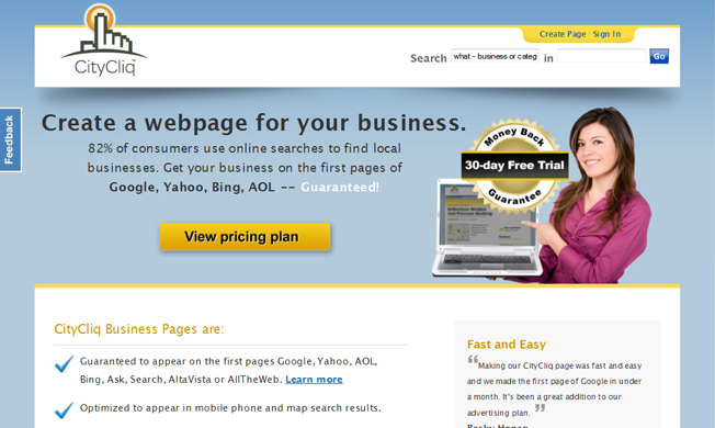
This is the best headline because it’s evident and precludes any language that you may find in your spam folder. Be innovative with your headlines and inform the visitor of what you do or the benefits of your product.
One more tip: having a headline that addresses a pain point has in one case, increased conversions by 32%.
They Tend To Have Short Forms
Conversion expert Tim Ash advises that only the necessary forms be preserved. How many times have you been prepared to sign up for something, continue to see more than 25 fields you ought to fill in? I have a lot of moments, and sometimes I only quit the site. It’s necessary to value the time that users have. It’s important that you don’t let them drop off because the form is too long if you’ve gotten the user as far as having to sign up.
Take a look at Dropbox’s signup form:
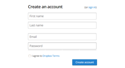
Dropbox is only asking for what they need. No username, no security questions, no birth date, no verification code, no re-enter password field, nothing unneeded.
They don’t force you to sign up for Proflower before you order. They don’t disturb the shopping process at all if you’re a first time customer. You don’t have to build a new account; once you make your order, you have the option of doing so. Proflowers remove all hurdles to buying.

Want to create a stellar website for your brand, click here to start your project now!
Building more concise forms is important.
Test the number of form fields!
Many conversion experts would conclude that the path you want to strive for when you are about to continue iterating should be to refine forms to make them simpler.
Often, the form conversion rate can be increased by having more fields. However, in general, fewer fields tend to yield better conversions (it depends on what your form is for). The point is: Don’t stick by the rule book, test and find out for yourself!
Other Techniques To Try
- Implementing a “Chat Now” button increased free signup form fills by 31%.
- Cars.com recently boosted their conversion rate 2.7% by having a security seal on their site.
- Including discount information in the title (e.g. 15% off Product A vs Product A) increased add to cart conversions by 148.3%.
- Benefits, social proof and credibility indicators led to a 144.1% improvement on landing pages.
- Putting people on your homepage can have a huge impact on conversions.
- Including a pain point in a headline increased conversions by 31%.
- Changing your call-to-action button from green to red has been shown to increase conversions by as much as 34%.
- Try moving around your Buy Now button. Appsumo did this (among other things) and doubled their conversion rate.
- Changing a button from “See Plans and Pricing” to “Get Started Today” increased conversions by 252%.
- Turning CAPTCHA off led to no conversions lost and very little spam mail in this case study.
- Showing testimonials can drive validation.
- Using natural language on forms has been shown to increase conversions by 25-40%.
- Having a nice mobile site can double conversions.
- Segmenting your users can increase conversion rates be giving more relevant content to the user.
- Putting your call-to-action button can really improve conversions.
Post credits:
https://neilpatel.com/blog/what-converting-websites-do/
https://www.wordstream.com/blog/ws/2016/04/27/value-proposition-examples